It is not every day that you have the opportunity to modernize a brand as iconic as Porsche. But the German sports car manufacturer's 75th birthday was the ideal starting point for a new era. Together, we embarked on a journey to recharge the brand and to shape its future.
Porsche always had and has its own way of showing up in the world. With the new brand design, we wanted to create something that is even more powerful, more iconic. A design that makes the brand purpose “driven by dreams” more visible, supports the strategic positioning, and increases the brand’s attractiveness. And a design that is flexible, recognizable, and, of course, suitable for digital display.
Video is loading…
Better apart: wordmark and crest
Porsche’s crest and wordmark are the brand’s most distinctive symbols and central elements of its presence. In the new brand design, just as on the car itself, we use these elements separately.
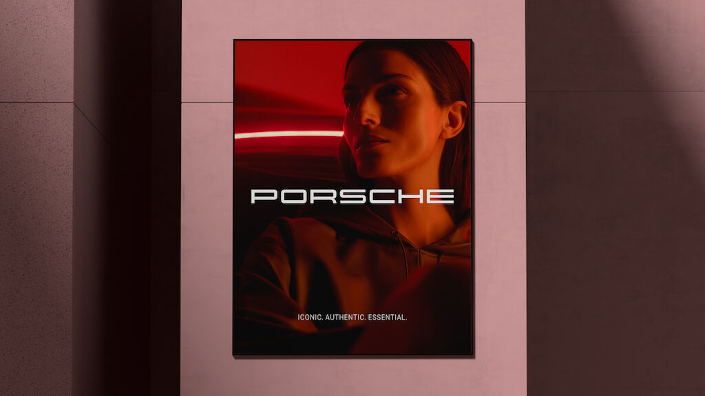
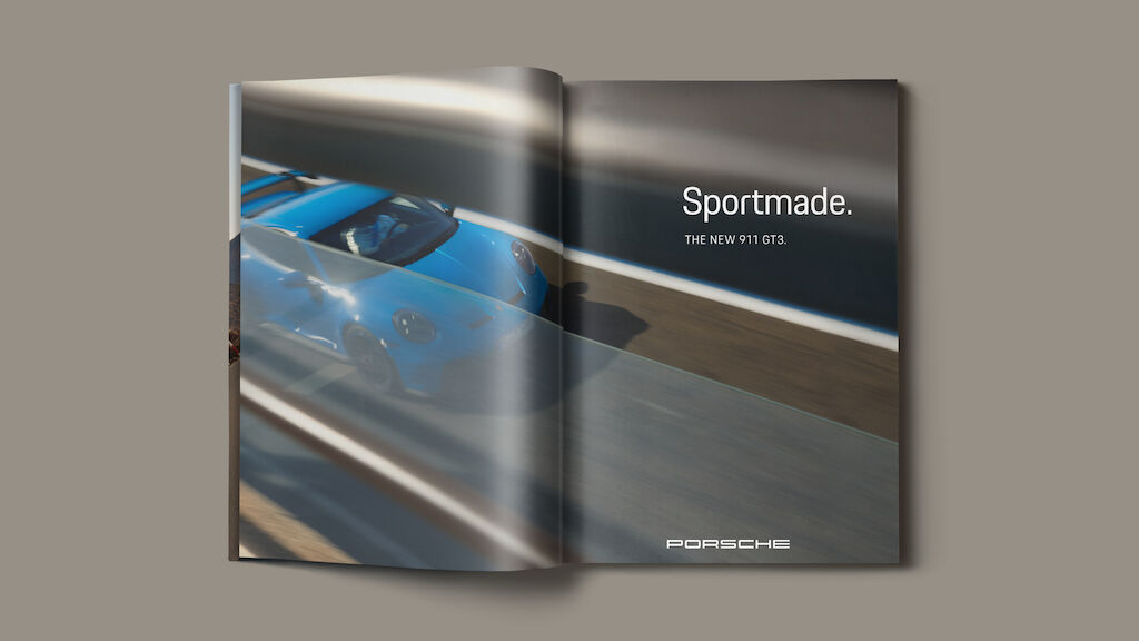
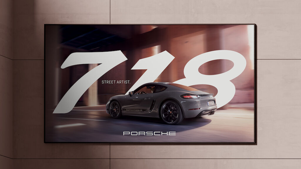
The iconic wordmark is now the centerpiece and the baseline element of the Porsche communication. We have carefully modernized it, making it easier to use, read, and scale. Using the wordmark on its own creates great flexibility and avoids double branding.
The crest was revived in a 3-year process by Porsche in-house. At MetaDesign, we put the finishing touches on it, making it suitable for usage in both analog and digital media. We only use the crest to provide a haptic experience, either as a three-dimensional object or in a refined format.
Video is loading…
Video is loading…
Video is loading…
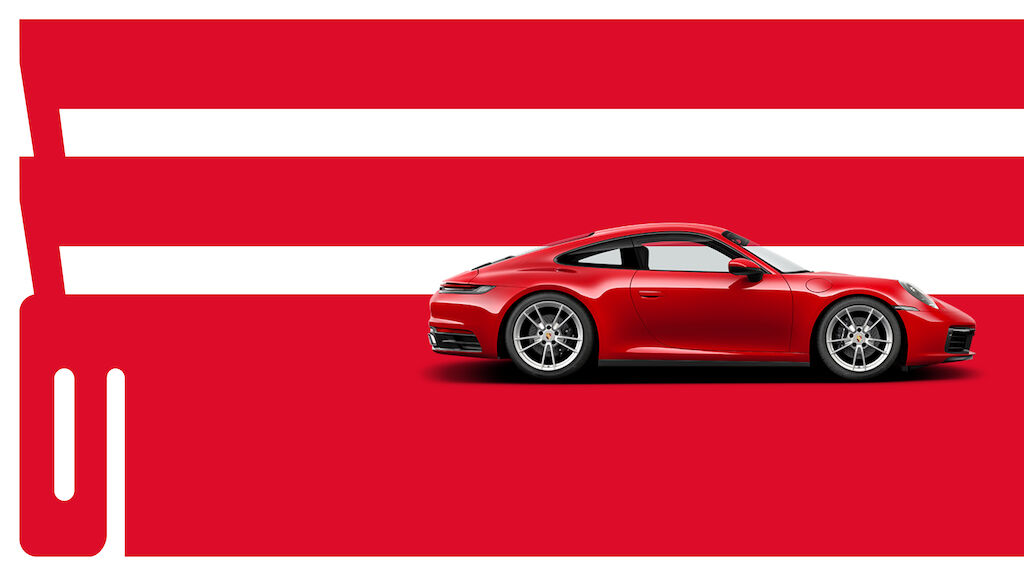
An expressive and flexible layout
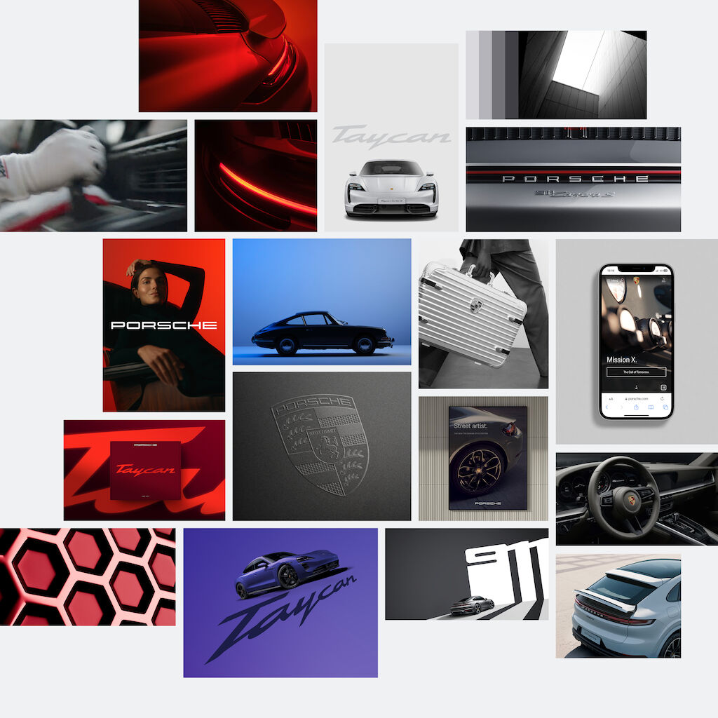
The new layout system follows simple rules that allow a high degree of flexibility in design expression. We use this system to implement the design principles across all media. The iconic wordmark, calm and precise typography, expressive imagery, and model lettering – they work together to create the unmistakable, luxurious Porsche look.
The refined wordmark is the determining factor for the entire layout system. Its size defines the spacing between elements, the type area, and the typesetting grid.
Video is loading…
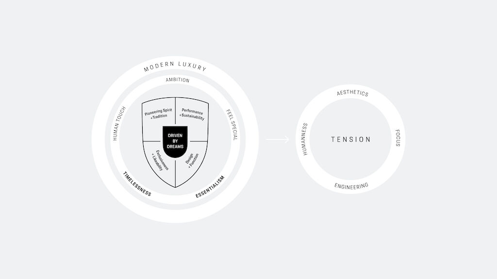
Unified in tension
We identified “tension” as the ever-present, overarching idea of reconciling the contradictions that characterize the Porsche brand. Tension builds connections–from the past to the future–to create a recognizable and memorable brand expression. It is this tension that we convey in the Porsche design philosophy and design principles.
Driven by Dreams
Porsche started with a dream. A dream of a car that was not yet on the road. A dream to advance, aspire and envision everything that could be. The realization of this dream is the starting point for the Porsche brand philosophy. It defines what makes the brand unique and distinctive, and it establishes Porsche as an icon of modern luxury. And it is this dream, this realization, that we are carrying forward in the new brand design. A design driven by dreams.