
Cuisinart
Feeding imagination
Cuisinart’s 50-year history as an iconic global kitchen brand was being diluted over time by international competitors vying for premium culinary product leadership. Tasked with re-energizing this heritage brand, MetaDesign embarked on a strategic redesign of the Cuisinart brand experience. After a competitive analysis and brand evaluation, we crafted a new strategic platform that leverages the brand’s unique purpose in Feeding Imagination while accentuating the company’s wider range of offerings and benefits. This new strategy also fuels ambitious business-growth targets with a fundamental, emotion-driven brand vision: A Cuisinart at the heart of every home.
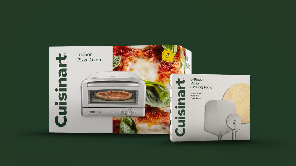
MetaDesign brought the inspiring strategy to life by refining the wordmark, producing a UI kit to improve the digital experience, and unifying the international brand presence with a new signature color to create consistency. A pivotal aspect of the redesign was updating Cuisinart's packaging, ensuring it aligns with the refreshed brand identity and enhances product appeal on both digital platforms and physical retail spaces worldwide.
Delicious details
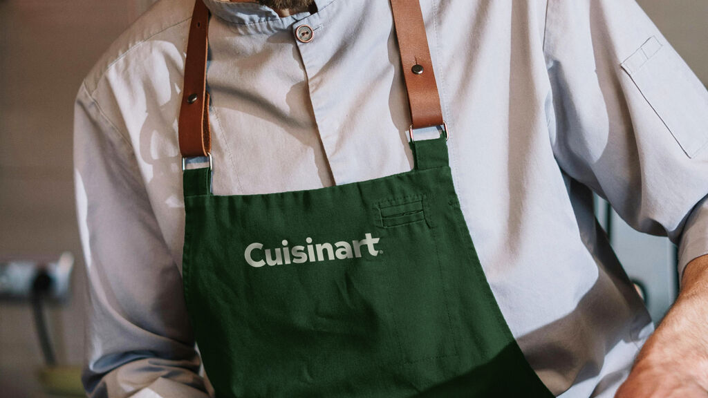
The redesign of the Cuisinart wordmark was an exercise in true craftsmanship, focusing on how it would perform across varied touchpoints, notably in the challenging context of metal stamping on the products themselves. This attention to detail addressed the existing wordmark's limitations, especially its tight kerning which posed challenges on physical products. The redesigned wordmark also introduced uniquely crafted flourishes, enhancing the "appetite appeal" of the brand. These adjustments not only solved practical issues but also enriched the visual identity, echoing Cuisinart's iconic status and culinary inspiration.


Seamless, joyous, intuitive
The UI toolkit for Cuisinart was thoughtfully designed to balance visual appeal with accessibility, aligning with the strategic theme of "Feeding imagination." It features a distinctive yellow accent color to enhance UX functionality and engagement, promoting seamless navigation and a joyous, intuitive user experience. This approach ensures the digital environment is accessible and enjoyable for a broad audience reflecting the brand's commitment to inclusivity and the joy of cooking.

The result
The redesign by MetaDesign successfully rejuvenated Cuisinart's brand identity, ensuring its relevance in the modern market while preserving the emotional bond with its consumers. The refreshed logo, UI kit, and packaging collectively reinforce Cuisinart's mission to inspire culinary creativity and joy, marking a significant step forward in the brand's evolution. This strategic overhaul not only solidified Cuisinart's market presence but also affirmed its legacy as a source of inspiration in kitchens worldwide.




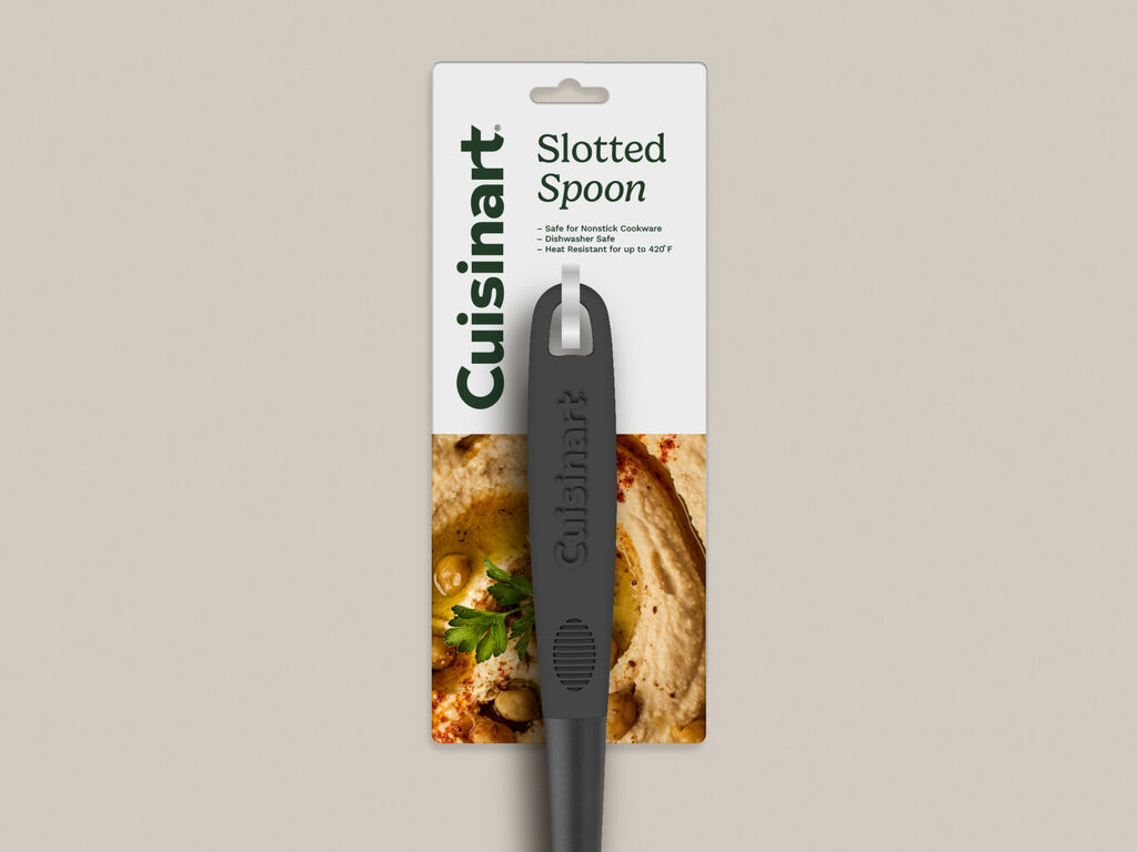

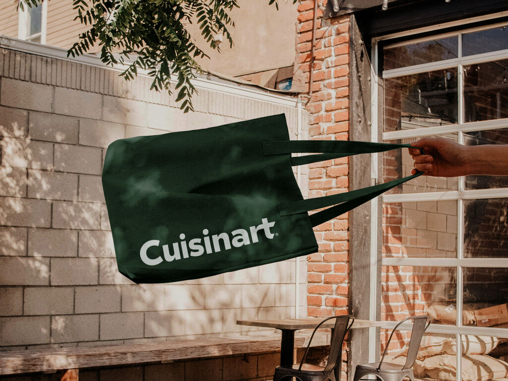

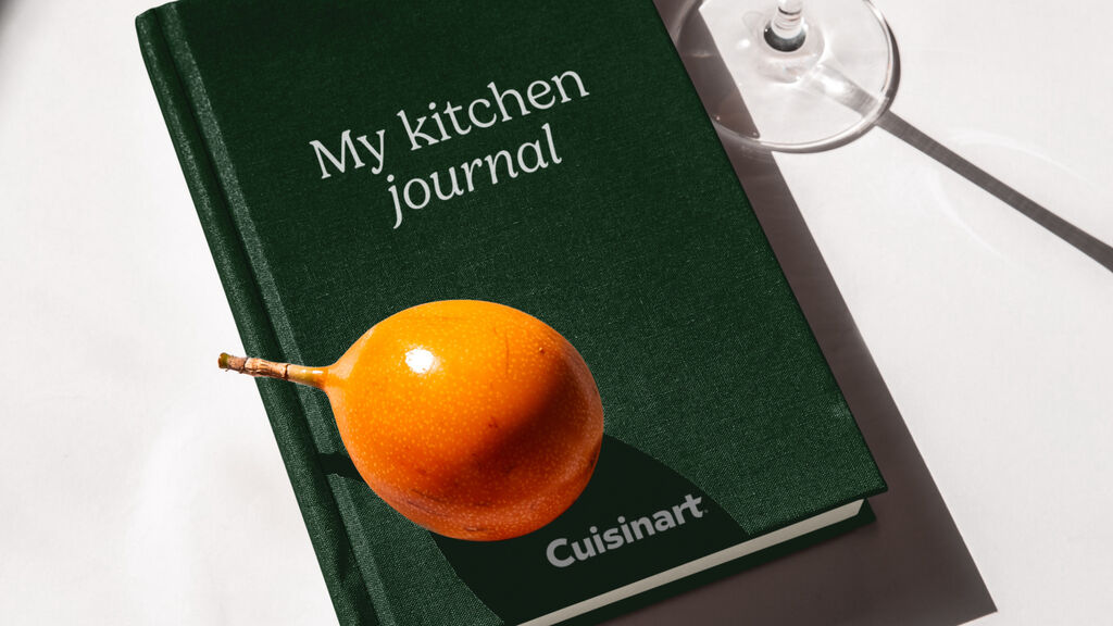
The refreshed Cuisinart brand made its public debut at the Wired and Well Housewares Expo Chicago in March 2024, showcasing the new identity and packaging. This event, highlighting home and wellness innovations, was an ideal setting for Cuisinart to present its commitment to culinary creativity and excellence, connecting directly with consumers and industry insiders.
With its refreshed identity, Cuisinart has successfully blended tradition with innovation, crafting a future that respects its past while embracing the new. This is not just a brand transformation; it's a testament to the balance between form and function, history and progress, utility and beauty. As Cuisinart continues to feed the imagination of culinary enthusiasts around the globe, it remains a cherished icon in kitchens, inspiring delicious creations and heartwarming memories for generations to come.

Awards
Transform Awards North America 2025 (Best Brand Evolution (Consumer) & Best Visual Identity from the Retail Sector)
Need more details?
Contact MetaDesign New York mail.sfo@metadesign.com +1 415 293 23 40

