Airtel
Refreshing one of India’s most visible brands
In the ultra-competitive Indian telecom market, Airtel represents a bridge between today’s essential technology needs and tomorrow’s inspiring innovations. With 364 million users and many more to come, Airtel asked MetaDesign to refresh the brand’s visual identity and help propel a strategic vision to advance beyond telecom.
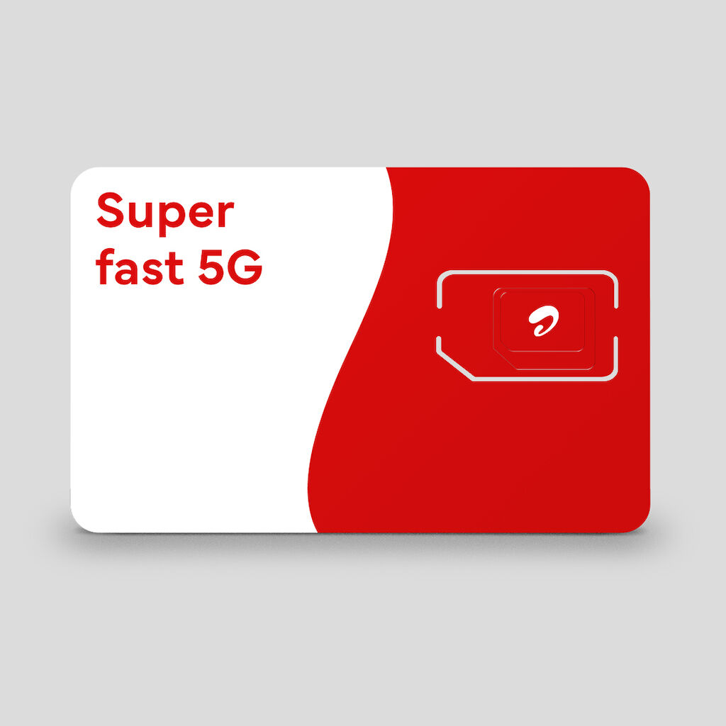
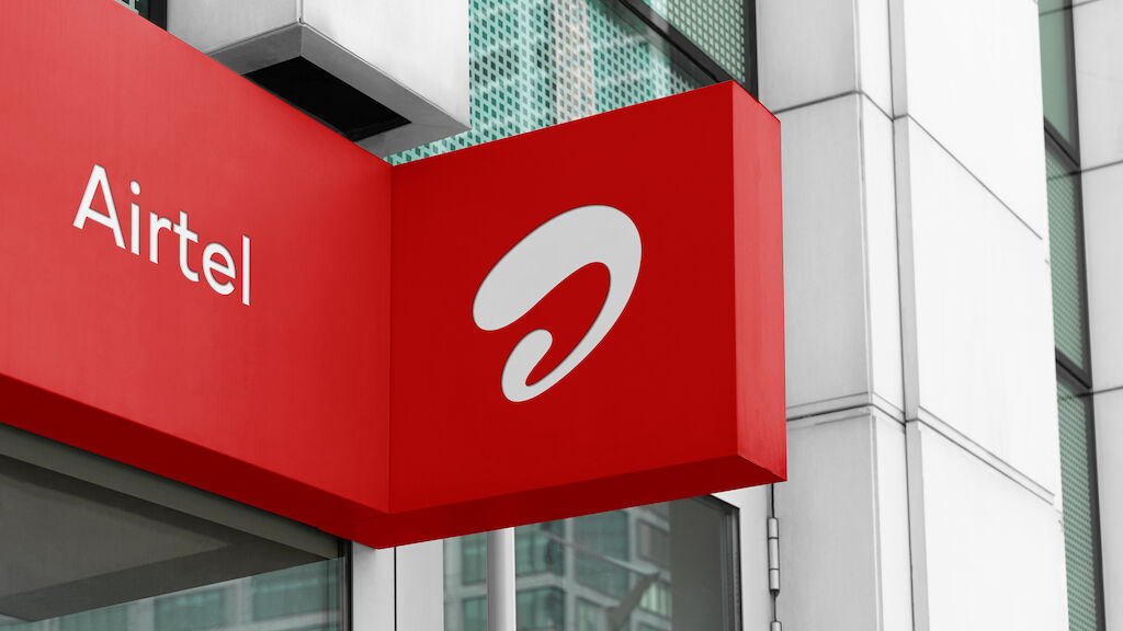
Unlocking the inherent power of the iconic Airtel mark, we created a brand language in which the symbol allows for new fields of dynamic expression and a unifying architecture. By doing away with the wordmark, we bolster the strength and recognition of the Airtel symbol with a renewed confidence.
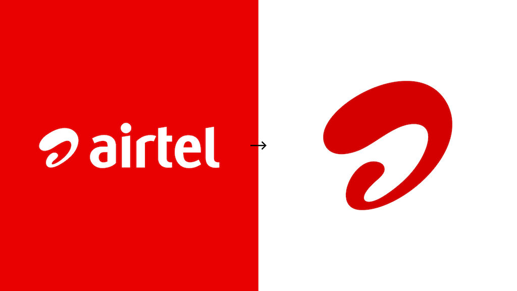
The Airtel logo: before & after
“With a consumer base of 364 million plus and presence across multiple touch points, we believe this is one of the largest brand refresh exercises ever and what could be more exciting to time the launch with 5G.”
Creating a scalable system for brand expansion
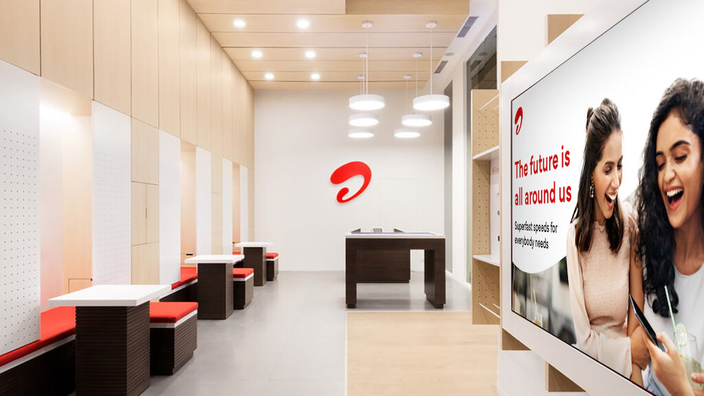
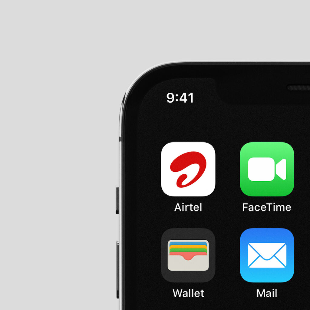
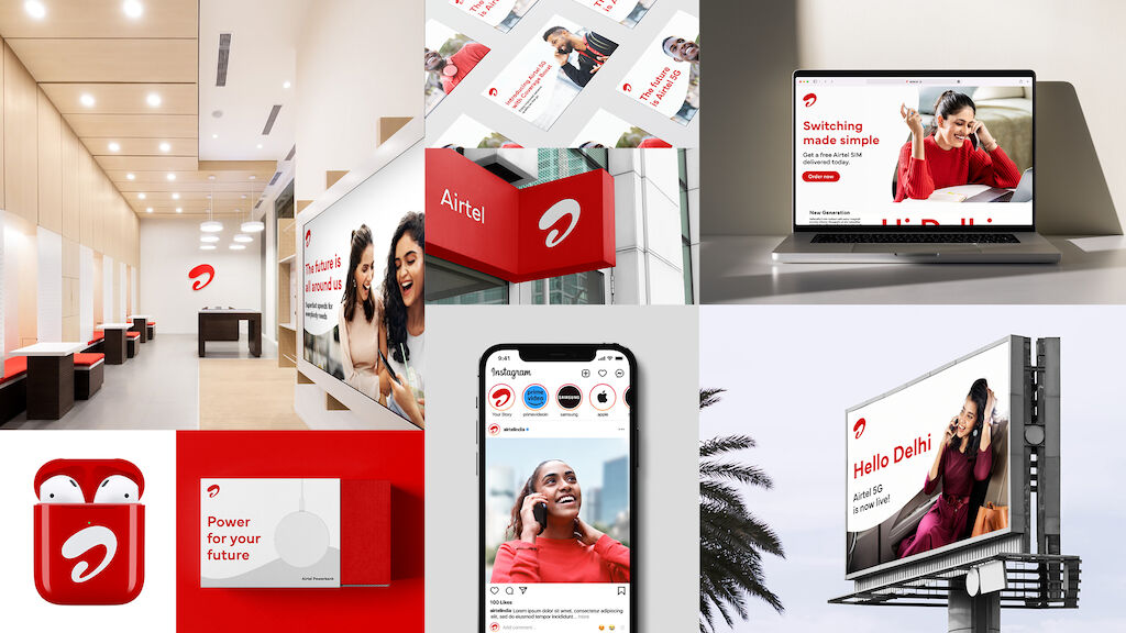
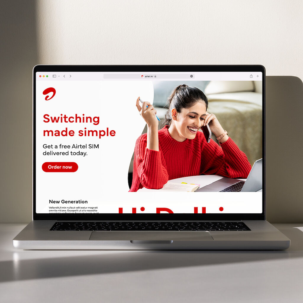
Airtel is a business of extraordinary size and complexity, and so it was essential from the very beginning that the brand rejuventation must be simple, and scalable. From enormous billboards on India’s busiest freeways to the smallest of phone screens, the brand stands proud; confident and consistent.
Brand elements
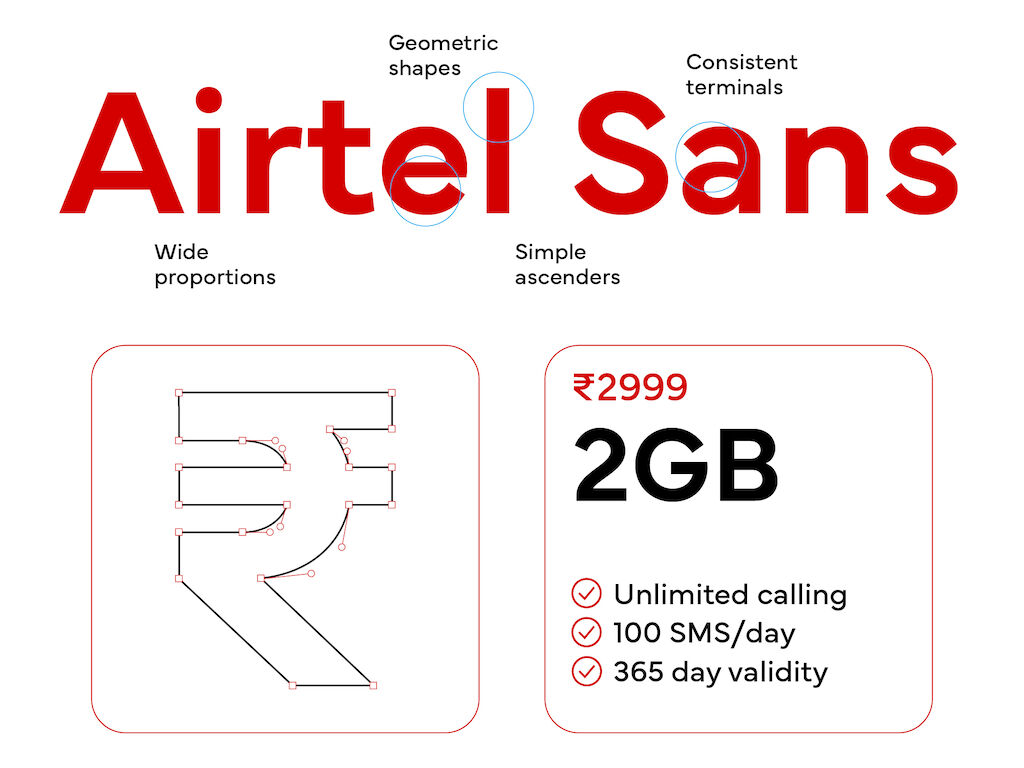
A brand is much more than a logo, and Airtel is no exception. MetaDesign worked with TipoType to adapt their iconic typeface Mundial for the Indian market. From this collaboration, Airtel Sans was born. The contemporary, geometric shapes of the font family reflect the forward-looking optimism of the Airtel brand.
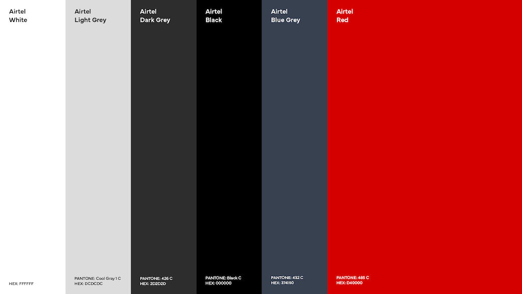
Additionally, the colour palette was refined to focus on the essential needs of the business, with a new shade of Airtel Red unifying a previously disparate palette of colors to create consistency across print, digital and in-store touchpoints.
Expressing the visual language of Innovating Care
Everyone talks about innovation – but what does innovation feel like? We leveraged Airtel’s strong customer care credentials and connected a visual thread to the exhilaration of innovation. For Airtel, Innovating Care is providing what someone needs to thrive.
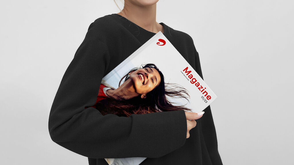
MetaDesign led a photoshoot to create the new Airtel image library in New Delhi, October 2022.


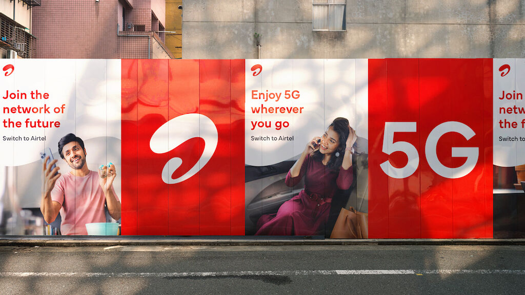

Each brand element was carefully designed with a specific intention and alignment to overall business objectives, and the outcome is a fitting translation of strategy in design.
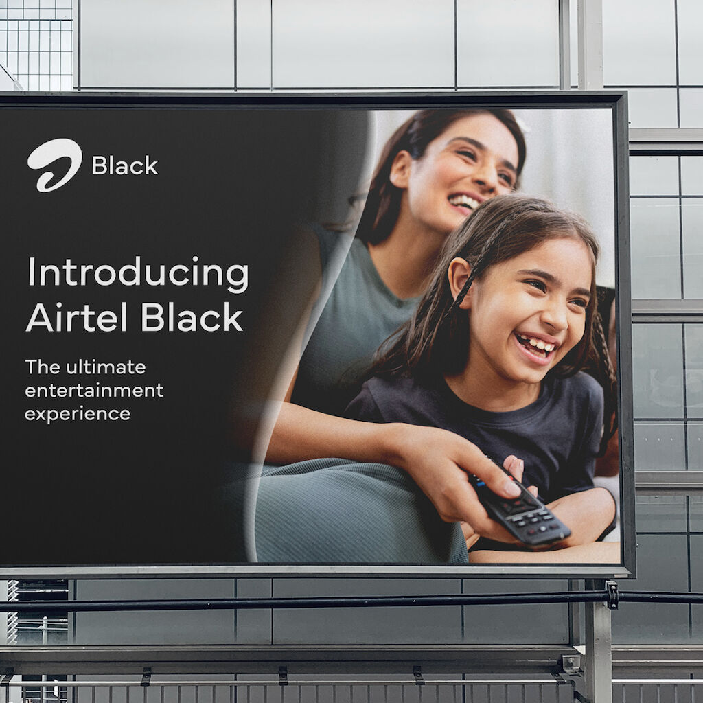
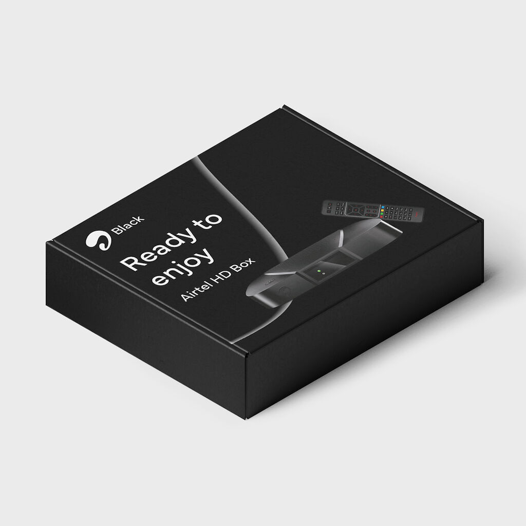
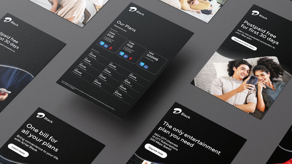
Airtel Black
To communicate the premium character of the brand’s bundled services, we created the new look and feel of Airtel Black: essential, refined, fundamental.

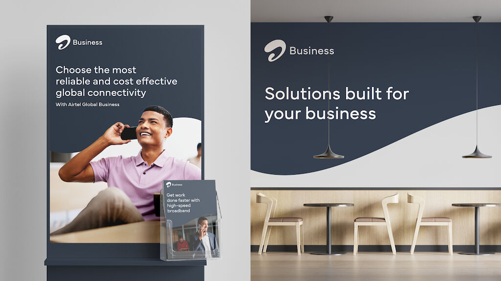
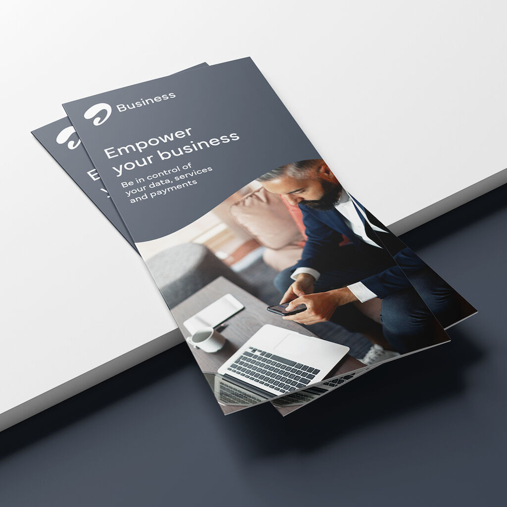
Airtel Business
Distinct from the consumer products yet still connected to the primary brand, the Airtel Business line now reflects the professional acumen and aspirations of this important target market.


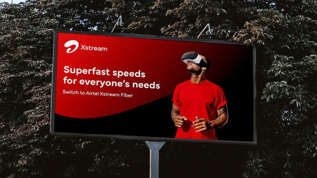
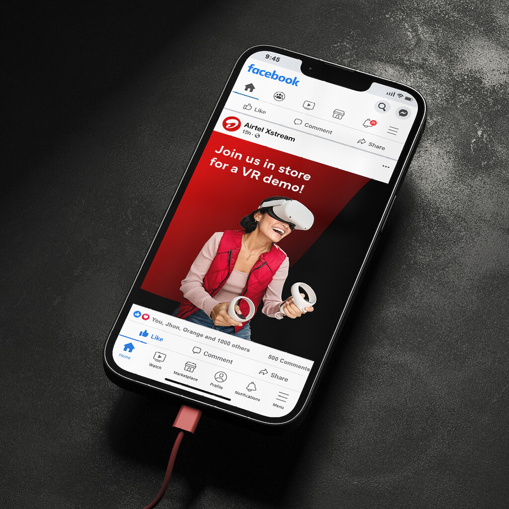
Airtel Xstream
Amplifying the vibrant, youthful glow of the refreshed brand, the entertainment-focused Xstream now exudes the energy of new and emerging innovations. High speed, high impact.


5G ready, and beyond
Building trust from the inside out and creating a differentiated offering in the telecom market were among our goals to deliver a unique experience. In one go, our work will reach close to half a million people, ensuring that the Airtel brand is ready for the exciting future ahead.
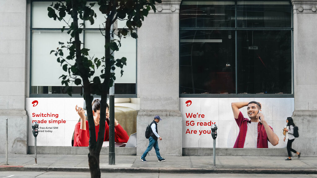
“The brand experience Airtel is looking to create through vibrant colors, smart and simple messaging, and powerful imagery, is that of an empowering hero enabling people to get the most out of technology.”
Need more details?
Contact MetaDesign San Francisco mail.sfo@metadesign.com +1 415 293 23 40
