Anyone who looks after the health of more than 27 million people must also set standards in brand experience. Together, we have positioned the AOK brand to meet the needs of today's digital and diverse society.
Achieving our goal with strategy: the strongest brand in the German healthcare system.
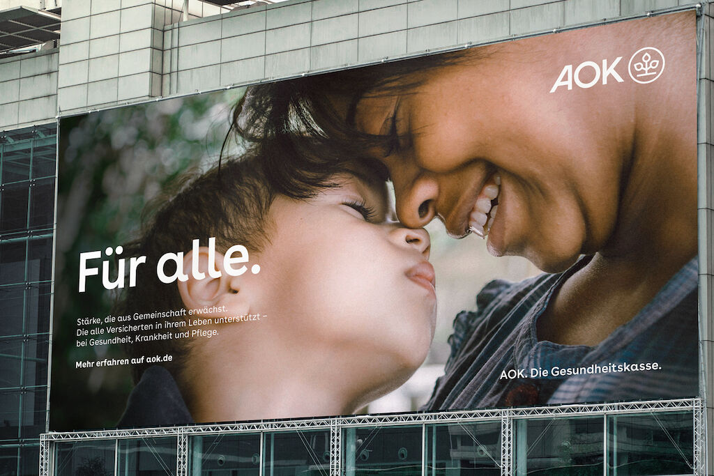
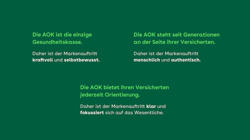
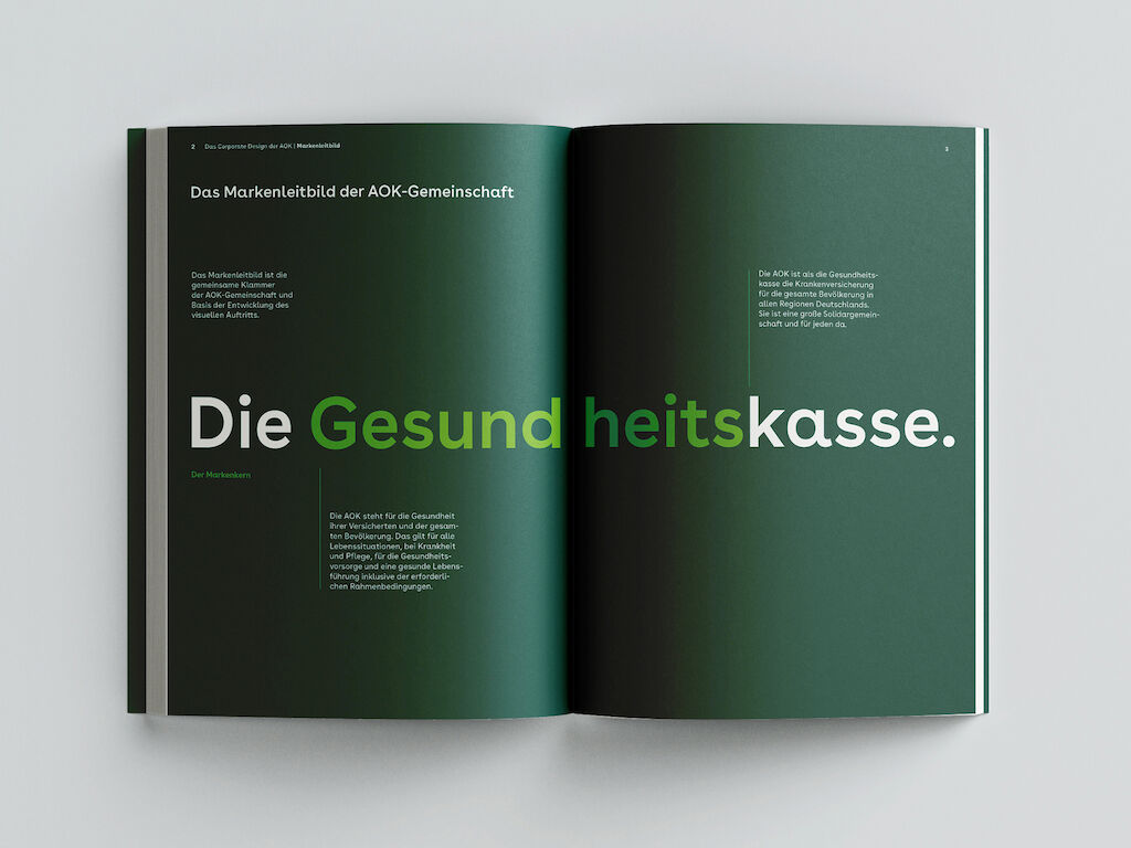
AOK is not just Germany's largest health insurance company - it is "The health insurance". As a strong solidarity-based community of 11 health insurance funds, it serves everyone in Germany - in health, illness and care. The goal: to become the strongest brand in the German healthcare system. The way to achieve this: a website that is accessible to everyone at all times and communicates the unique profile of the AOK in a self-confident and differentiating way.
The foundation for this is laid by clearly defined experience principles that align the brand's strategy with user expectations and serve as a concrete guideline for future appearances. From the smallest digital interaction to the multisensory experience in the offices.
Digital, democratic, design-oriented: Our mode of operation in a federal system
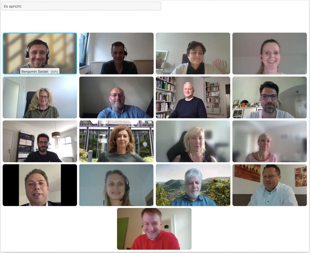
If you want to present a united front, you first have to come together. The new corporate design was developed in a permanent project group involving all AOKs. And this was done at a time when hardly any face-to-face workshops were possible. With a well thought-out work mode, we turned necessity into a virtue: In ten sprints and structured remote workshops, the entire website was created in record speed. The journey was part of the objective: A new culture of collaboration is the basis for a common consistent appearance. Tailor-made committee work and a well-planned implementation strategy ensured that the project quickly gained momentum at all management levels and could be implemented.
An appearance for all: barrier-free design
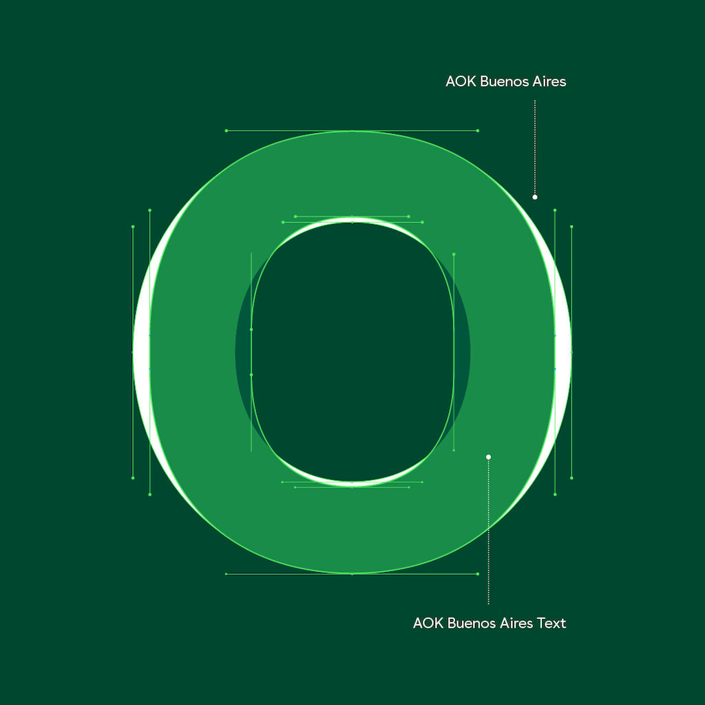
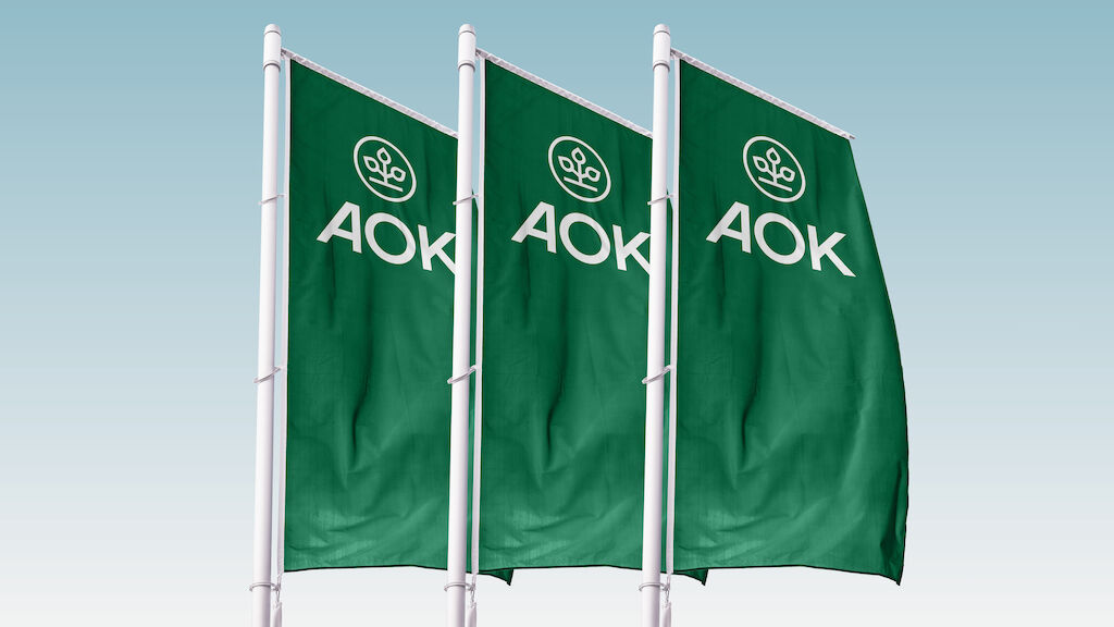
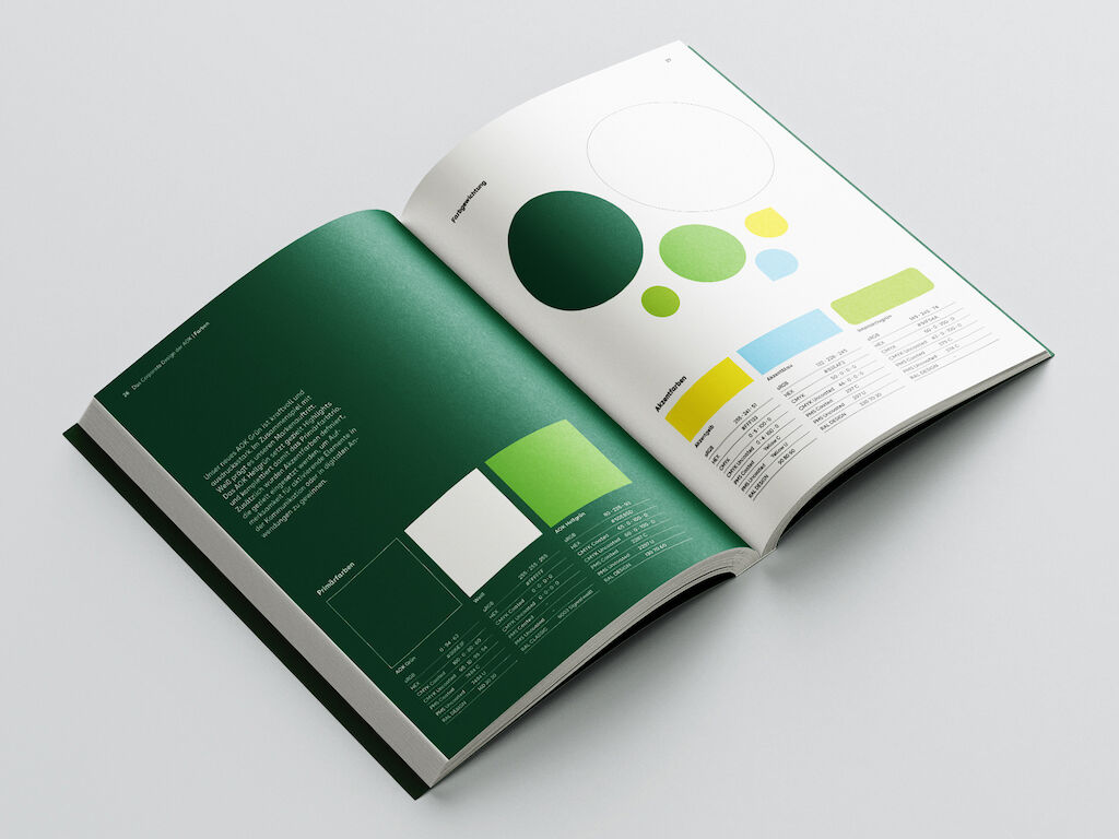
The new, strengthened identity becomes apparent upon first contact with the logo: The tree of life has been freed from the "O" and thus gains more visibility. Overall, the logo has been strengthened so that it can also be used flexibly both in small formats and digitally.
Video is loading…
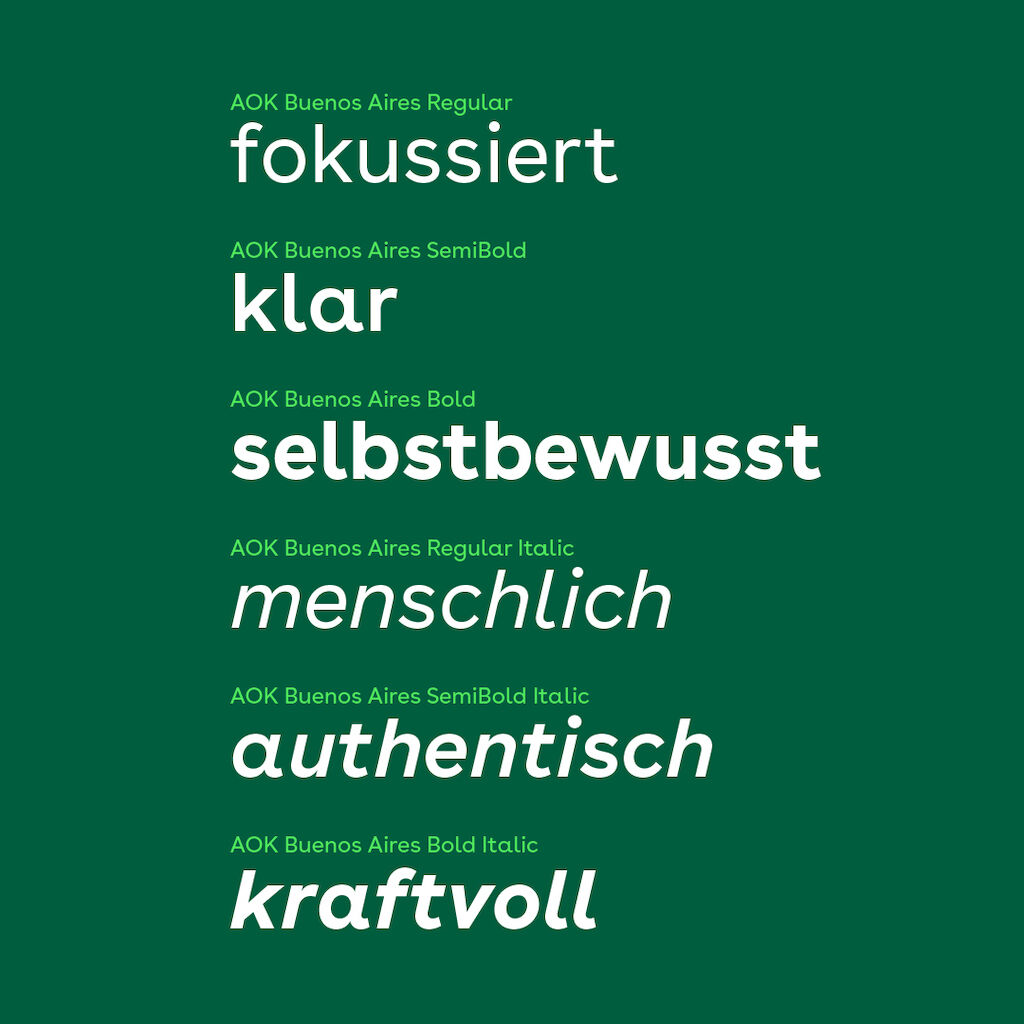
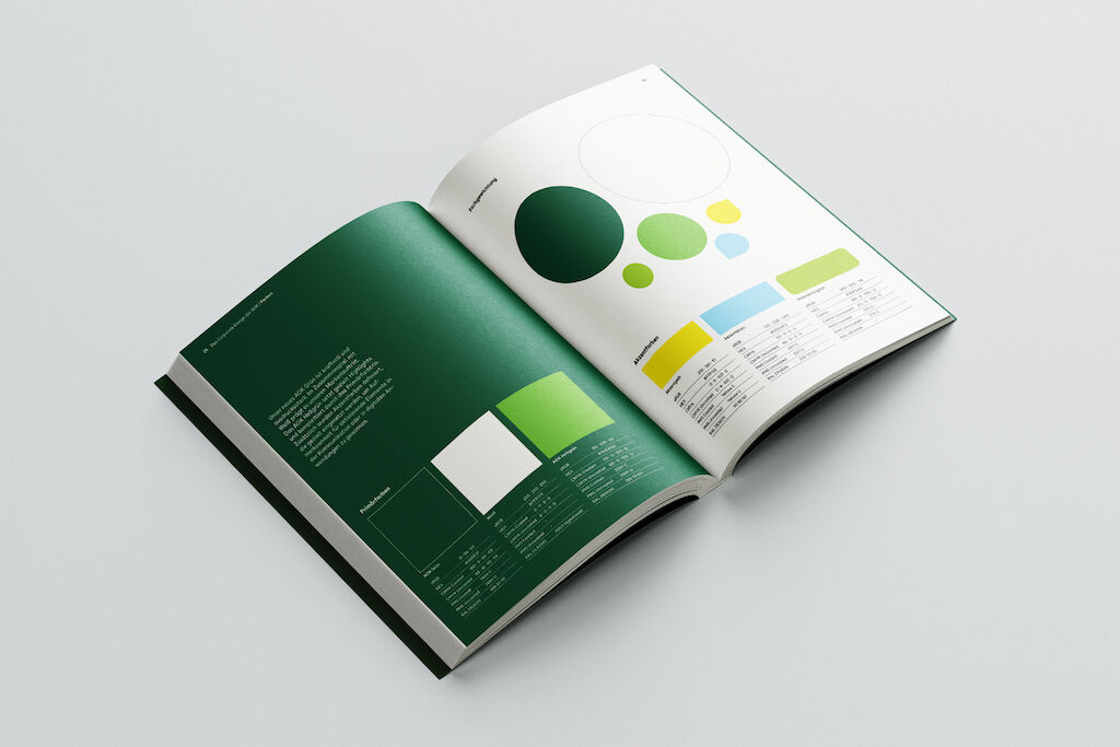
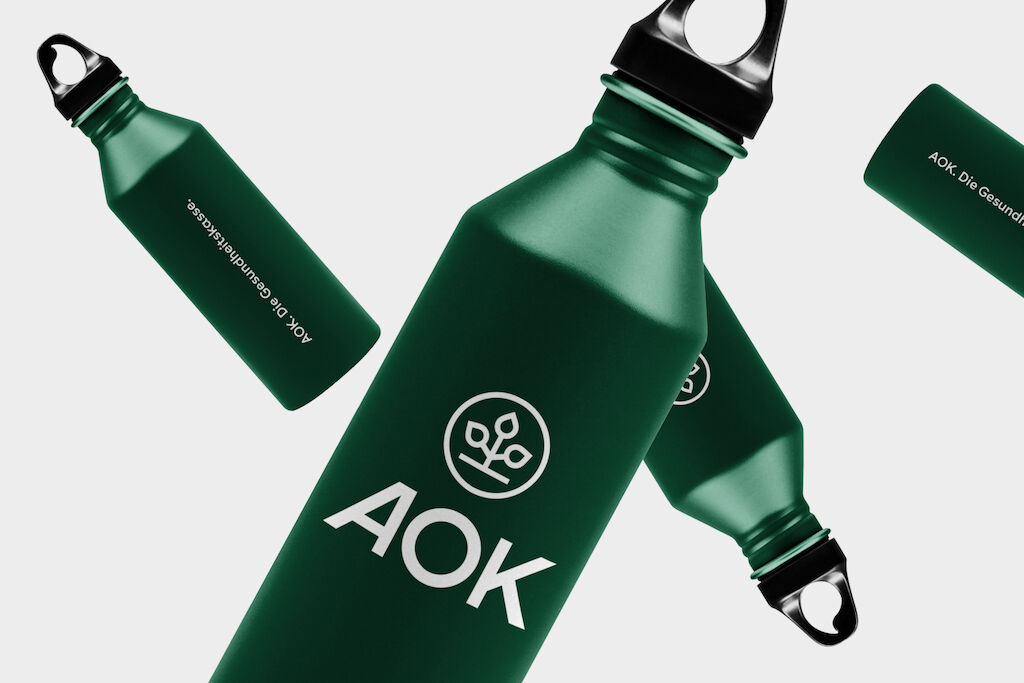
Readability and accessibility were key factors in the redesign of all elements. The new dark green of AOK not only looks more powerful, it also creates the right contrast with the two other brand-defining colors, AOK light green and white. With AOK Buenos Aires, a custom typeface was developed that shines with maximum functionality whilst reflecting the brand's friendly, open character.
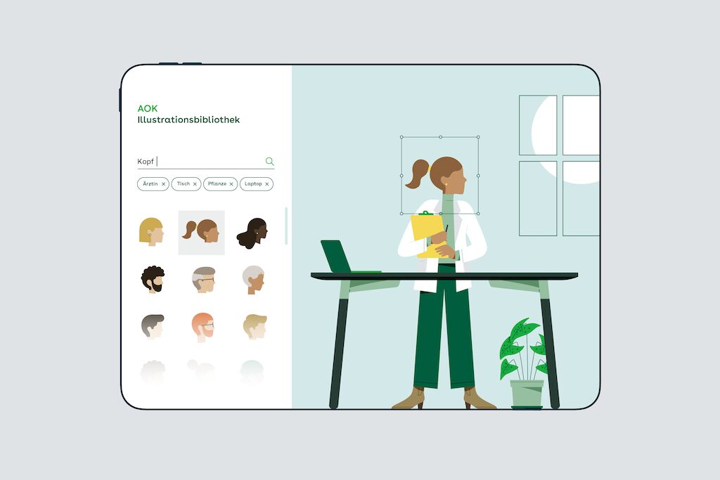
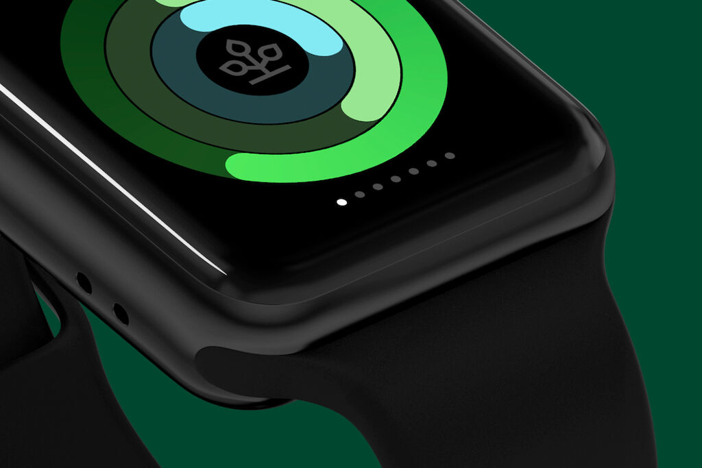
The new visual style echoes the diversity of our society and conveys the brand's closeness and humanity. A modular illustration style and an extensive icon library make it easy to present even complex topics in an appealing way.
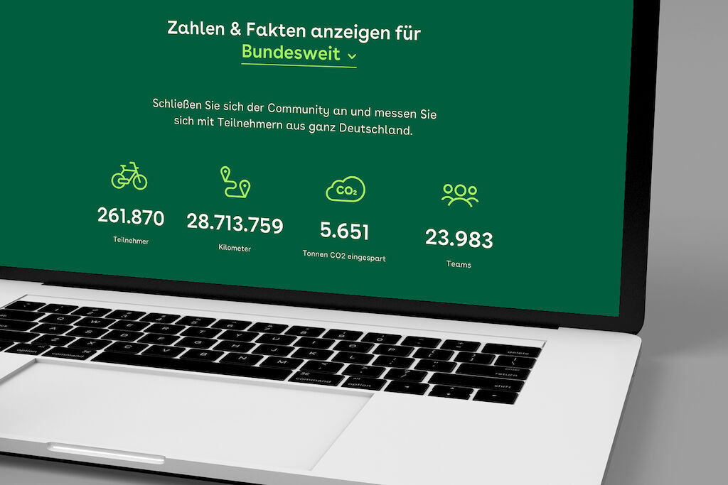
UX principles and a UI starter kit lay the foundation for the brand's consistent, accessible presence on digital platforms and in apps.
Video is loading…
The contact points: A rebranding of unprecedented width and depth.
The strength of the new brand identity is particularly evident in the interplay of all design elements, which flexibly adapt to the requirements of the various contact points. And at Germany's largest health insurance company, there are quite a few.
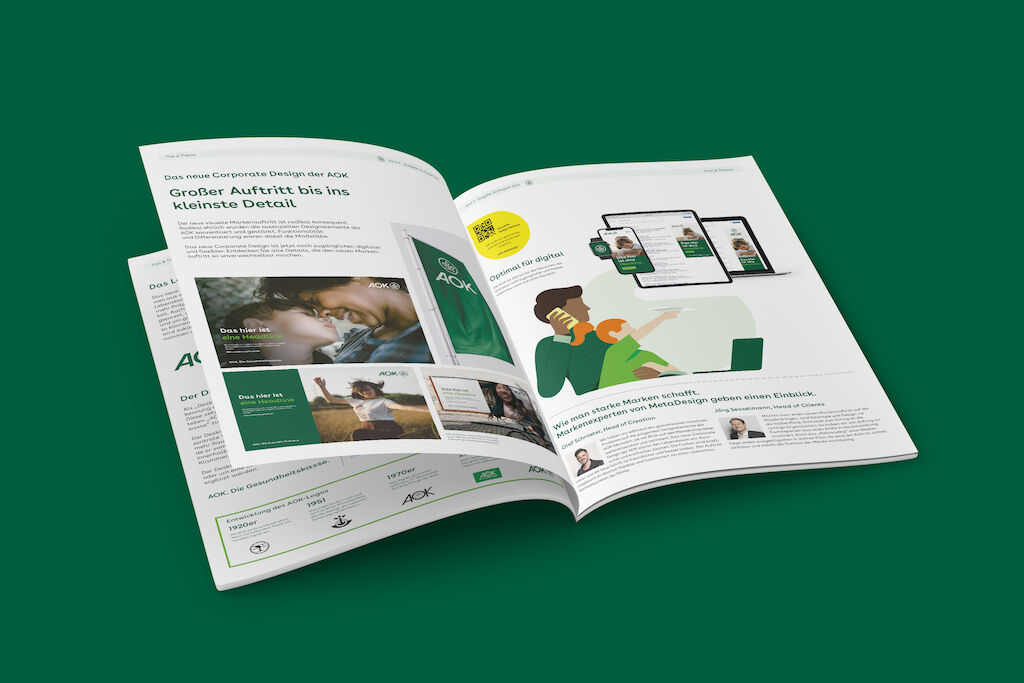
The most important contact points were rethought in great depth. This resulted in a new visual magazine concept for "Das Gesundheitsmagazin", one of Germany's largest publications with a circulation of over 24 million. To strengthen personal contact points as well, a new labeling system was developed for one of the densest branch networks in Germany. The social media presence follows its own rules and yet remains true to the brand. An expanded design system enables authentic communication and attractive content.
Practical templates and digital guidelines have been created as a basis for all other digital and physical media. From out-of-home formats to PowerPoint presentations all the way to branded fashion.
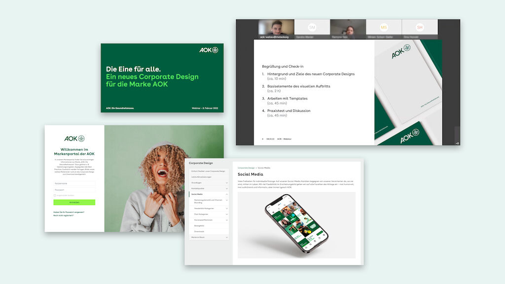
The implementation: Inspiring and empowering 65,000 employees.
Rebranding is not a sprint, but a marathon, requiring the mobilization of all forces. At AOK, the external launch in September 2021 was preceded by a six-month internal activation campaign in which all 65,000 employees were informed, inspired and empowered. In countless keynotes, webinars and through an interactive brand microsite, hundreds of brand creators and external service providers in all locations were prepared for the rollout and familiarized in detail with the new guidelines. As a result, the new brand appearance became visible in record time as part of the nationwide umbrella campaign and numerous regional campaigns.
A well thought-out five-year plan controls the migration of all media according to effort and impact. The 11 AOKs are completely autonomous in their regional implementation.
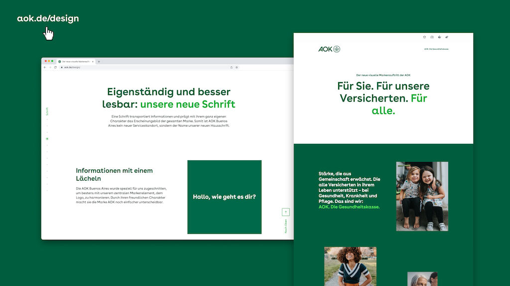
For detailed insights into the new brand presence, please visit: https://www.aok.de/design/.
Awards
German Design Award 2023 (Excellent Communications Design - Corporate Identity)
ADC Wettbewerb 2022 (Brand Building - Cross-Media Conception)
Red Dot Design Award 2022 (Brands & Communication - Brand Design & Identity)
iF DESIGN AWARD 2022 (Communication - Company Branding)