With the Liquid Brand Design, we are taking the next big step together with Telekom in the consistent advancement of the brand. Flexible, sustainable, lively and future-oriented – the new design uses the strength of the brand color magenta, making a new level of creativity possible for Europe’s most valuable telecommunications brand.
Video is loading…
Ready for the future
Our world is becoming more digital in all areas of life. Telekom is a key driver of this change. At the same time, new technologies, business areas and user requirements are presenting the brand with new challenges.
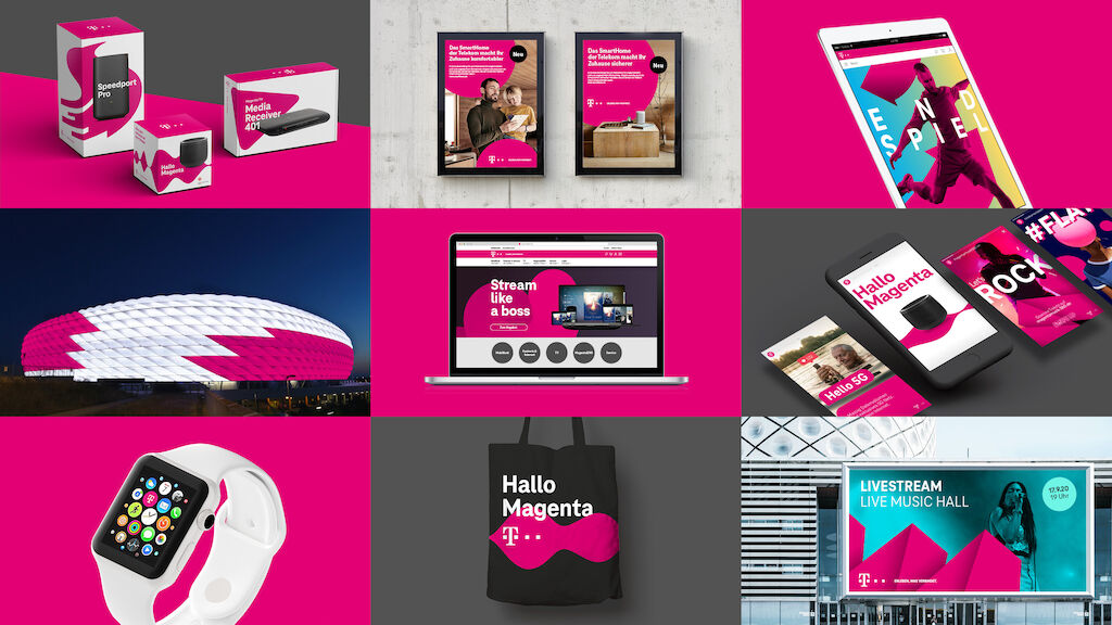
Our answer to this is the comprehensive evolution of the visual identity. We are bringing the brand on track for the future. With a sustainable design system that is quite consciously geared to current and upcoming demands: Maximum creative flexibility and unique recognition. At all points of contact. In all contexts.
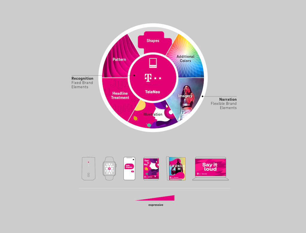
Maximum flexibility and unique recognition
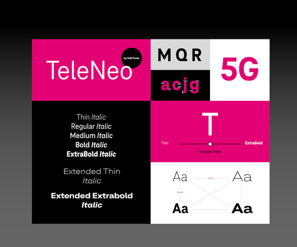
The balance between both these aspects is organized in a higher-level system and controlled through simple principles: The color magenta, the T logo and the new font “TeleNeo” make up the visual constants in the brand image. As strong and well-known brand elements, they ensure recognition at all times.
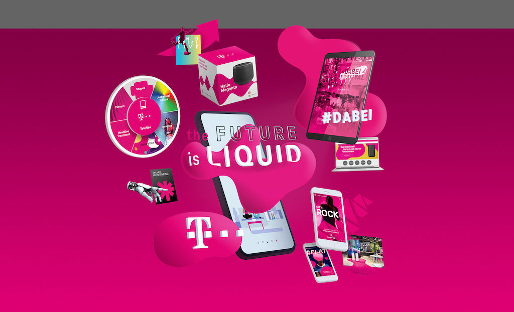
Flexibility evolves through new creative latitude in forms, illustrations, imagery, additional colors and how typography is handled. This way, consistently new emotional stories can be told to every target group in every context and exciting brand experiences created.
Holistic evolution
From the big picture to the smallest detail – the design elements have been optimized and developed.
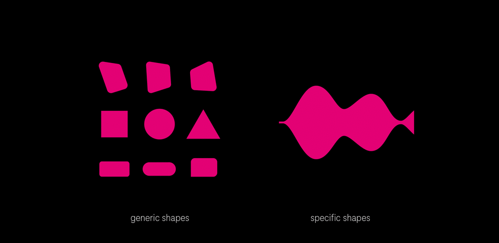
A key innovation is the freedom of design language. What we call Shapes bring form to magenta. Constantly surprising and different. Specific Shapes provide impressive support in the message of the respective communication.
The new font, “TeleNeo”, created in cooperation with typographer Hannes von Döhren and HvD Fonts, represents Telekom with characteristic and contemporary expression. Moreover, as a variable font, it opens up many possibilities for digital media and new environments such as Augmented and Virtual Reality experiences. The future can come now.
“Digital environments increasingly require contextual flexibility instead of rigid rules. The brand must be in a position to get involved with people and the respective situation – not the other way around.”
Awards
Transform Awards Europe 2023 (Best Brand Evolution (Corporate))