The situation
We needed a consistent visual structure and distinctive sound brand to achieve “one brand, one voice”.
The company’s stunning growth had outpaced its brand management capacity, resulting in a highly fragmented brand image. DiDi needed a consistent, unified, flexible branding system as it pursued global ambitions.
Our strategy
Simplicity and a clear identity.
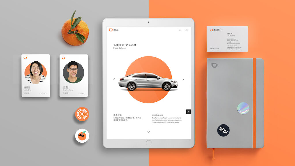
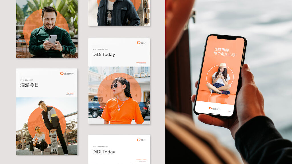
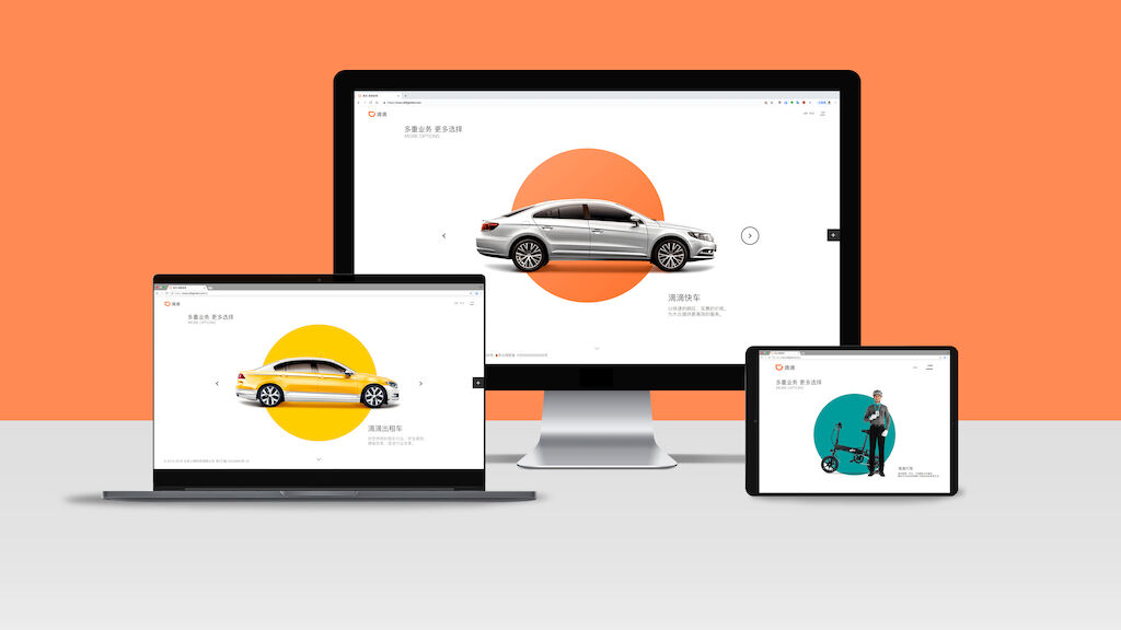
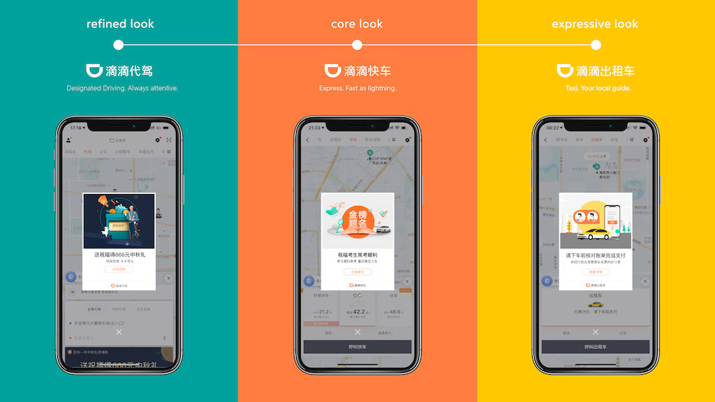
Simplified the brand design based on the concept “More is Less”. Using this approach, we devised a clear brand structure, with distinct color schemes and image styles to identify the Masterbrand and sub-brands services – all while keeping in mind the brand’s origin as a “little orange”. As a result, DiDi’s entire branding framework became clearer, allowing customers to instantly identify different types of services.
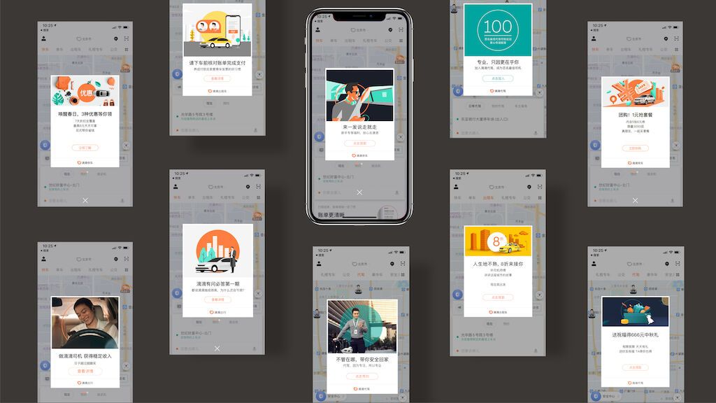
To let customers know when their DiDi is arriving, a custom 2.5 second sound design was created which blends light crisp notes from the glockenspiel, pizzicato strings and whispers “DiDi”. Most importantly, the new identity system was applied to the UI and UX of the DiDi Chuxing app - enabling visual unity and easier, more intuitive use for customers.
In addition to a stronger, more unified brand, this work made their core product – the DiDi Chuxing app - far easier to navigate and use.
Our solution
The brand strategy and identity system unified DiDi’s brand and services during a crucial moment in its business growth, empowering its successful expansion across mainland China and into 6 new markets including Australia, Brazil, Mexico, Japan, Hong Kong and Taiwan. The sound design has since become symbolic for China’s largest ride-hailing app – with the friendly sound heard across more than 400 cities in China 30 million times a day!