DiDi Chuxing
A world-leading mobility platform
Founded in 2012, DiDi Chuxing grew from a taxi-hailing app into one of the largest and fastest-growing intelligent mobility platforms in the world. With more than 550 million users taking 30 million rides per day, it now boasts an ever-growing range of “one-stop” mobility services, ranging from ride hailing and car/bike sharing to rental and after-market services.
Our Strategy
Simplicity and a clear identity.
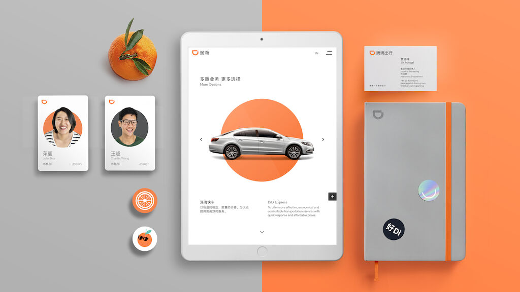
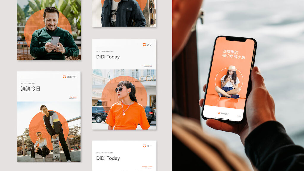
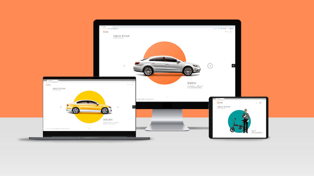
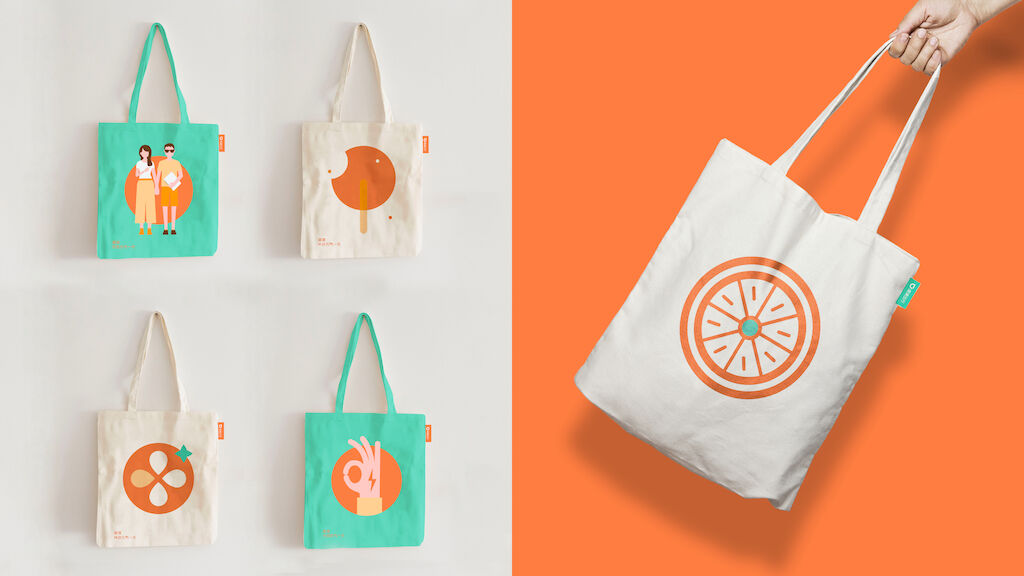
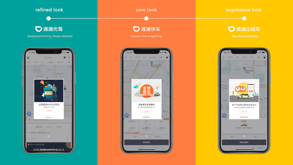
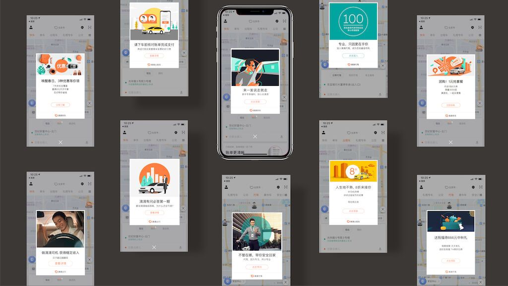
Rooted in the concept “More is Less”, we devised a dynamic branding outlook, using distinct color schemes and image styles to identify the Masterbrand and sub-brands values. As a result, DiDi’s entire branding framework became clearer, allowing customers to instantly identify different types of services. In addition to a stronger, more unified brand, this work made their core product – the DiDi Chuxing app - far easier to navigate and use.
What we did
- Developed an entirely new logotype for the DiDi Masterbrand
- Designed and streamlined the visual assets for the Masterbrand and different business units/services under it: from fonts to colors, image style to illustrations.
- Consolidated the new identity in a set of clear and easy to use bilingual guidelines
Our solution
Unified DiDi’s voice during a crucial moment in its plans for further expansion across China and into 6 new markets including Australia, Brazil, Mexico, Japan, Hong Kong and Taiwan.
需要更多信息?
联系 MetaDesign 北京 business@metadesign.com