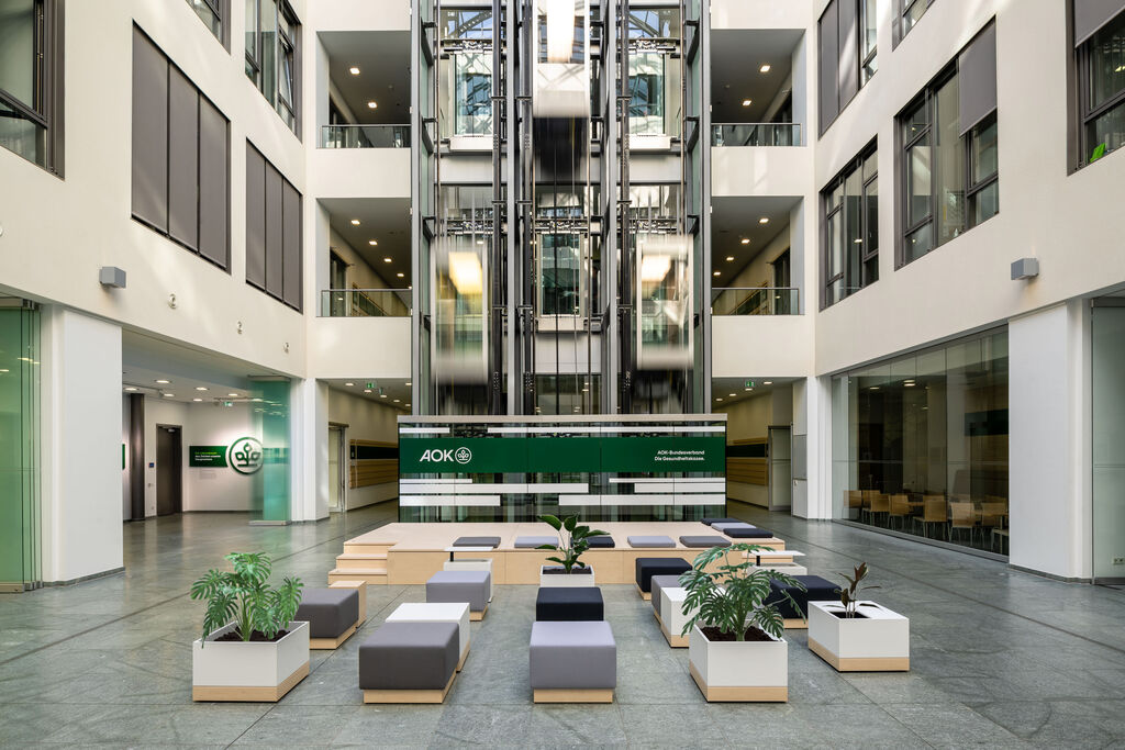
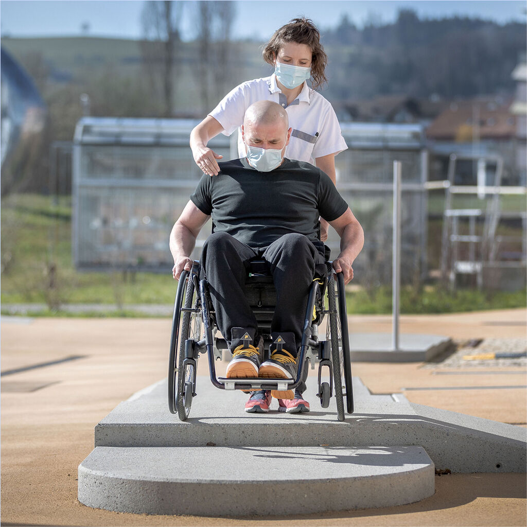
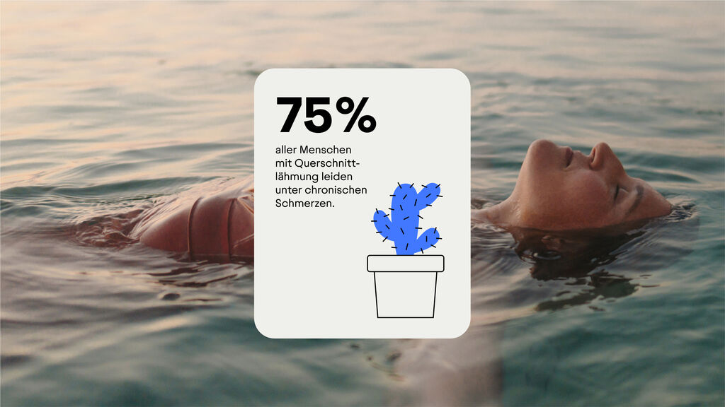
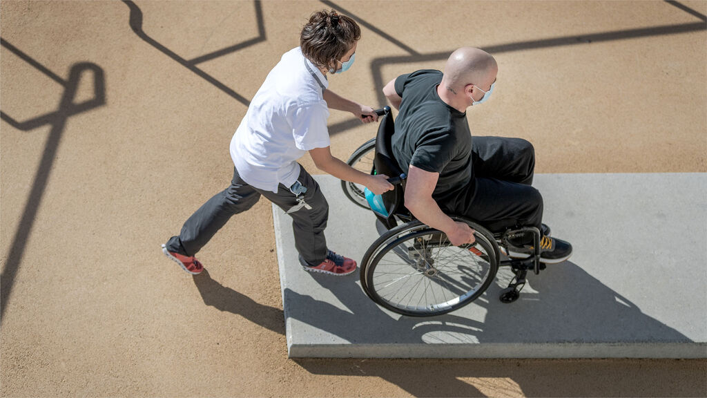
The Swiss Paraplegic Group (SPG) is the epitome of holistic rehabilitation and lifelong support for people with spinal paralysis throughout the country. With 1.9 million members, it is one of the most important solidarity organizations in Switzerland. The key to this success story is a globally unique network of highly specialized medical care, integration into work, family and society, and targeted research. In the context of success, growth and specialization in its services, SPG needed to sharpen its profile in the market.
Video is loading…
Schweizer Paraplegiker-Gruppe
A unifying brand experience for a globally unique service network
Video is loading…
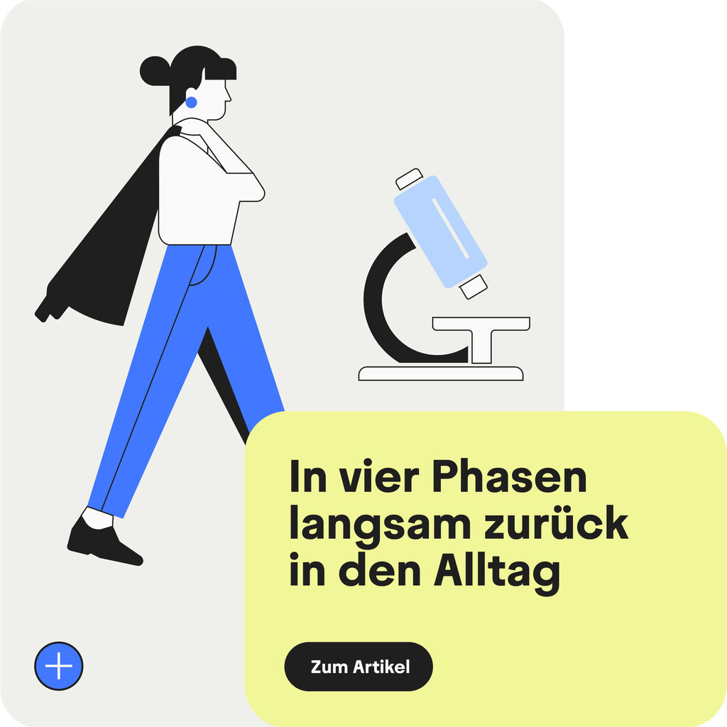
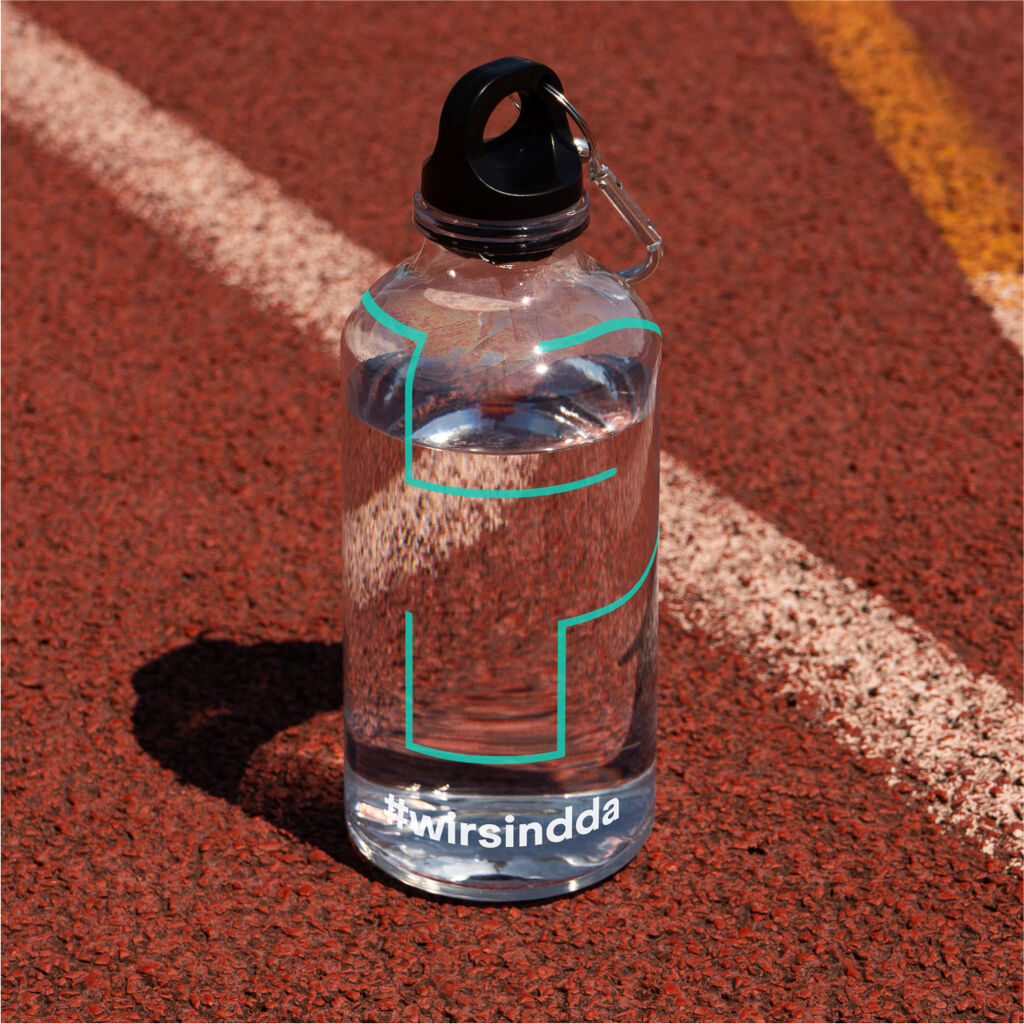
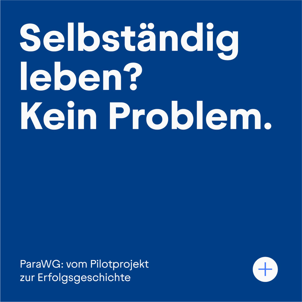
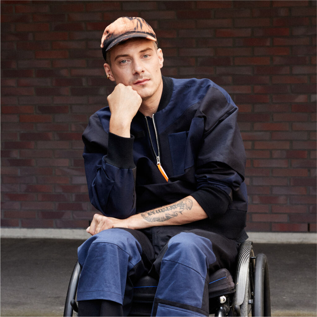
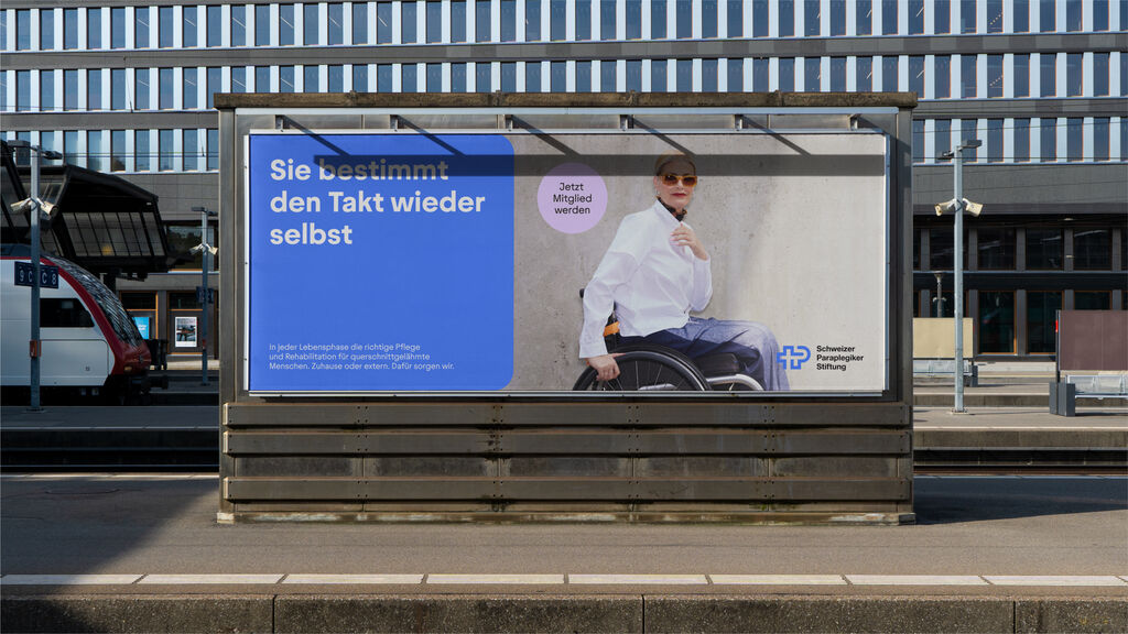
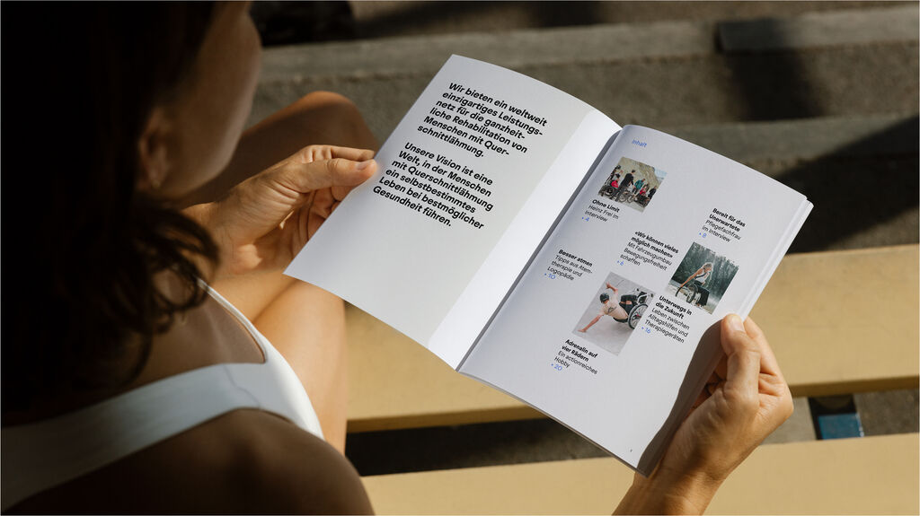
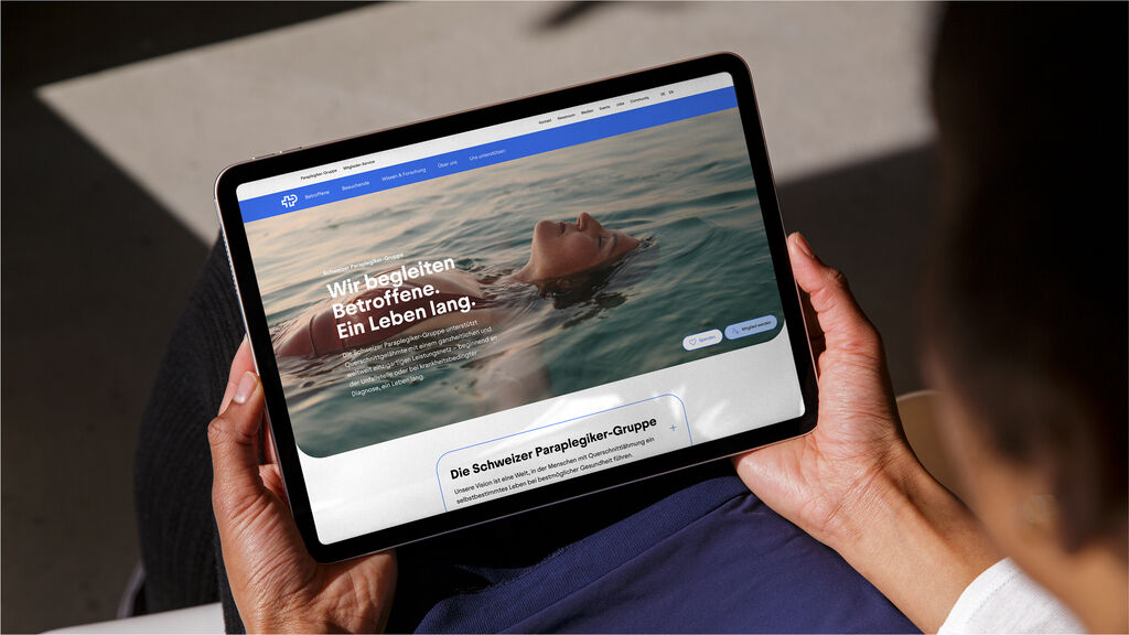
We clarified the roles of the individual organizations within the group, defined their communication behavior and translated this into a new experience, presenting SPG and its organizations as a companion that puts people first and meets them at eye level. A logo consisting of a unifying figurative mark and the name of the organization creates the desired clarity in communication. An open, movable super sign in the shape of a cross-P acts as a central, pulsating design element and creates a dynamic, common visual language - hand in hand with the color blue, complemented by other subtle tints. The title font Juneau stands for the personal and emotional nature of SPG, Frutiger for the precision of highly specialized medicine. A flexible layout principle enables the organizations to make their communication easily accessible. An overarching brand language with specific messages for the organizations rounds off the overall experience.
Video is loading…
Video is loading…
Video is loading…
Video is loading…

“As an organization, we are committed to people and are largely supported by donations. It is therefore crucial to communicate our services as effectively as possible, to convince members, to continuously recruit employees with strong human and professional skills and at the same time to continuously strengthen the overall structure of our organization.”
Video is loading…
Video is loading…

Video is loading…
Video is loading…
Video is loading…
(Bilder: Schweizer Paraplegiker-Stiftung)
Need more details?
Contact MetaDesign Zürich