Power lines
Electric flow and the actual product design of Innomotics’ motors inspired our central design idea - Power lines. Highly flexible, scalable and adaptable, they are the visual core of the Innomotics design system.
Time for new reliable motion
Electromotors and generators are essential to reducing the CO2 footprint in industries and infrastructure worldwide. Siemens, one of the leaders in the energy transformation market, has introduced an entirely new brand for industrial applications to help companies scale up efficiency, electrification, sustainability, and digitalization while reducing their carbon footprint. Welcome to Innomotics.
Innomotics brings to the market a suite of forward-thinking motors, drives, systems, services, and solutions. They serve almost all industries, from chemicals, oil & gas to utilities, from fiber to automotive and marine, and from water to waste water.
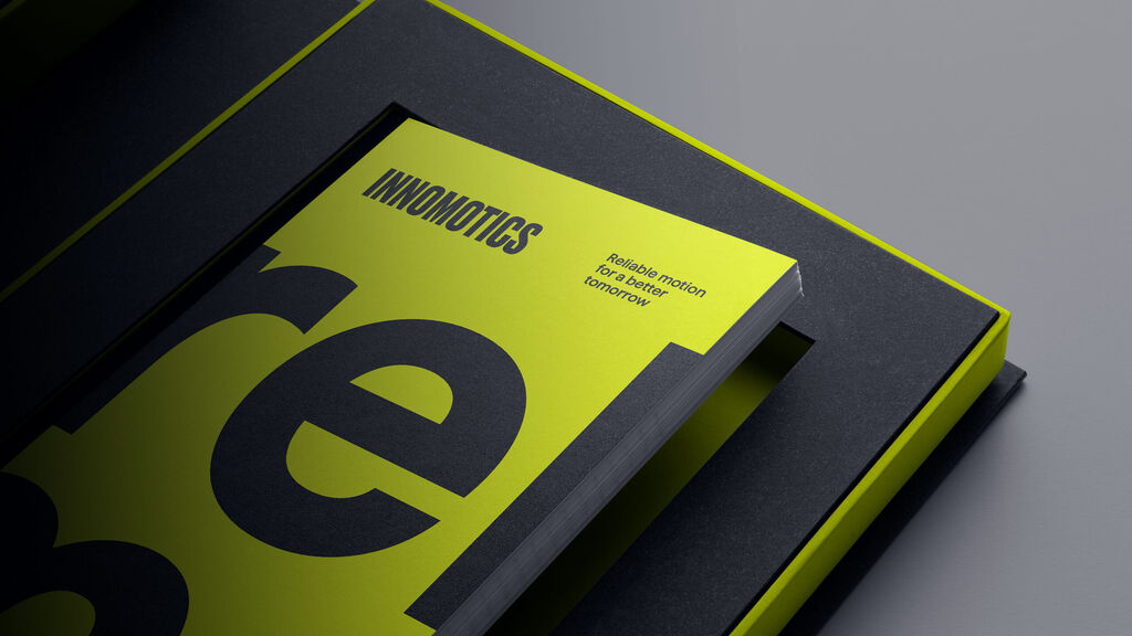
MetaDesign developed the name, brand strategy and design for Innomotics from scratch. The identity reflects a powerful, visionary, and bold brand, proud of its people and teams. It is confident, sustainable, and digital. And with its purpose at the core of everything, “Redefining reliable motion for a better tomorrow.”
This is the beginning of new reliable motion. It's time for a new green.
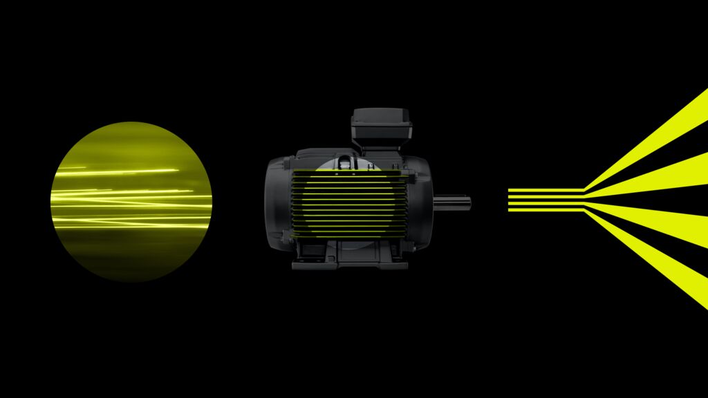
Electric flow and the actual product design of Innomotics’ motors inspired our central design idea - Power lines. Highly flexible, scalable and adaptable, they are the visual core of the Innomotics design system.
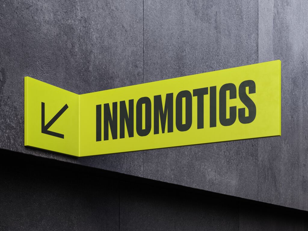
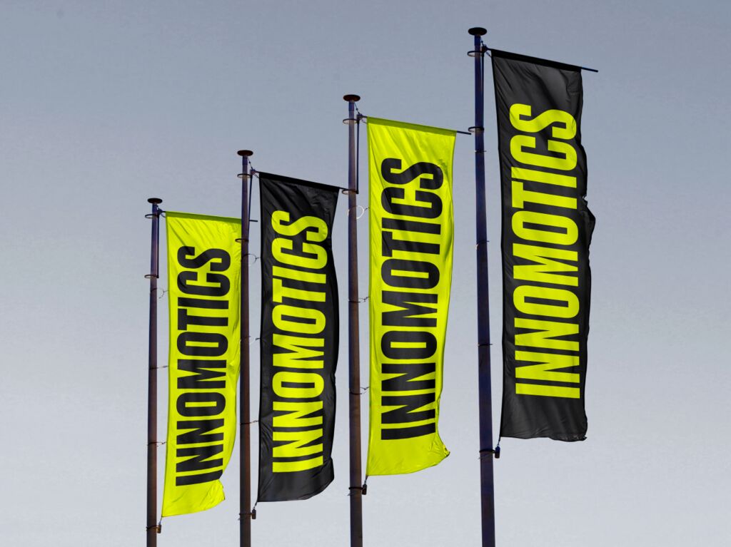
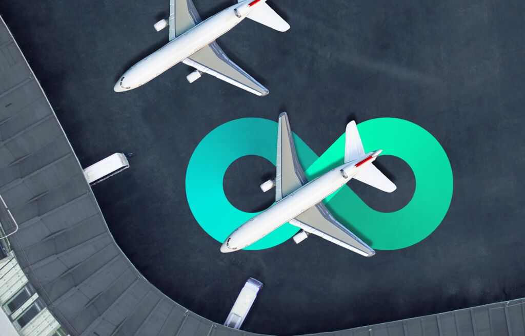
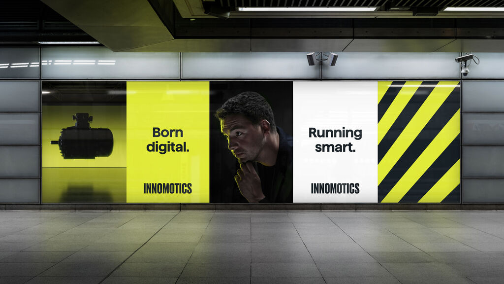
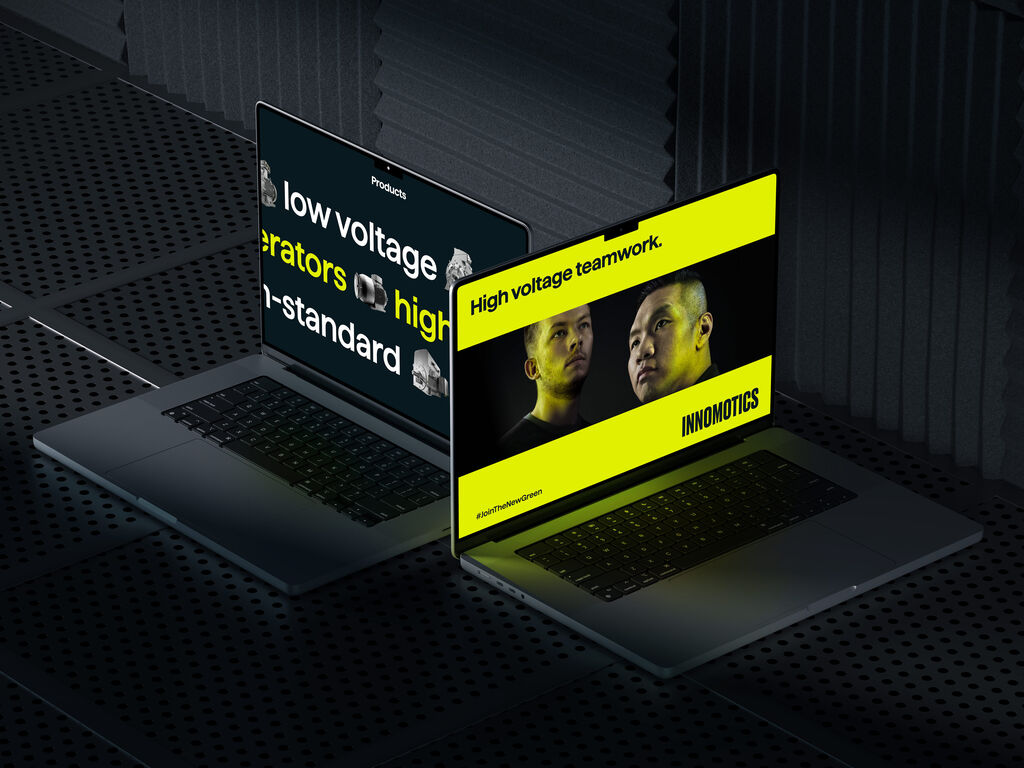
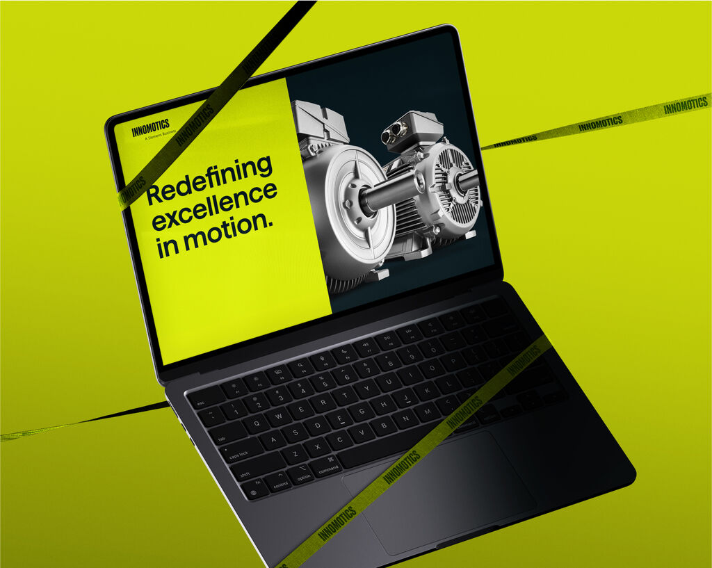
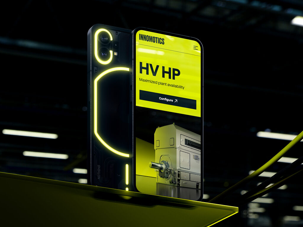
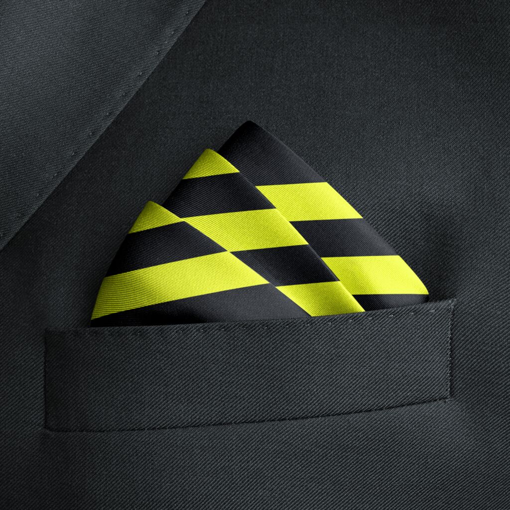
Bold shapes and powerful colors form the backbone of the new Innomotics brand. The identity design is as flexible as it is scalable and works great at every touchpoint.
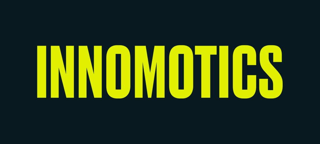
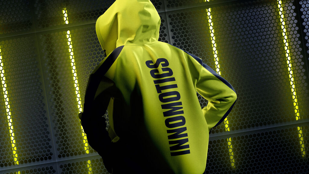
The logo with its industrial character is technically precise and facilitates fast recognition.
An accurate analysis of competition showed us where Innomotics could stand out and be distinctive - color. That's why we chose to be vibrantly different from the start and implement lime as the primary brand color. Dark grey adds a deep and bold contrast. This makes the Innomotics "lime" distinctive and impactful.
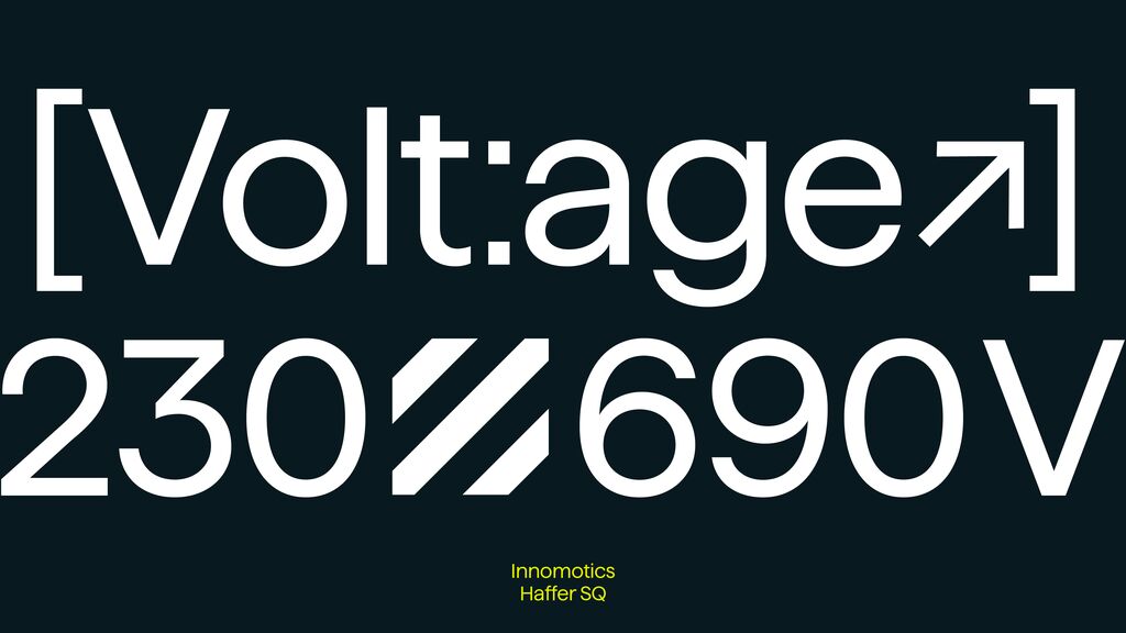
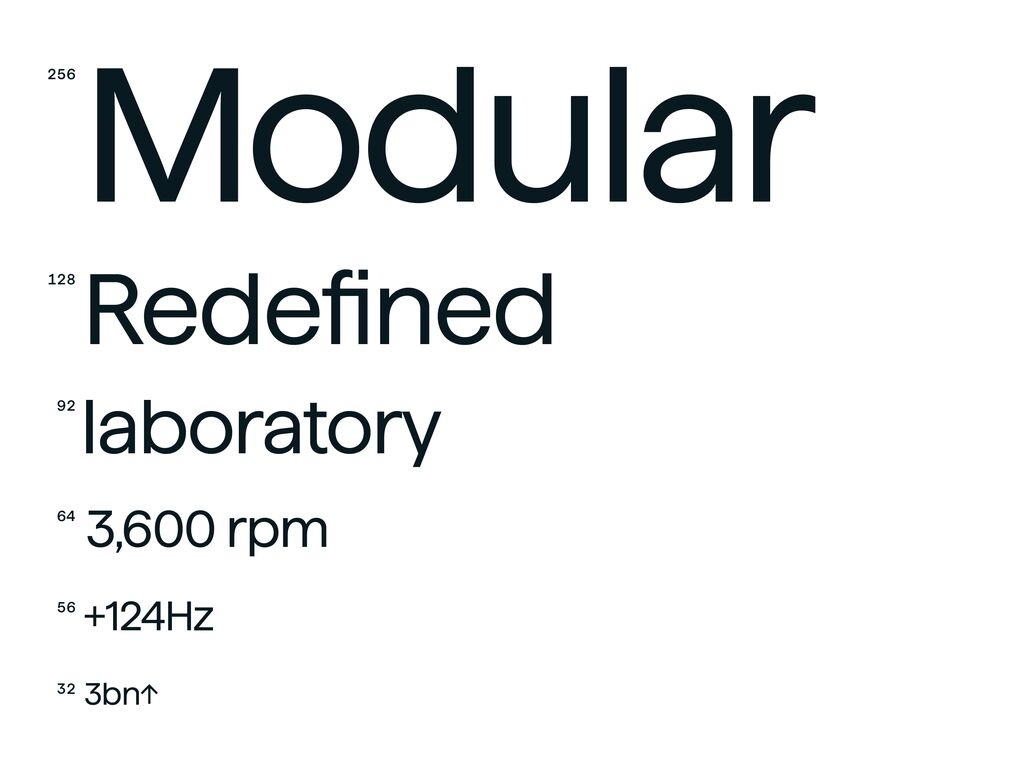
The brand typeface Innomotics Haffer underlines the technical and reliable character of Innomotics with its simple yet bold shapes.
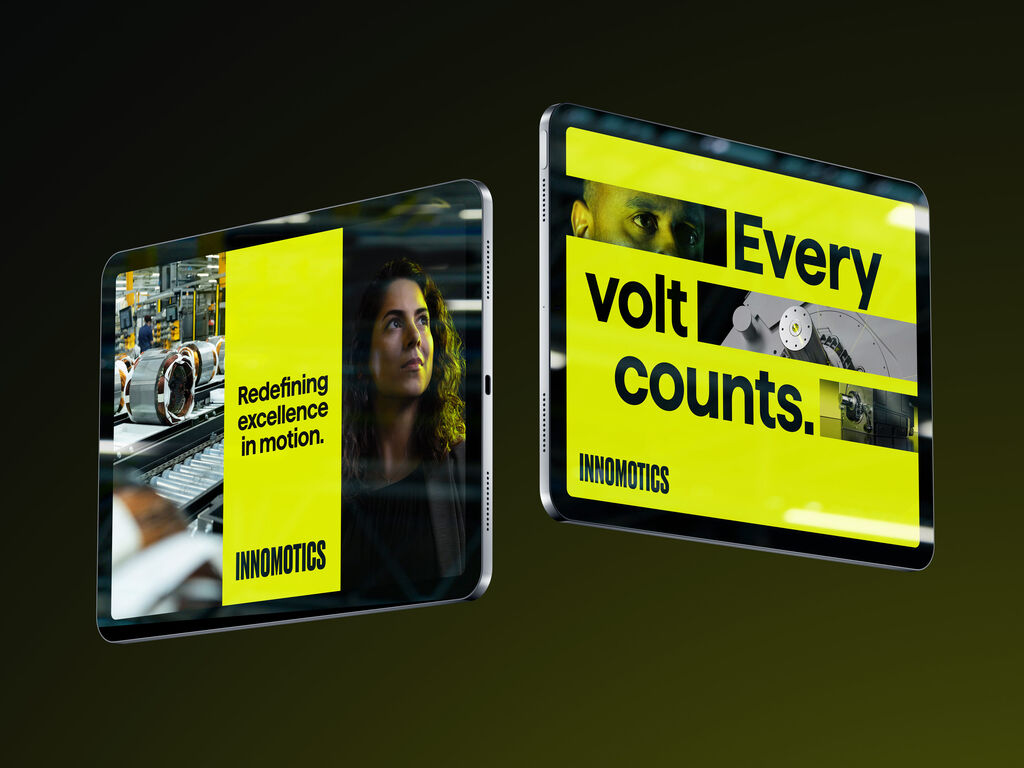
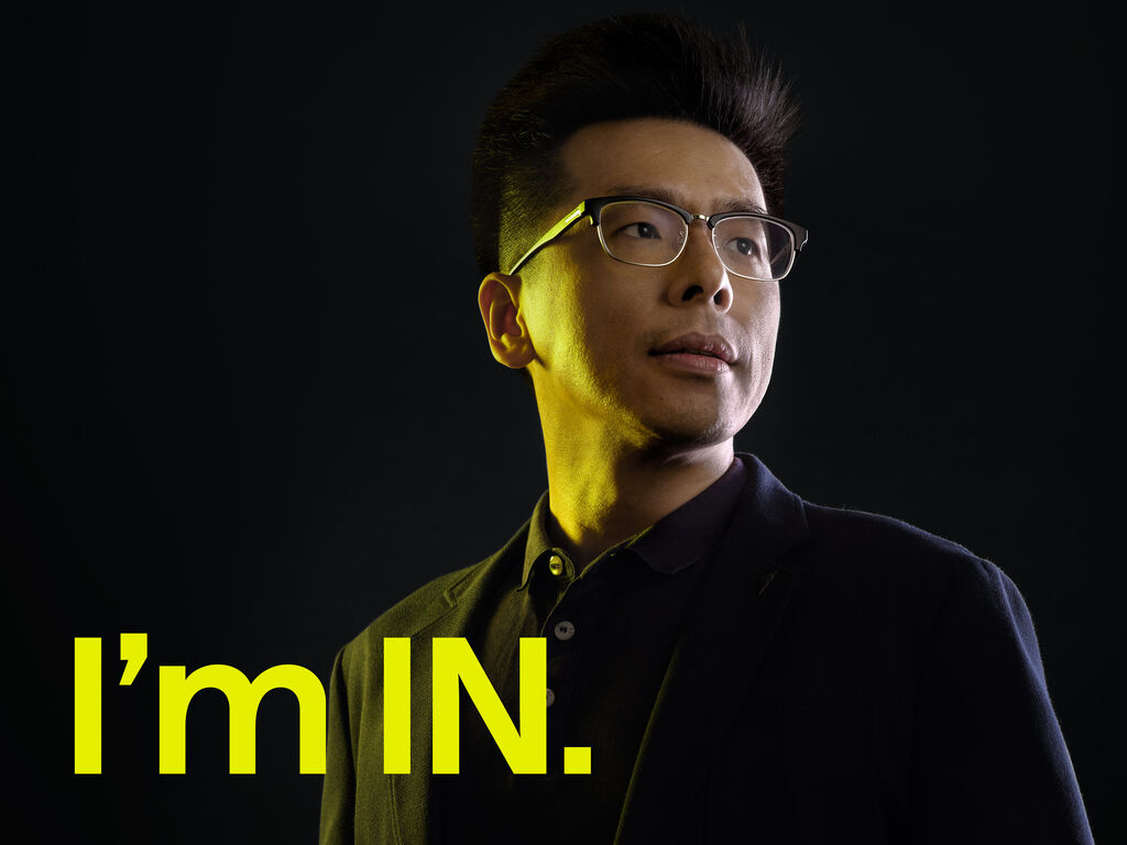
With the launch of Innomotics, former Siemens employees moved to a brand that also creates enthusiasm and trust right from the start. The new brand focusses on employees, teams, and real internal experts to represent the brand. The launch was accompanied by many personal posts on social media, using the brand design with the message “I’m IN! I’m Innomotics!” As a result Innomotics saw immediate identification and pride among its employees. Innomotics continues to gain acceptance, identification and motivation with the roll out of the new brand.


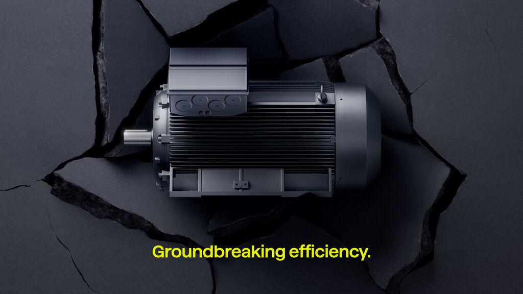
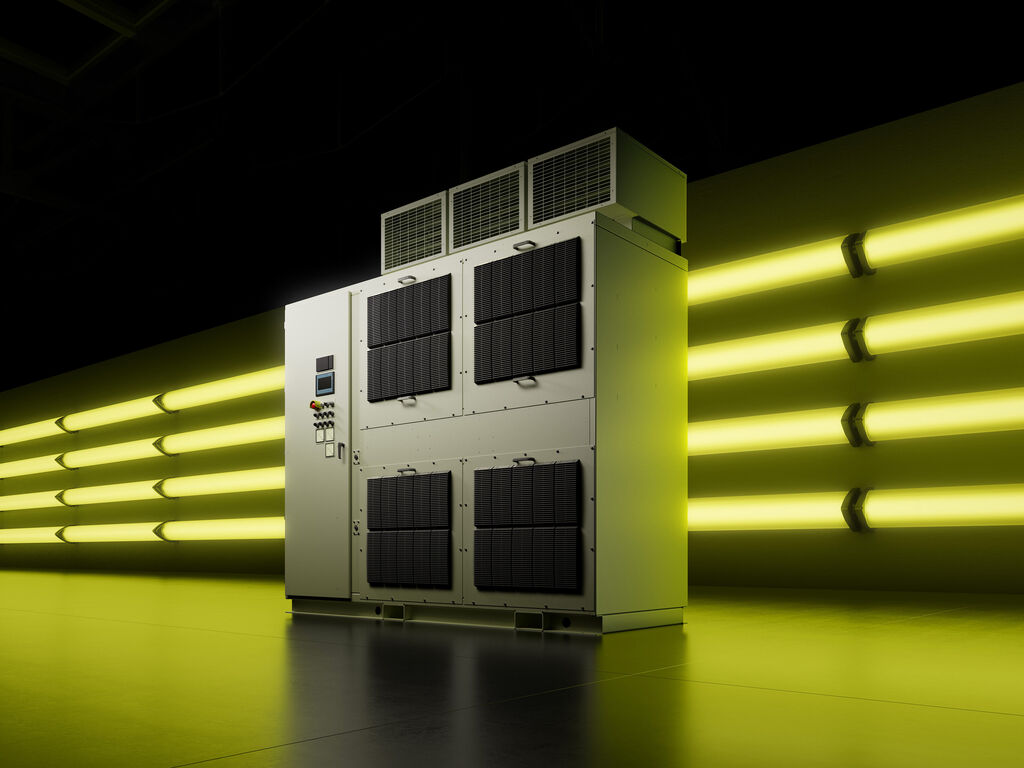
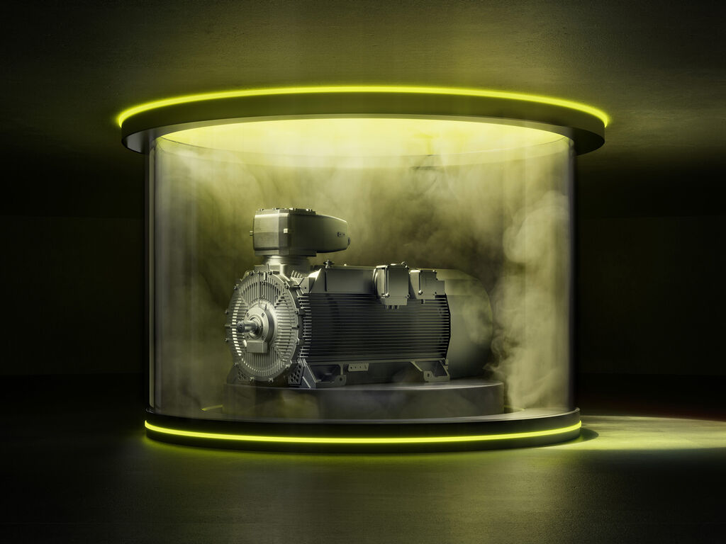
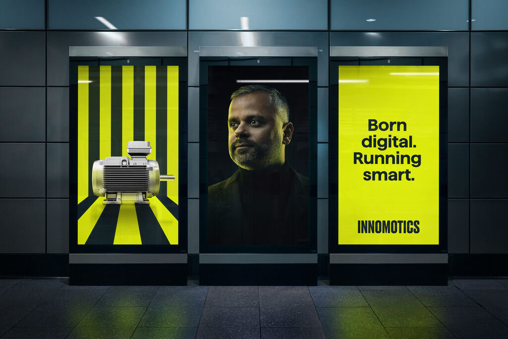
Groundbreaking product presentation uses 3D renderings to stage the products in unconventional settings, making familiar products look surprising and emotional.
Clear motion principles underline the visionary character of Innomotics and create a powerful and dynamic brand experience.
The Innomotics design creates ultimate differentiation and enormous visual power right from the start. For former Siemens employees in particular, it reinforces identification and creates pride in the new brand.
Contact MetaDesign Berlin