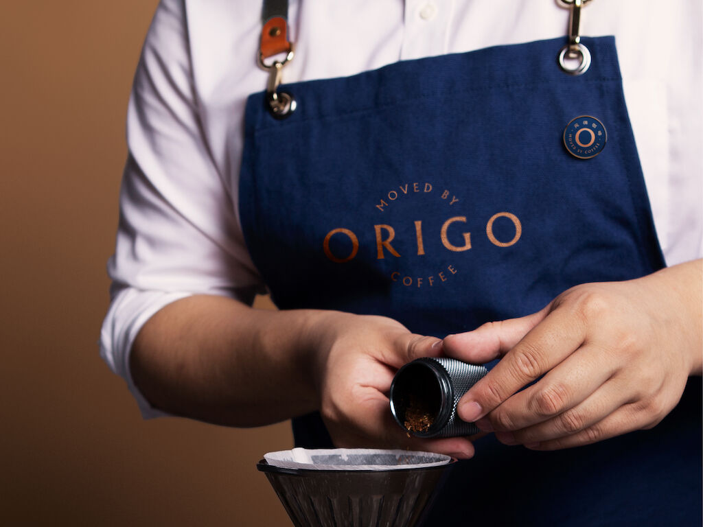
"Coffee Commune exists to give small Yunnan coffee farmers a chance to survive and thrive by crafting quality coffees that discerning customers will pay a premium for. Hence, we needed to tell a compelling story about the quality, the heritage, and the social impact of our specialty coffees. MetaDesign helped us achieve this with a carefully layered visual identity," said Eric Baden, Founder & CEO of Coffee Commune.
Coffee commune
Coffee with a Chinese soul
Coffee farming is hard work. Shanghai-based craft roaster Coffee Commune is a brand firmly rooted in its support and engagement with the coffee farming communities of Yunnan Province. With a brand vision to uplift the farmers that grow their products through deep engagement and fair prices across every link in the coffee value chain.
Chinese coffee with a soul
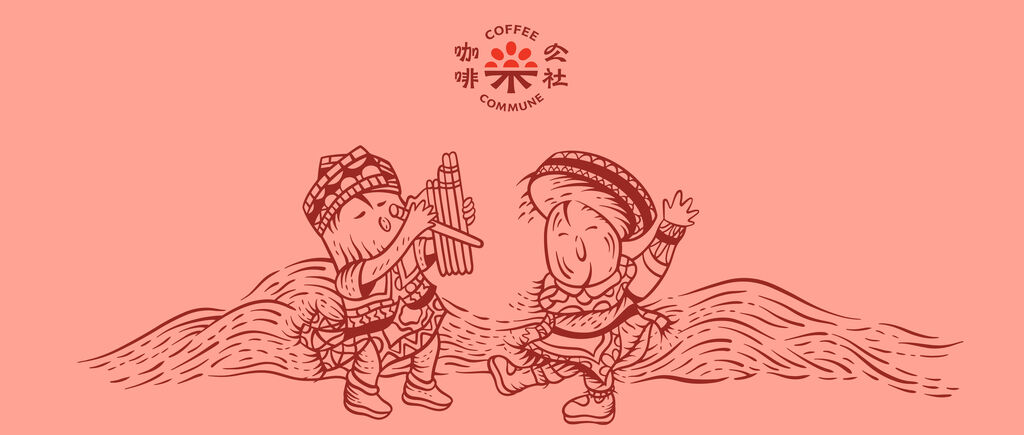
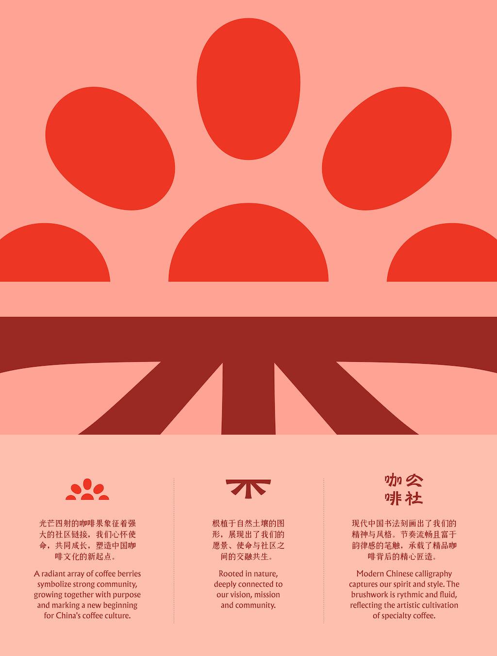
Starting with the logo – topped with a radiant array of coffee berries symbolizing strong community, growing together with purpose and marking a new beginning for China’s coffee culture. Rooted in nature and deeply connected to the brand’s vision and mission to create ‘coffee with a soul’. Meanwhile, the modern Chinese calligraphy is rhythmic and fluid, reflecting the artistic cultivation of specialty coffee.
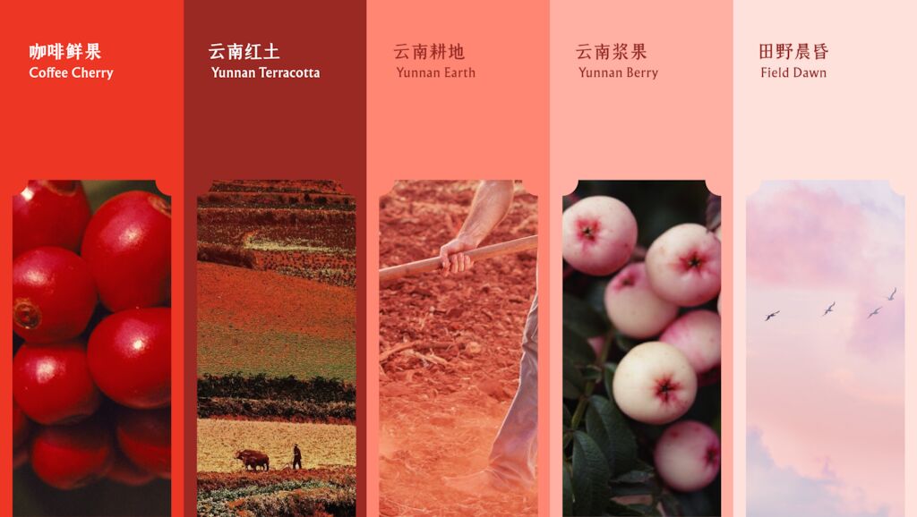
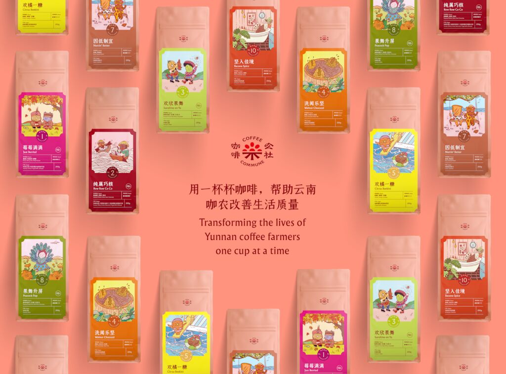
The color palette is inspired by the red soil of Yunnan. Led by two hero colors – ‘Yunnan Terracotta’ and ‘Yunnan Earth’, with a rich ‘Coffee Cherry’ bringing contrast and energy. The more subtle ‘Yunnan Berry’ and ‘Field Dawn’ colors bring depth to the selection of red tones – creating a core identity for Coffee Commune and helping the distinct colors assigned to each product line pop on the packaging.
Every flavor tells a story
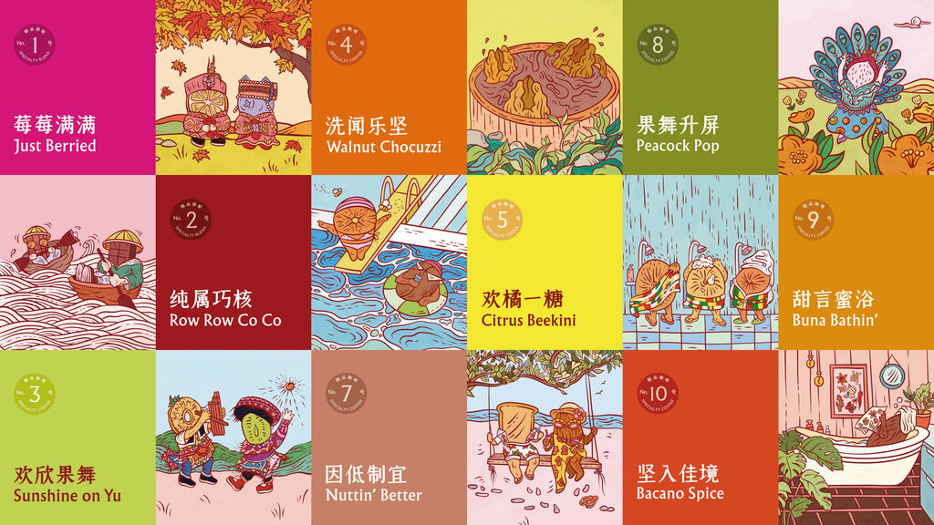
As part of their handcrafted approach to coffee-making, Coffee Commune’s signature roasts are numbered 1-10, each with a distinct, nuanced flavor profile and its own story to tell.
“True to the brand, it was a fulfilling co-creation process. Collaborating with the Coffee Commune team to create the individual roast names, which take inspiration from the flavor profiles, process and origin, was a highlight,” Sally Anderson, Creative Director of MetaDesign, said.
“The bilingual names are filled with personality, lighthearted fun and rhythmic wordplay. For each flavor we created a story, working with Shanghai-based illustrator Matti Tang to visualise them with imaginative ink-line characters portraying playful, everyday scenes and incorporating Chinese cultural elements. This allows each flavor to have its own flair and personality whilst still connecting as a family of specialty coffee flavours. We hope this creative effort goes towards making an impact on the Chinese coffee community and the coffee farming communities in Yunnan.”
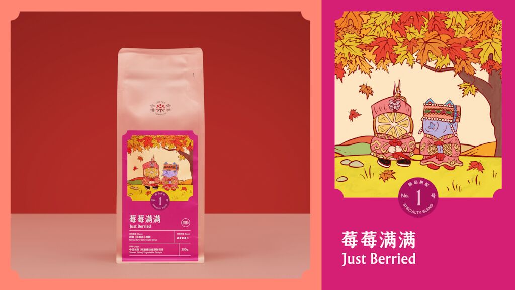
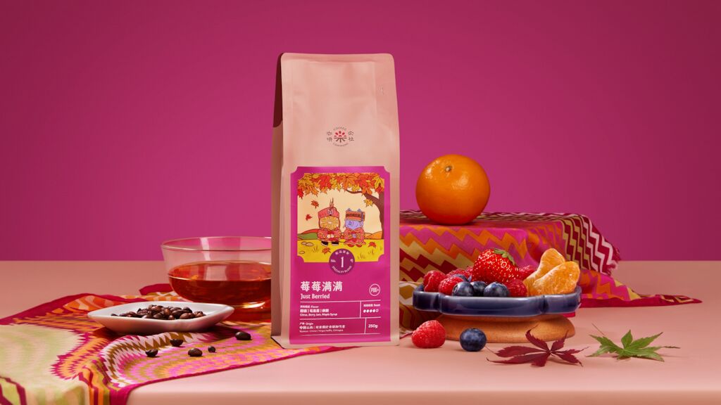
Just Berried
Connecting with the fruity, berry notes of the roast, ‘Just Berried’ shows two recently married fruits in traditional Yunnan wedding garb.
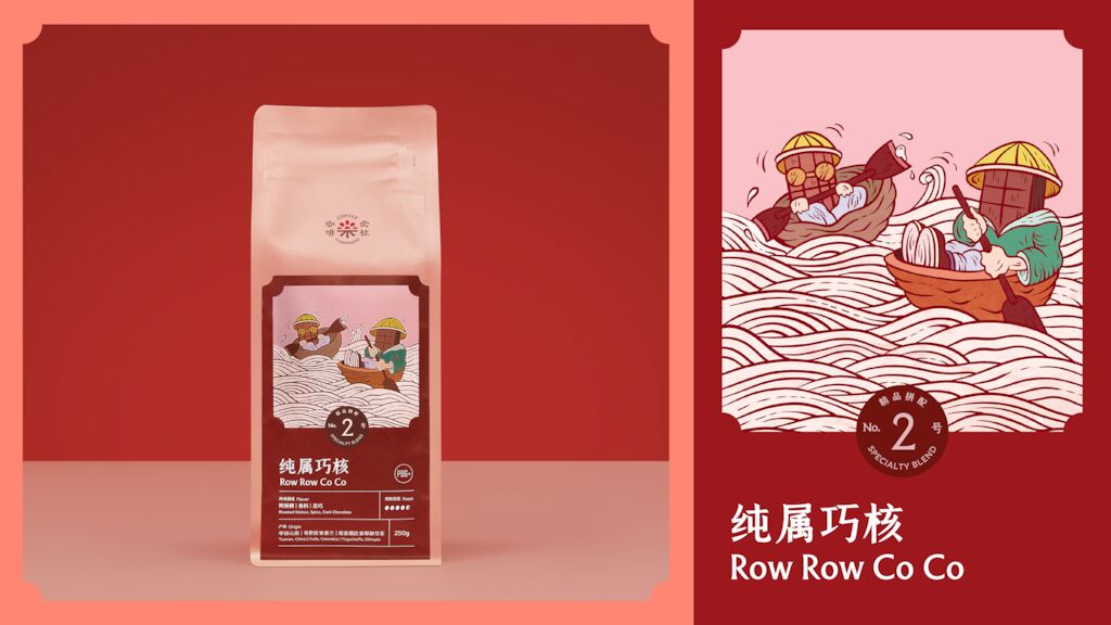
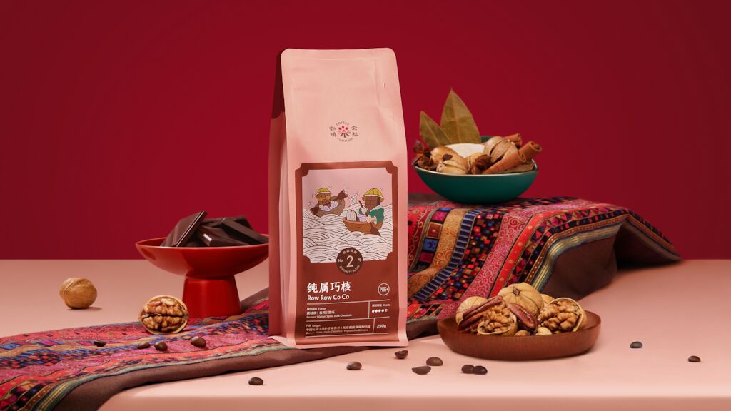
Row Row Co Co
A Café Latte Blend with nut and chocolate notes, it features two chocolates rowing in walnut boats down a river of milk, paying homage to Yunnan’s river & lake culture.
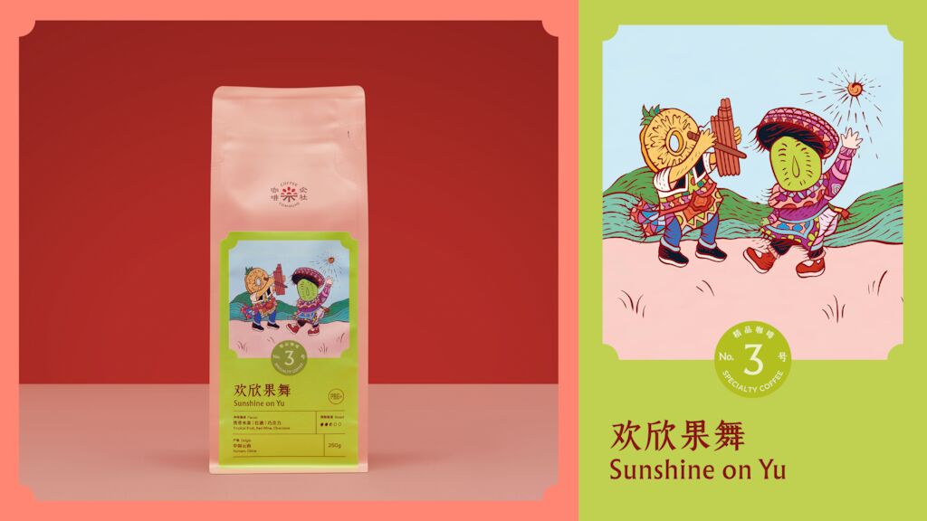
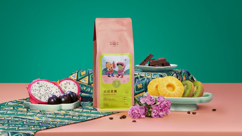
Sunshine on Yu
The brand’s hero Yunnan roast ‘Sunshine on Yu’ celebrates Yunnan culture and flavor with two sun-dried fruits dancing the traditional ‘Gamen Kadou’ ethnic dance.
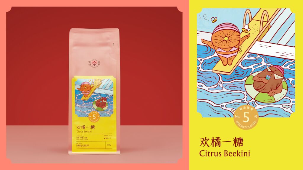
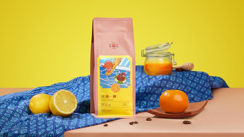
Citrus Beekini
The name plays on tasting notes of honey and citrus, while a relaxing poolside scene reflects the washed filter process of this Ethiopian roast.
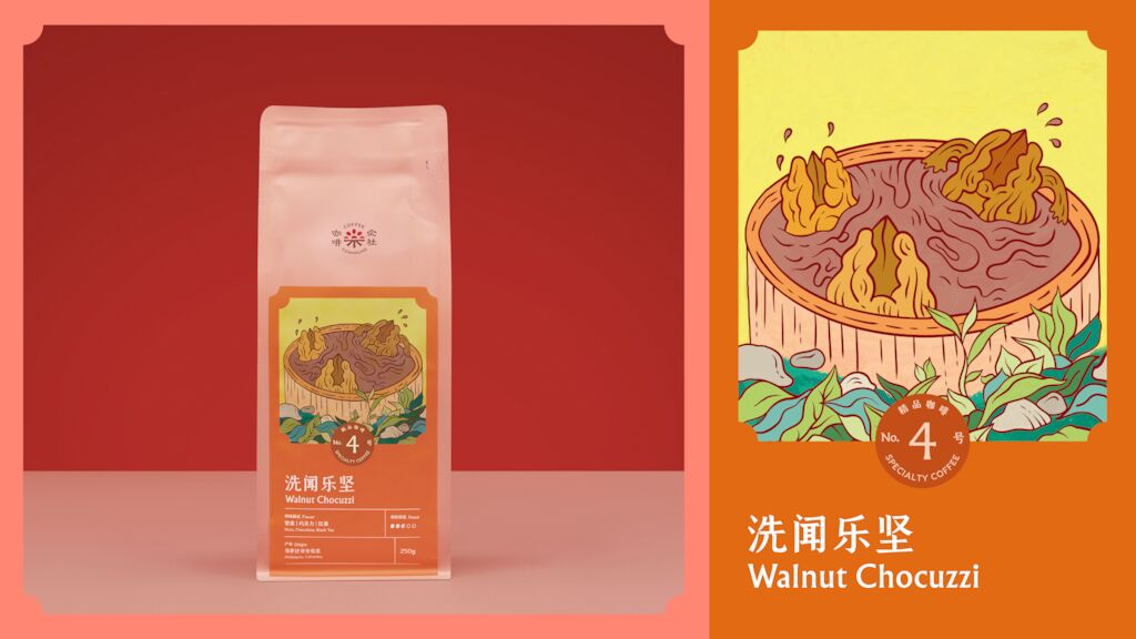
Walnut Chocuzzi
A Colombian roast with nutty walnut & chocolate notes, the lavish scene connects with the walnut’s status as the “Royal Nut”.
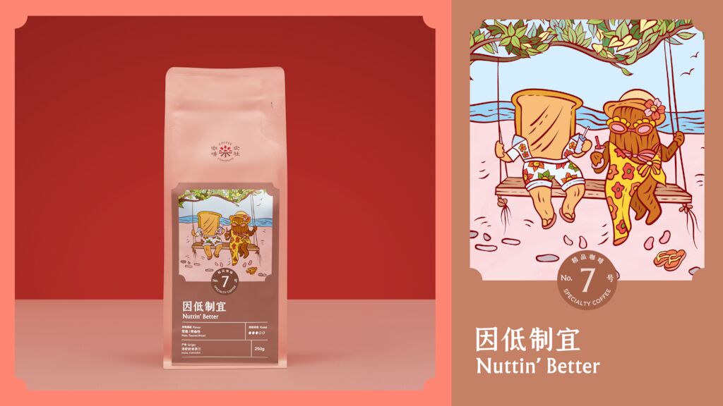
Nuttin’ Better
Dual wordplay on ‘nothing better’ - as in nothing better than a day spent with a friend - and ‘nut and butter’ – linking to this mild decaf’s nut and toast flavor profile.
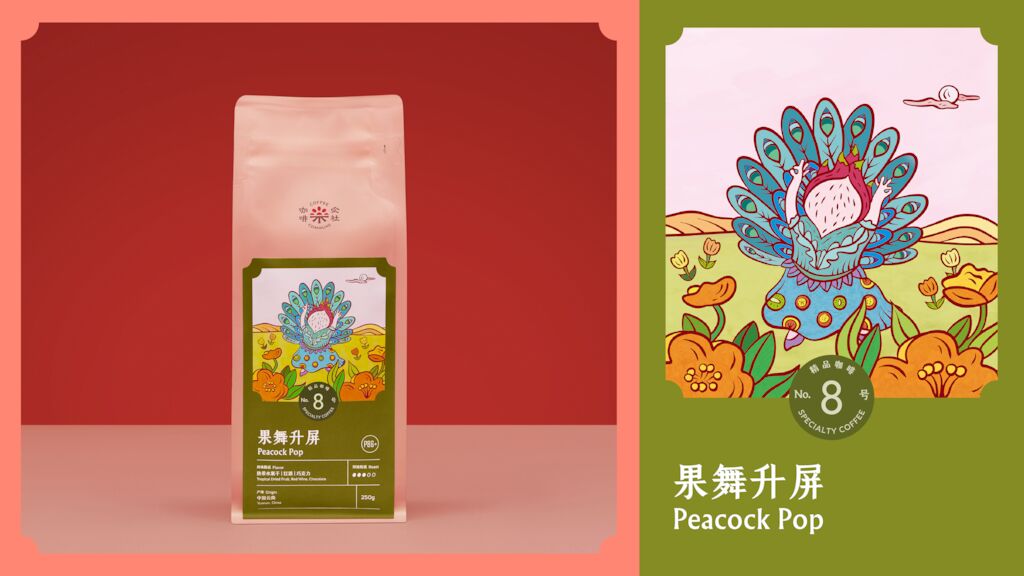
Peacock Pop
Single Origin Espressos (SOE) are the peak of specialty coffee, this fruity Yunnan SOE is proudly shown with a dragon fruit performing the Dai minority ‘Peacock’ dance.
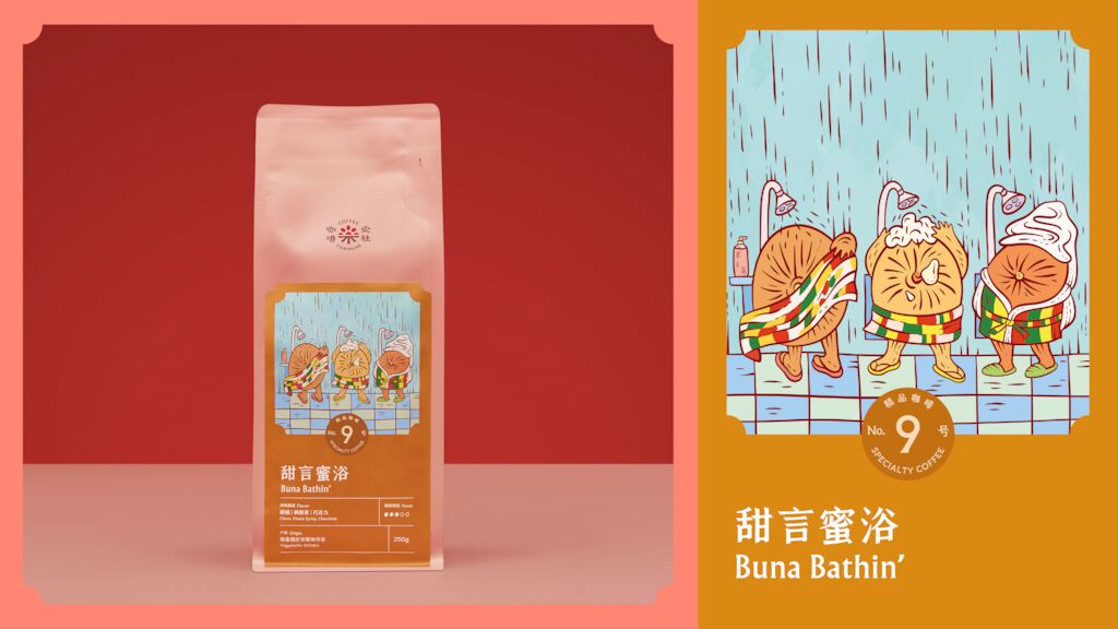
Buna Bathin’
‘Buna’ is an Ethiopian word describing the country’s community coffee-brewing ceremony, while ‘Bathin’ links to the ‘washed’ process of this Ethiopian SOE roast.
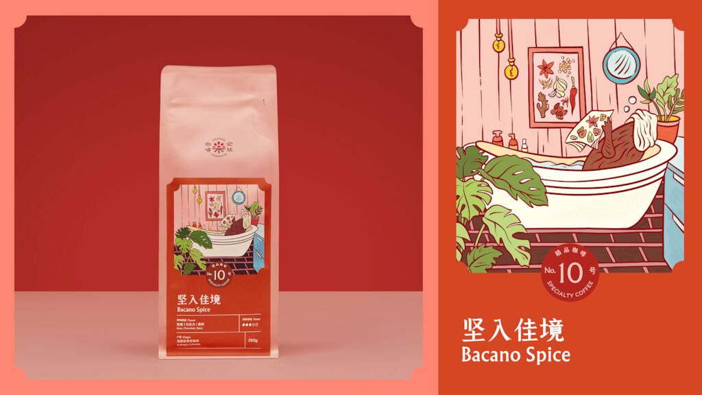
Bacano Spice
Bacano is South American slang for a ‘cool idea or situation’, perfectly fitting the relaxed illustration for this Colombian Washed SOE with notes of spice.
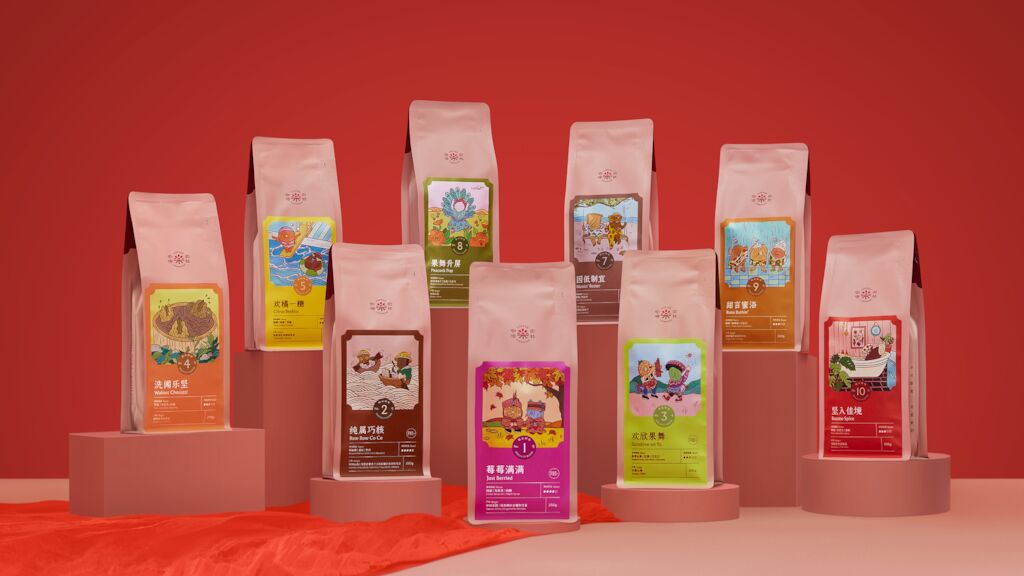
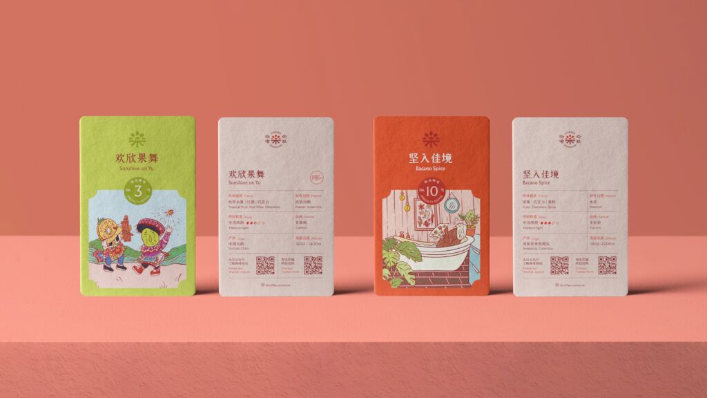
While the packaging is visually playful, the layout system reinforces Coffee Commune’s identity as a specialty roaster celebrating the technical craft of their coffee.Providing clear roast information including tasting notes, origin and even growing altitude with a simplified grid system that perfectly complements the stunning illustrations.
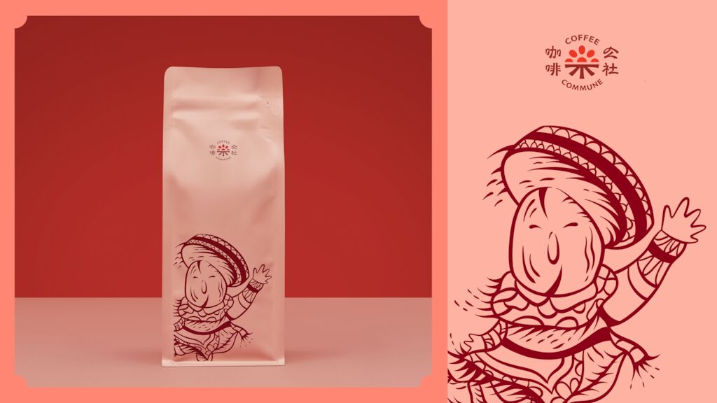
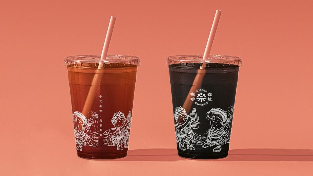
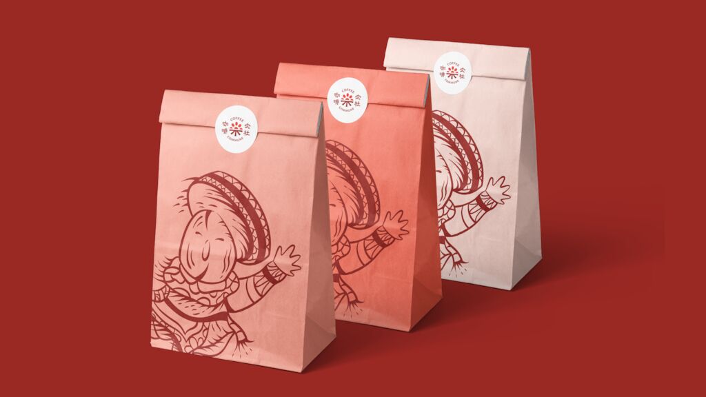
Sunshine in the spotlight
The signature character draws from the brand’s hero Yunnan roast ‘Sunshine on Yu’, featuring a friendly coffee bean dressed in traditional Miao minority garments engaged in the ethnic ‘gameng kadou’– an 1,800-year-old dance that is considered a physical transliteration of the Miao dialect. A special celebration of Yunnan culture, magnified to become a clear visual welcome across Coffee Commune’s entire range of applications.
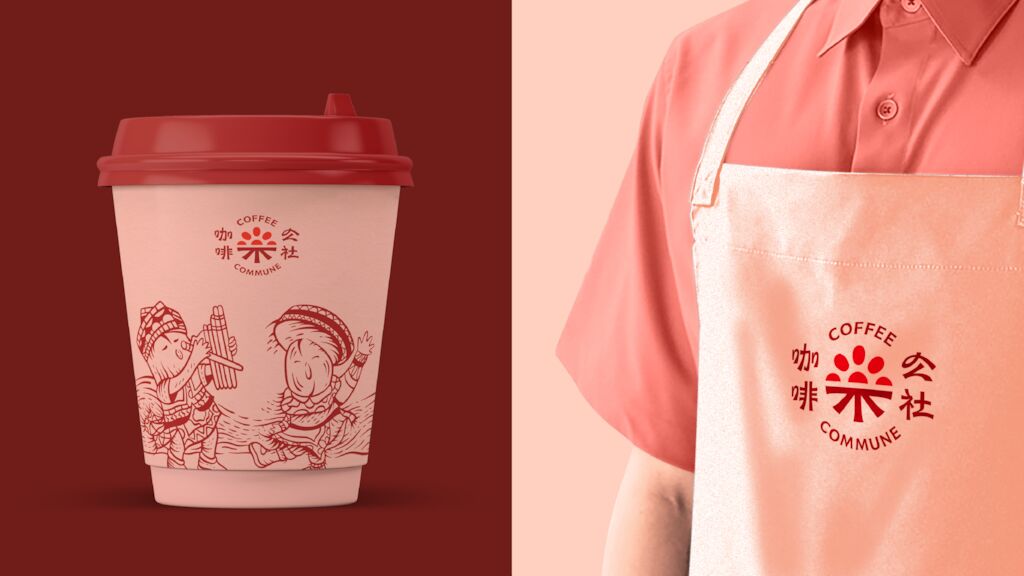
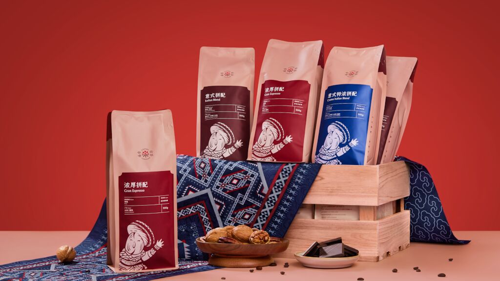
Expressive, yet flexible
Carrying the identity forward for Coffee Commune’s B2B clients, the signature graphic continues as the focal point for the design identity, while bolder colors create a clear differentiation between the 3 different premium product lines.
“As designers, we revel in the moments we are given full creative license to create something spectacular. From crafting the illustrations, developing the names, to designing the packaging, it was a pleasure working closely with the Coffee Commune team to create a design that reflected their bright outlook and carries the brand’s positive spirit,” MetaDesign Managing Director Mauro Marescialli said.
Special thanks to our creative partners
Illustrator: Matti Tang
Photographer: Liu Miao
Need more details?
Contact MetaDesign Beijing business@metadesign.com