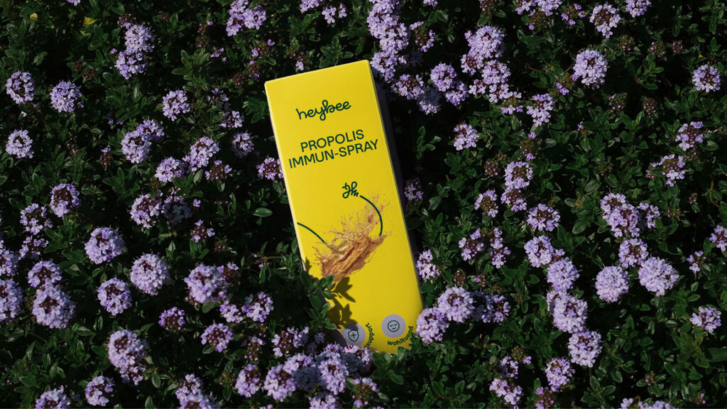
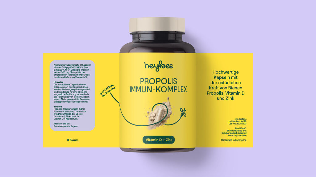
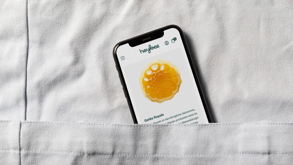
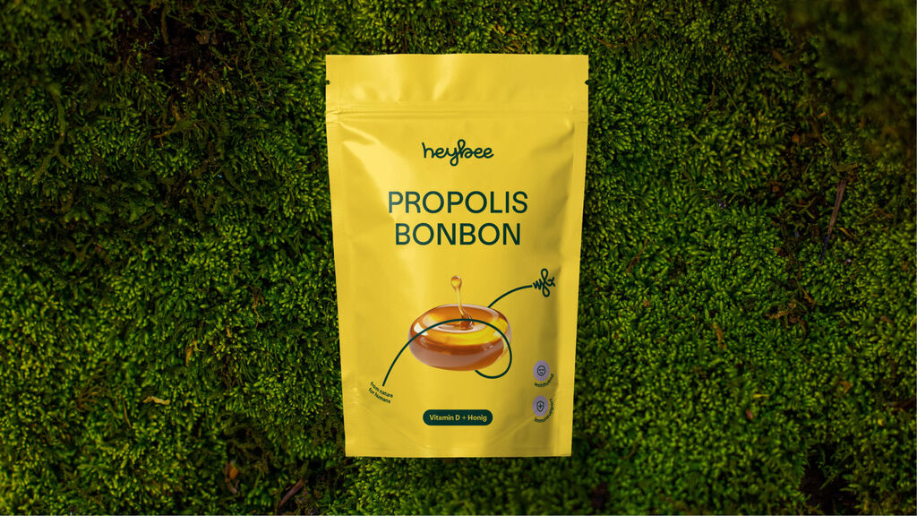
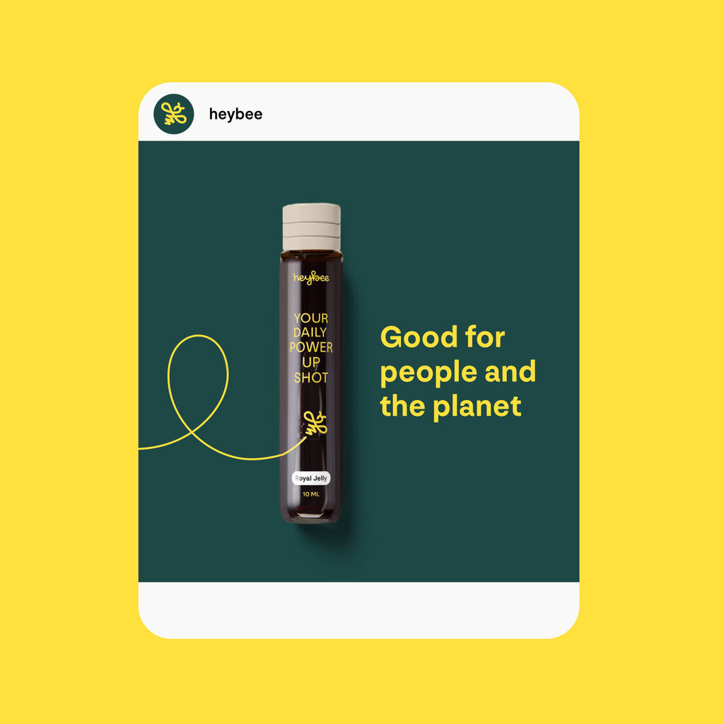
To bring this natural power and product to life in a brand, as busy as bees and humming like a hive, we created the heybee brand in one month. In a highly collaborative and agile process, we developed the strategy, the brand name, the visual identity, and the packaging design from scratch.
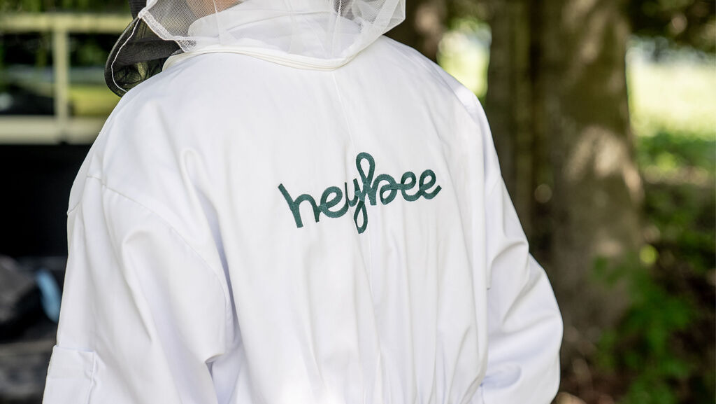
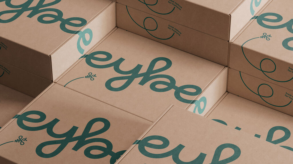
The new name is the result of a broad creative exploration in parallel with intensive trademark checks. heybee stands for the friendliness and convenience of the product as a supportive natural remedy in everyday life. The word mark and the super symbol reflect the light and lively spirit of the bee dance.
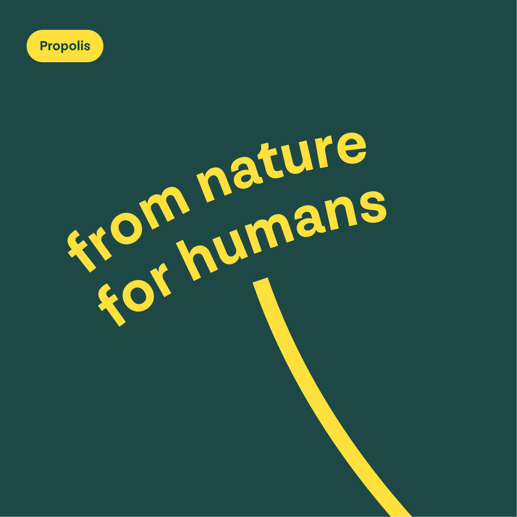
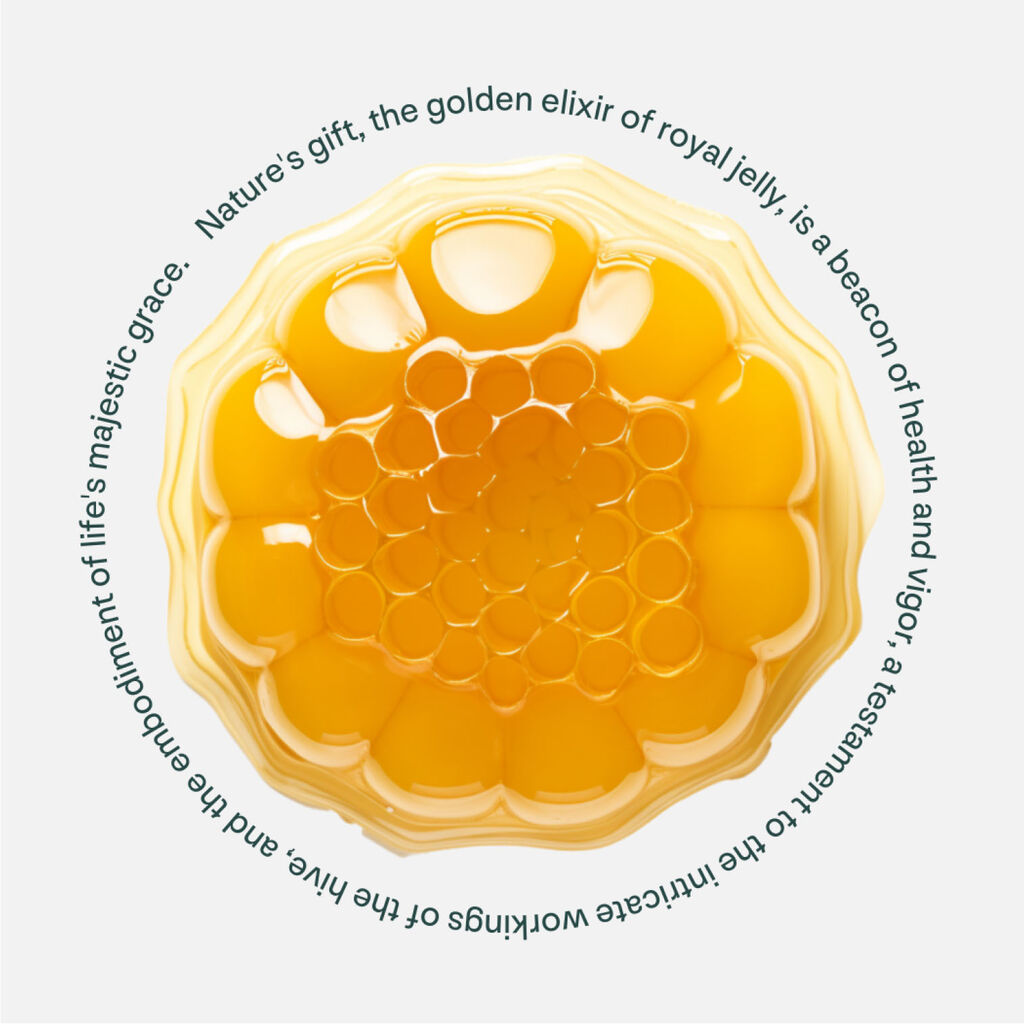
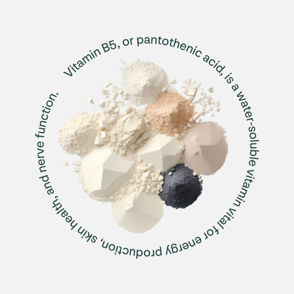
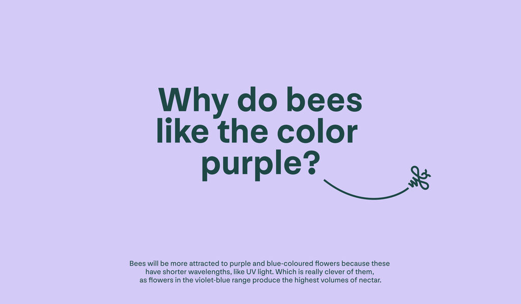
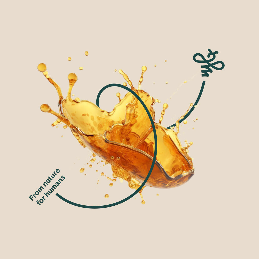
The color Bee Yellow characterizes the category code, complemented by the natural tones named Nature Green, Berry Purple, Stone Gray, and Earth Brown. Through the simple nature of the imagery, we enable the startup to easily and independently create impactful visuals using AI. With attention to detail, the typography is dotted with small elements that resemble bees' antennae. Orchestrated like a beehive, heybee reflects the surprising, inspiring and joyful, yet efficient and reliable character of a brand at the intersection of health and lifestyle.
