Liebherr
The Liebherr Group is developing a new brand identity: In the family-run company with 13 product segments and almost 50,000 employees worldwide, an umbrella brand strategy is being implemented with a clear mission:
A strong brand that clearly stands out in the competitive environment and can be intuitively experienced at all points of contact. With a clear positioning and powerful messages in moving stories from around the world.
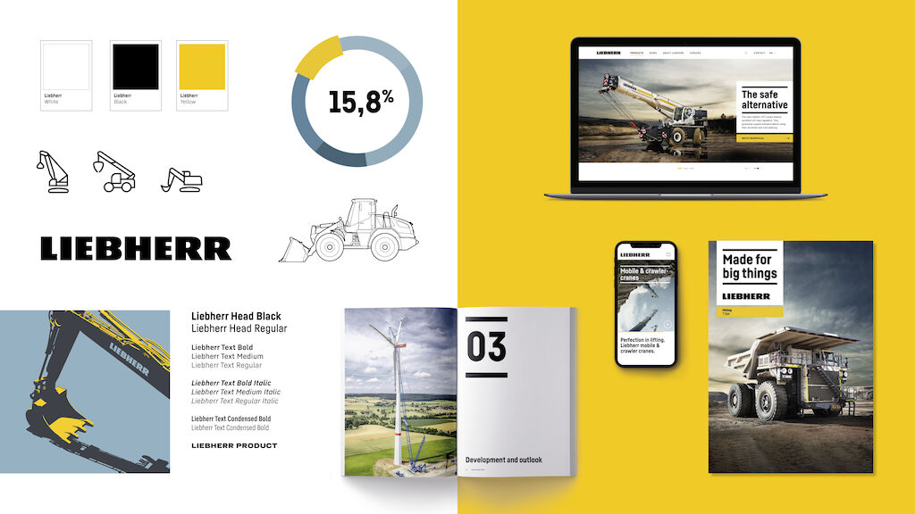
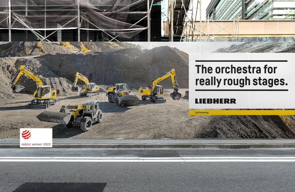
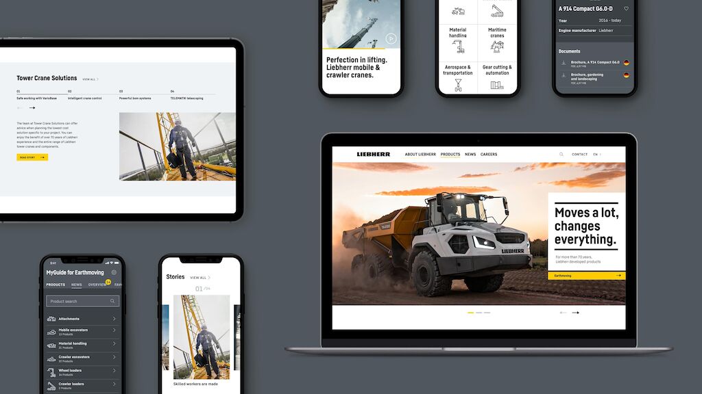
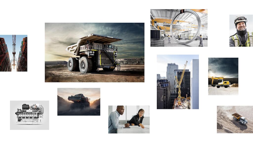
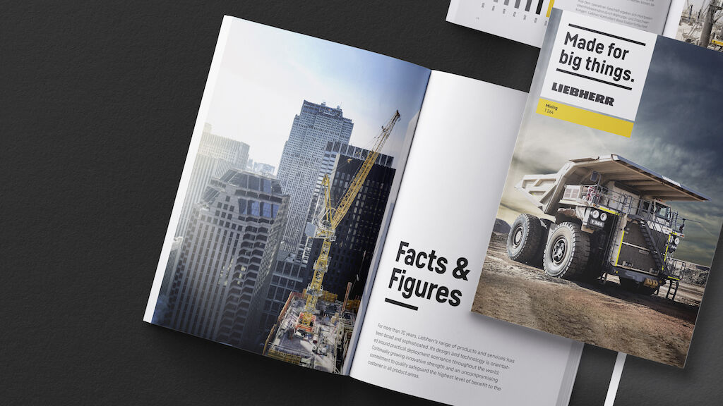
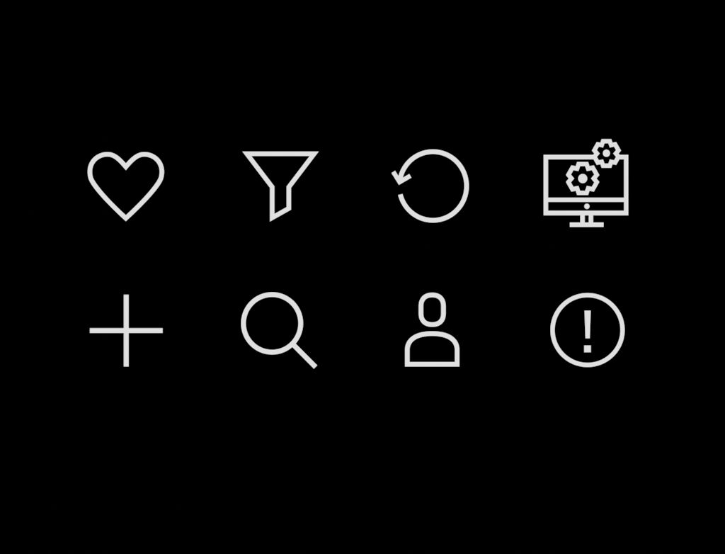
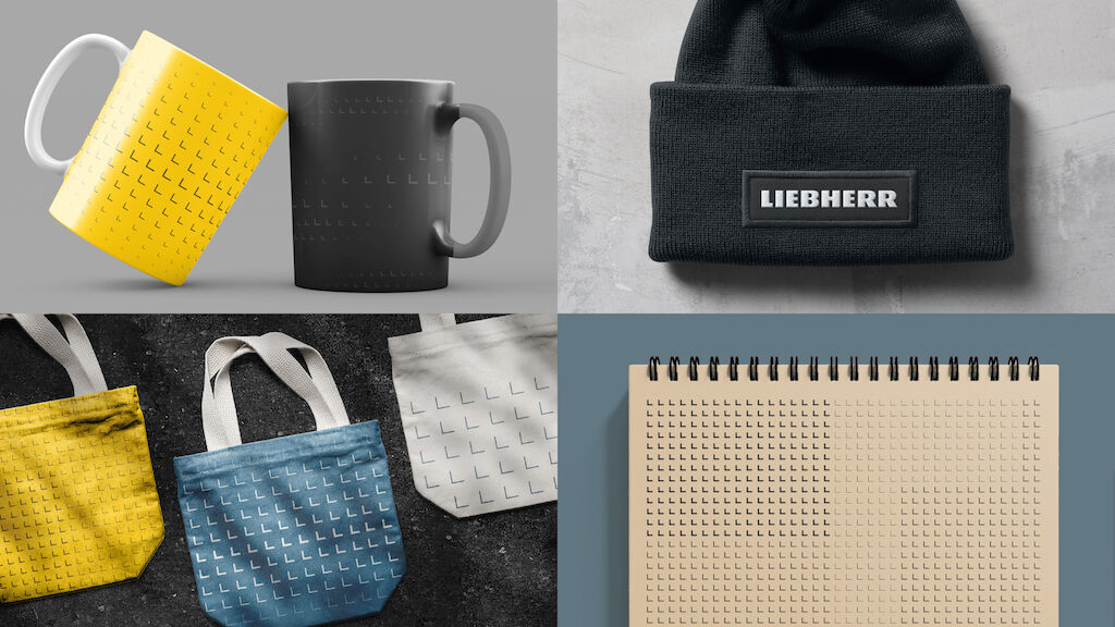
Together with Liebherr, we developed a holistic design system that enables a consistent brand experience across all touchpoints. Derived from the brand strategy and the brand character, a system was created that gives the brand clarity, power and dynamism - online and offline, in visuals and in language. All product segments of the company group communicate uniformly and recognizably in the sense of the umbrella brand. The product segments sometimes communicate in a particularly powerful way, sometimes in a more technical way. The new corporate design offers a broad spectrum to visually support this content-related balancing act: Photography, icons, product illustrations, infographics, diagrams and free illustrations. A differentiated solution is only available in the area of household appliances, with B2C products aimed at a specific target group.
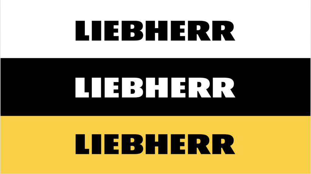
Optimized for the digital age: The logo was carefully balanced and adapted especially for use in digital media without changing the familiar look and feel of the brand. It is the focal point of the brand's self-confident presence.
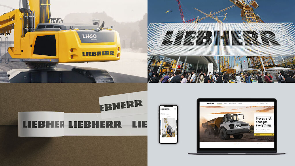
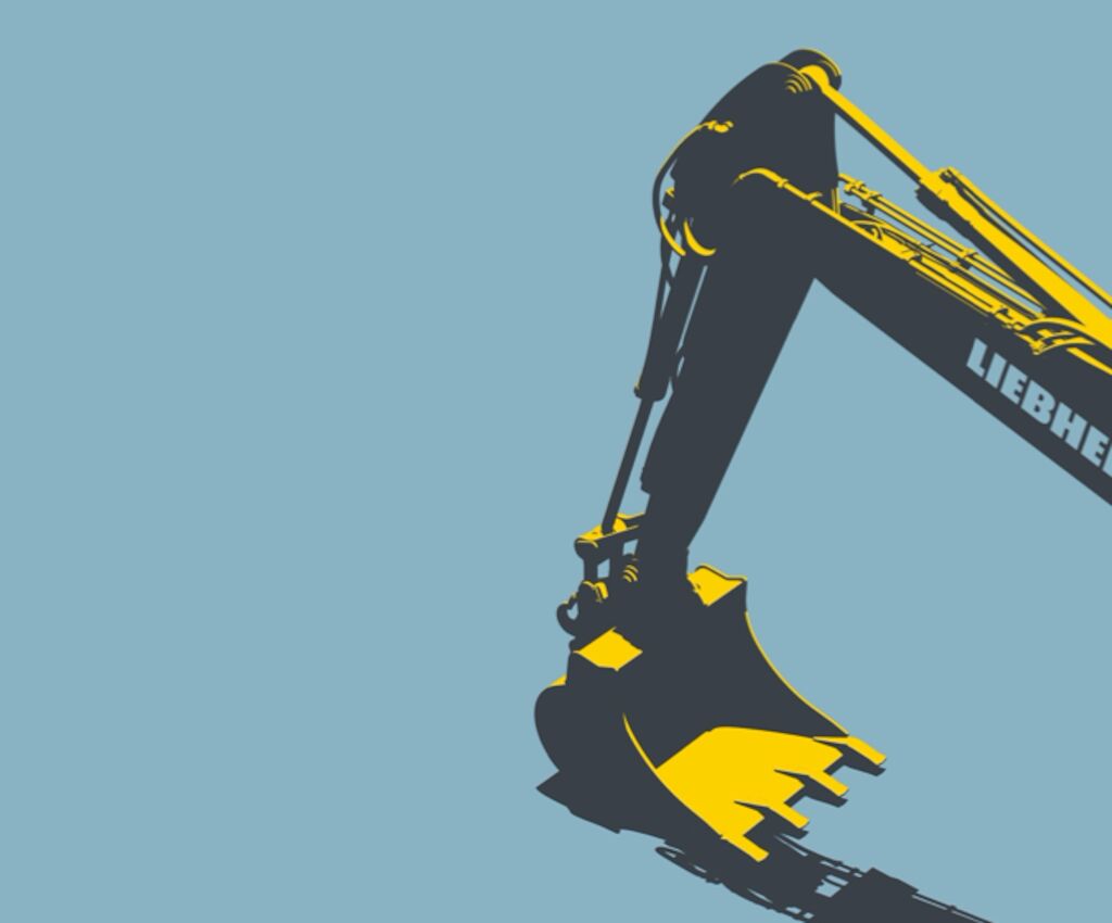
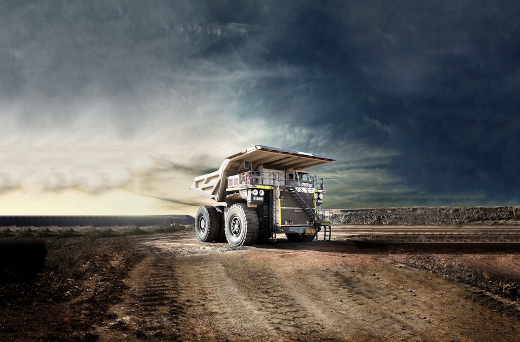
The revised imagery considers the diverse requirements of various corporate divisions. In this way, images can convey strong technical precision in a way that is appropriate for the target group, additionally it stages the dramatic effect and size of the products.
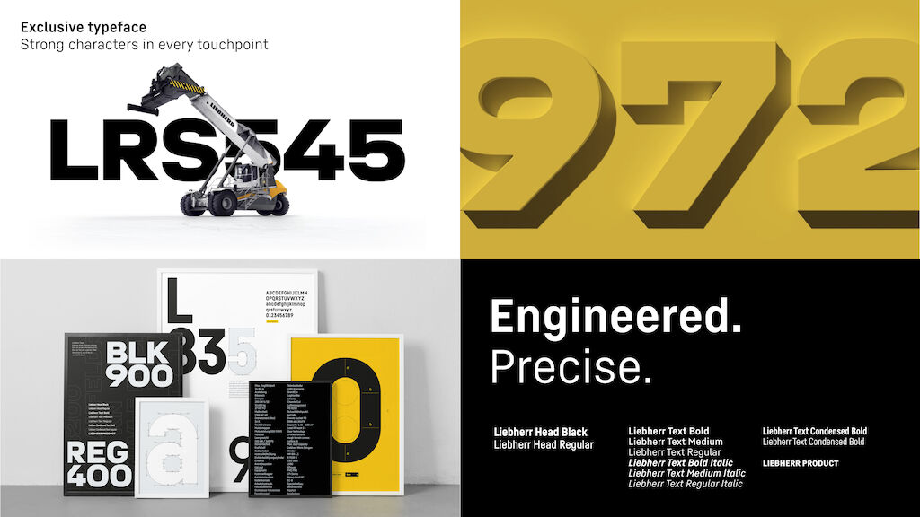
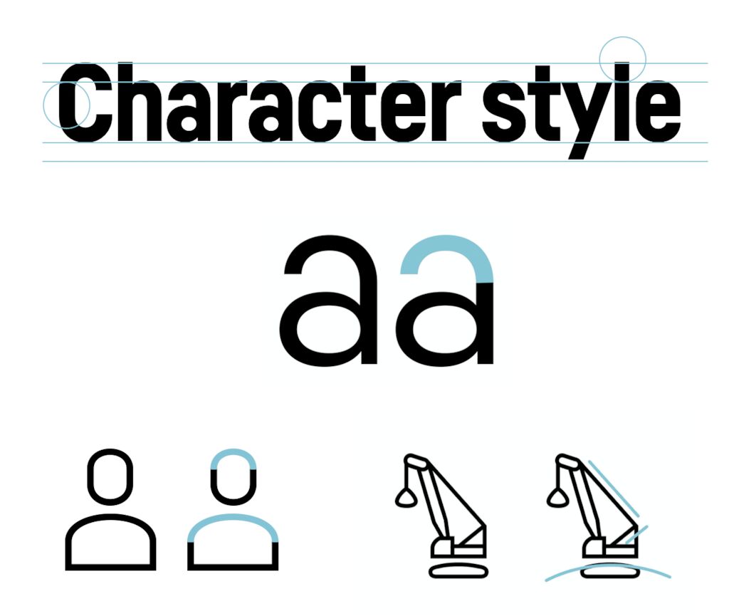
The new exclusive fonts are particularly prominent. Based on the brand character, a powerful brand font was developed together with HvD Fonts, which makes Liebherr unmistakable at all touchpoints. In addition to a particularly characteristic and expressive variant for headlines, a version for reading texts and product branding was also created. Tailor-made typography from big to small scale.

The design system was conceived in motion from the start: Motion Principles create a consistent basis for the brand to be experienced dynamically and consistently across all digital touchpoints.
"The fact that all colleagues could hardly wait to start working with the new design system was the greatest praise for us."
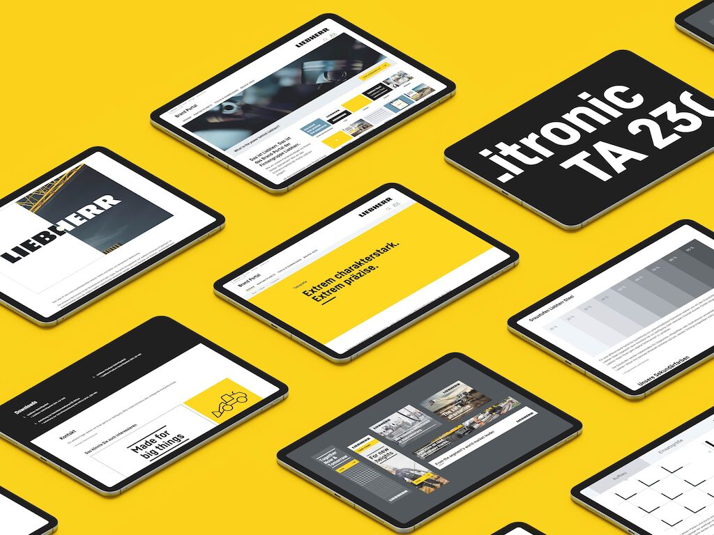
The basic UI/UX library provides an easy-to-use basis for many digital applications. Digital applications can be implemented efficiently and in line with the brand using the defined elements and modules.

"Because the flexible design system was thought of digitally from the start, we've created an important foundation for the group's digital platforms."
Awards
iF DESIGN AWARD 2023 (Communications - Company Branding)
ADC Wettbewerb 2023 (Design - Pictogram / Icon)
Red Dot Design Award 2022 (Brands & Communication - Brand Design & Identity)
Need more information?
Contact MetaDesign Berlin