Shaping health.
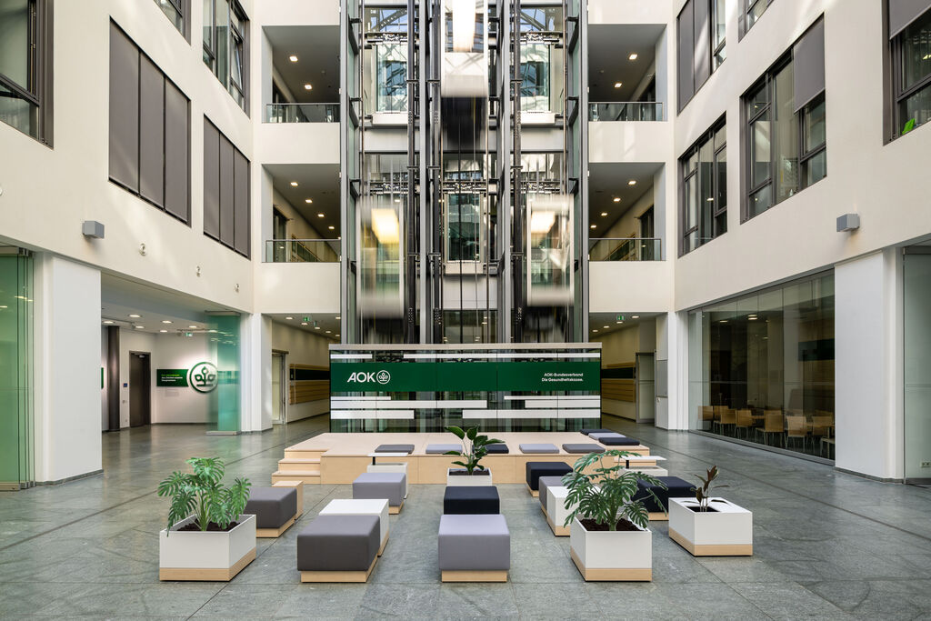
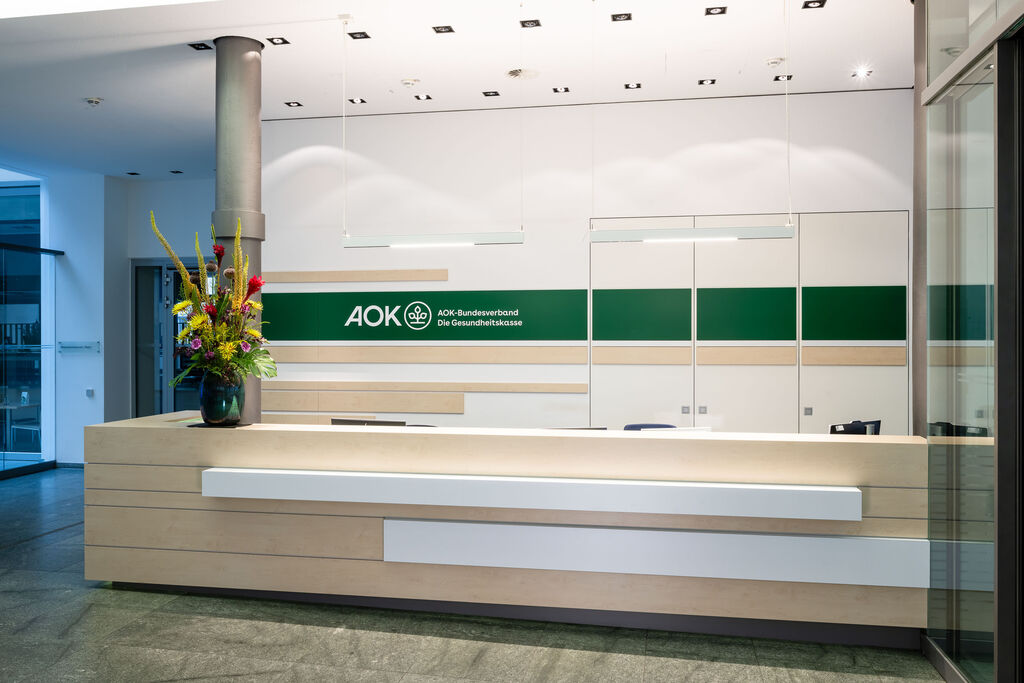
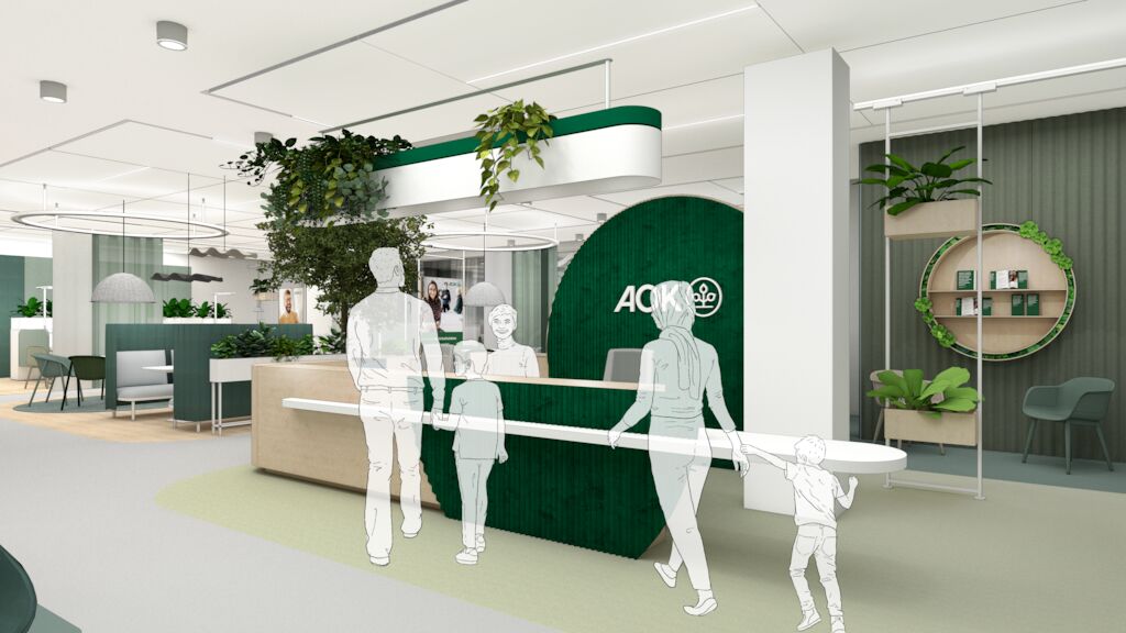
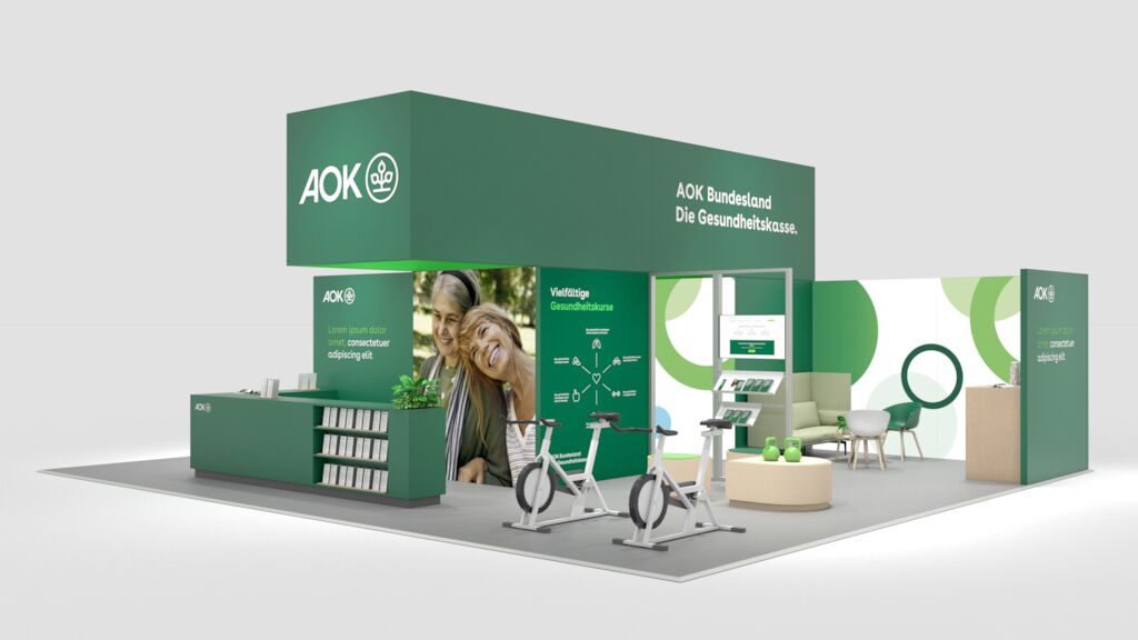
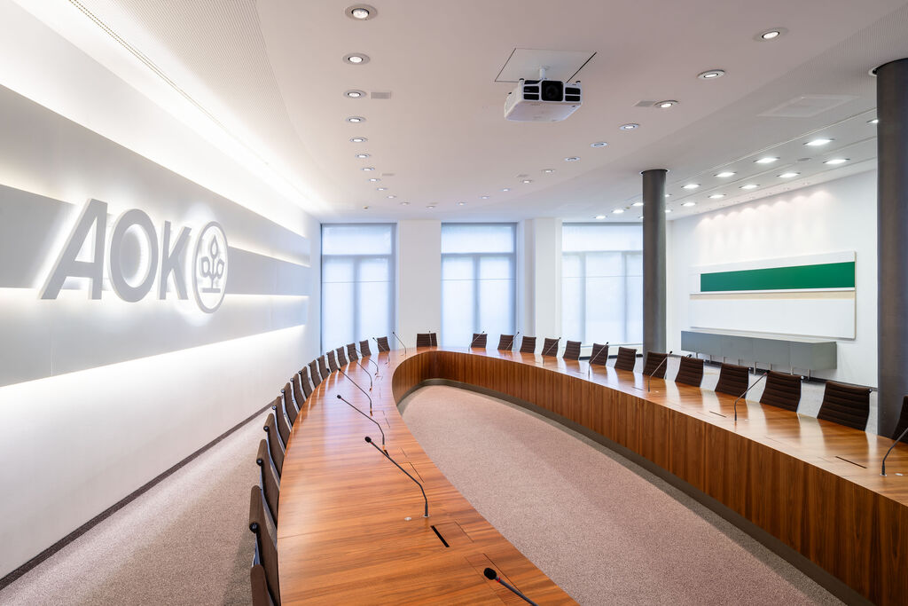
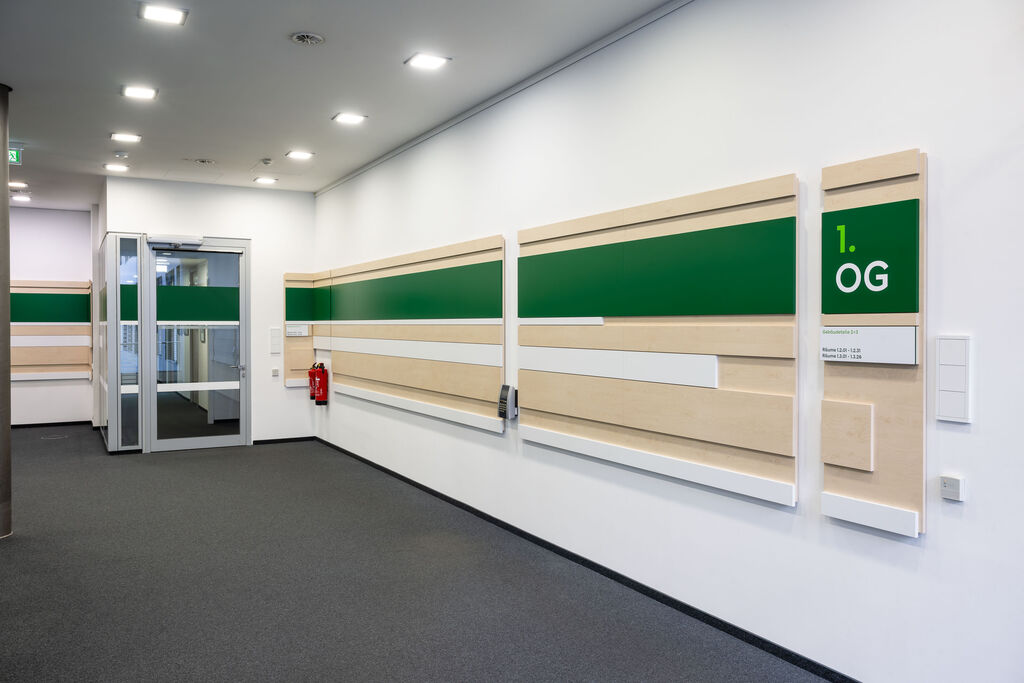
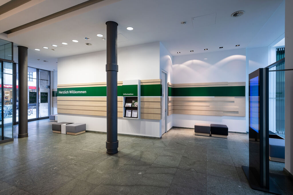
From the trade fair concept to a new branch concept including primary and secondary labeling, up to an individual brand appearance in the building of the AOK Federal Association was not purely a uniform appearance as possible, but above all that undisturbed encounters between the AOKs brand and its policyholders, employees and partners. The desire for a higher degree of proximity and identification and recognition is achieved not only by using authentic materials or new image motifs, but also by integrating unusual new offers and uncomplicated digital applications.
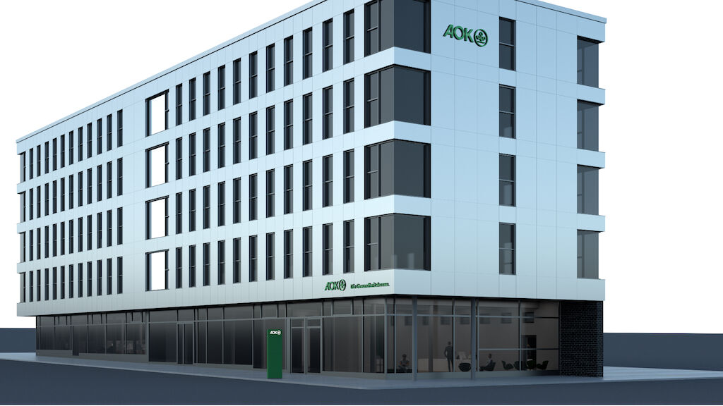
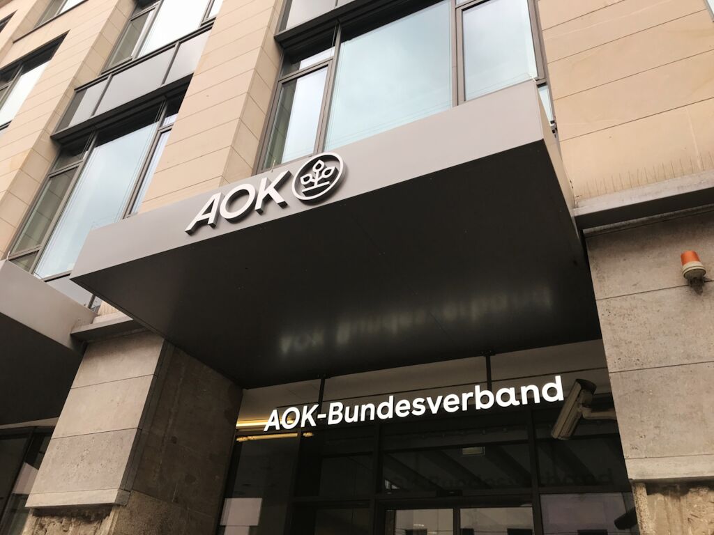
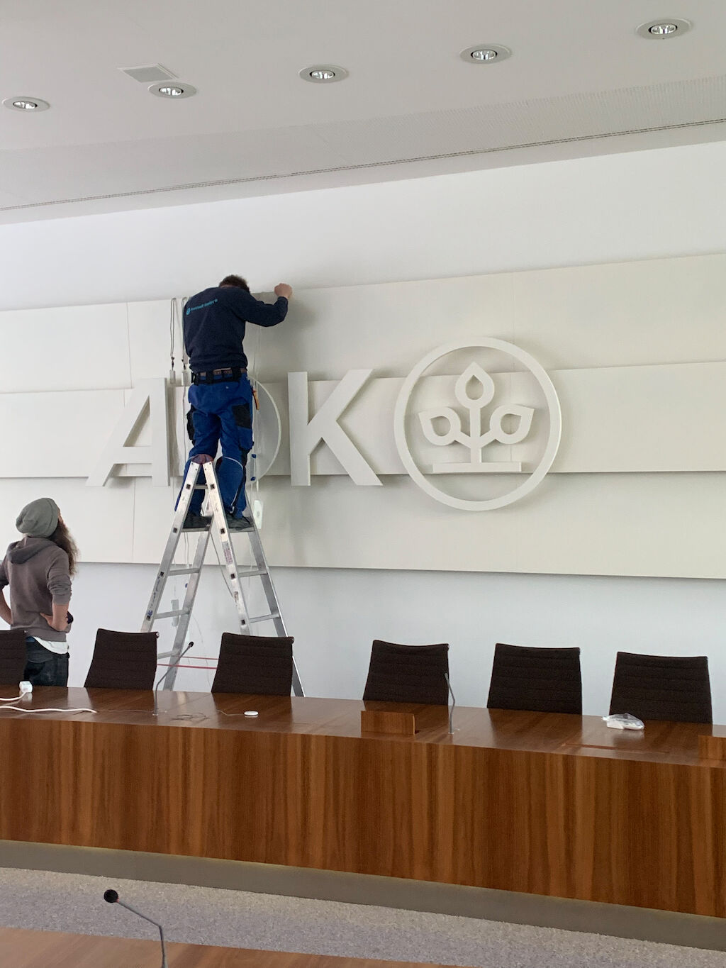
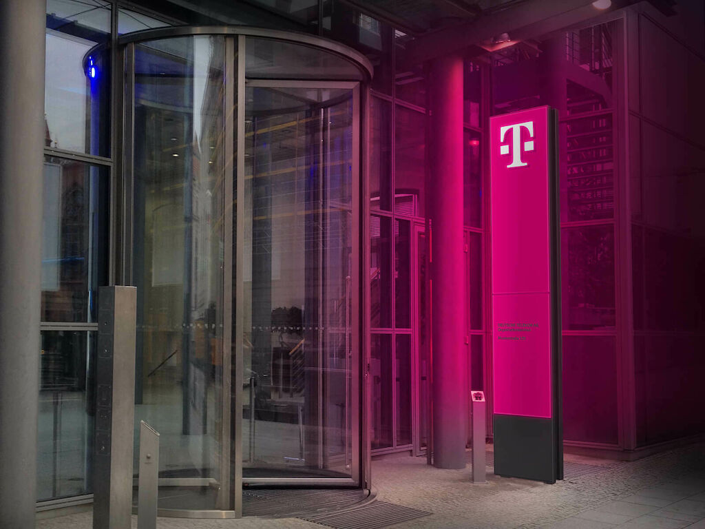
The new logo is also radiant for the spatial appearance. On the building of the federal association as with the 11 regional AOK's.
