We personalize our sneakers, our muesli, and our Coke. We personalize our car, our perfume, and the flavor of our electronic cigarette. The more “me,” the merrier. And if things are not customized, they’re simply standard. And nobody wants to be standard. So my question is: why the heck are we still writing in Arial?
Never have we been telling and writing as much as we do now. But while all eyes are on the content, we seem to neglect its smallest fraction: the letter. And the art behind it. Why is that?
Up to now digital media haven’t given us much of a choice, really. There has always been this pot of standard fonts to choose from — and that was it. Also, for years typefaces seemed to be almost a secret science with only a few people mastering the art, making it time-consuming, expensive, and error-prone to develop a proprietary typeface. But that was then.
Today we have all the technical possibilities, resulting in an infinite number of true experts on the matter. And that opens up a whole new world for typography in branding. It’s now easier and more accessible and thus less expensive, less time-consuming, and less error-prone. So today you don’t have to compromise by choosing from existing types that remotely comply with what you want — and then sharing it with a bunch of other brands. Today you actually have the possibility of having your very own typeface that reflects everything your brand stands for, just for yourself. And the icing on the cake: you save licensing costs in the long run.
Let’s simply face it: Today we have no more good excuses for shirking away. We have the power and the privilege to translate the oldest cultural achievement — language — into scriptures. We have the power to exploit the expressive force of the medium scripture. So let’s make use of it and make the most of it. Let’s set higher expectations for ourselves in branding. Let’s go all the way. Because when you think about it, typeface is the potency pill of expressing individuality. So let’s face type!
_André Stauffer is creative director at MetaDesign Zürich.
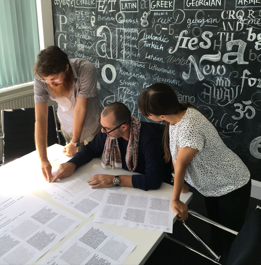
Image courtesy of Türi Cengiz. It was taken at Dalton Maag font foundry in London and features (left to right) Riccardo De Franceschi of Dalton Maag and Paolo Tonti and Alexandra Fukazawa of MetaDesign Zürich.