The Expressiveness of X’s

The newsstand of the future has a name, and it’s Texture. Backed by some of the world’s largest publishers, Texture offers unlimited digital access to Vogue, Sports Illustrated, The New Yorker, and a hundred-plus other magazines for the price of a pint or two of beer every month. Neha Hattangdi, who helped design the Texture identity for MetaDesign San Francisco, discusses the project with Hozy Rossi.

HR: You worked at a magazine before joining Meta, right?


NH: Yes, I worked at a fashion and lifestyle magazine in India. I used to really like working there, and I loved the idea of people curating stuff for other people.

When we started working with Next Issue, they wanted to do the same thing, which spoke to me. In the new Texture app, their team curates content for the reader based on that person’s favorite magazines and their favorite articles. So when you open the app, it looks slightly different for each person because the content is curated according to your tastes.

HR: So you just called them Next Issue, and you called them Texture. What’s the story with the two names?


NH: When Next Issue came to us, they already had an application in place, and that was its name. They were well known by that name in Canada, but they were contemplating changing the name. So they wanted us to explore both.

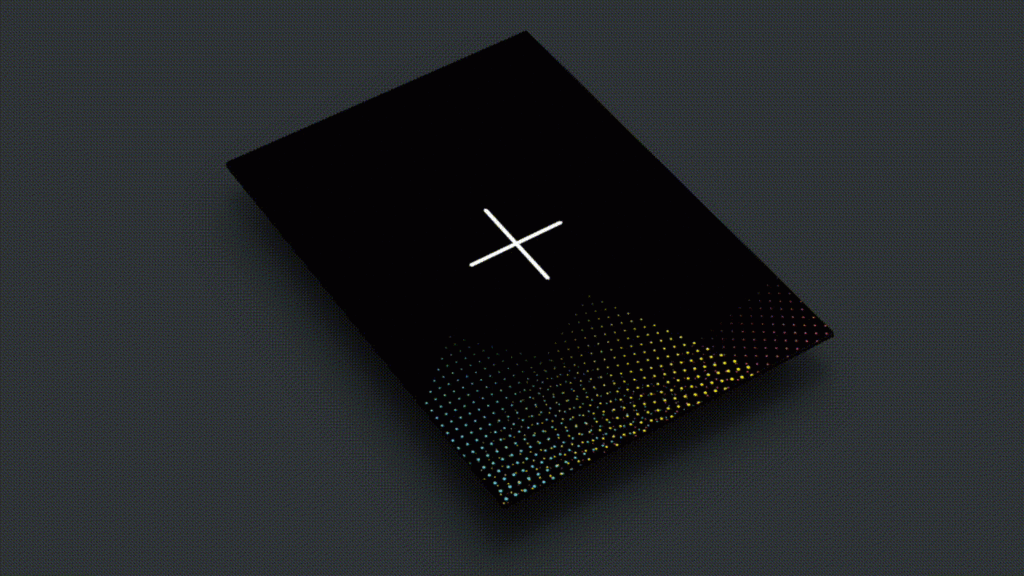
I remember for the first round of design we showed them three directions with the logo Next Issue and three for Texture. We had five or six designers working on it, and the designers were asked to pick the name that spoke to them. I really liked the name Texture because it was more abstract, and you could have fun with it visually.

HR: We went in with six different directions for the first round. What happened next?


NH: They gravitated towards three of them. They liked the boldness with one. The second direction that they liked was modular. The third one, they liked the flexibility in the logo. They wanted to be more expressive, and they wanted their brand to not fade into the background. This system could be dialed up or dialed down if need be.

Txt_1

HR: And that’s the direction they went with. Let’s talk about the flexibility in the system.


NH: With their new app, they have all these different genres. We thought it would be a good idea to have the X change depending on the content and what the reader was choosing to read.

Texture is a brand and yet they represent magazines that are showcased in the app. They needed their brand to be able to stand alone by itself but also be able to house the magazines within it and fade into the background at times.

For the colors we used a vibrant palette. Magazines are generally about people; they aren’t especially super bright. So the Texture brand by itself is really bright. For the main brand, we used only the primary colors. For the sub-brands, the genres, that’s when we use a mixture of secondary and primary. It’s not very obvious. It’s subtle.

HR: There was a lot of thought put into how the brand would live in the world.


NH: Well, we wanted to build something that had the ability to be expressive. Nothing about the app makes you feel like you’re going to see the same content again and again. That was the idea behind the flexibility — that you can do all these different things with the X’s and the colors and the animation.

We worked hand in hand with the design team at Texture because they were familiar with the app, and they were familiar with what had worked and what hadn’t worked for them in the past and what they wanted to push forward in the new versions. In the app we really wanted to push the fact that there was so much content. You’re not just browsing. You can spend all day looking at it and find different types of things. Every time you look at it you’re seeing a different view.

Nh_appui

They were excited to launch the new brand internally as well. They even sent us some Texture t-shirts and hoodies.

It’s been a few months since Texture launched their rebrand, and it’s great to see how the brand is being rolled out into different print and TV applications by the Texture team. The changing X’s make it look new every time.


_Hozy Rossi is a creative director at MetaDesign San Francisco.