Md_transform_awards_meizu11

Smarter, Faster, Higher

Crafting a brand that stands out in the increasingly crowded smartphone market can be challenging. Sally Anderson and Jana Xing, creative director and senior designer at MetaDesign Beijing, discuss the new identity they developed for MEIZU.

JWK: Many people outside of China aren’t too familiar with the MEIZU brand. Can you tell us a bit more about who they are, what they do, and for how long they have been working with MetaDesign Beijing?


JX: MEIZU is a young tech startup from Zhuhai in southern China that creates smart hardware. They started in 2003 as a producer of MP3 players before launching their first smartphone in 2008. It was an immediate hit and earned them a loyal following among local enthusiasts. We started working with them a few years thereafter, following a creative pitch in 2013.

JWK: Out of interest, what does the name MEIZU mean?


JX: The company hasn’t really come out with an official translation, but the first character mèi (魅) means “magic” or “charming,” while the second character zú (族) means “group” or “clan.” So, when combined, you could say the name suggests a “charming group,” and refers both to the company itself and the people who use their products. In fact, this shines through in their product tagline: For the lovely ones.

JWK: How would you describe the MEIZU brand before you started working with them in 2013?


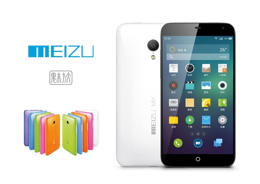
SA: When we first started working together, MEIZU had a brand identity that was largely that of a hardware developer. They were bright, young, and colorful, but appeared desperate to attract attention. Their image didn’t reflect their design philosophy or the quality of their products, so it was the right time for us to work with their team to develop a more mature brand identity.

Md_transform_awards_meizu14

MEIZU before the rebrand (2013)

JWK: Can you give us some more background as to the rebrand? What was the market like at the time, and what factors did you have to take into consideration?


SA: More than anything, it was important for us to realize that MEIZU was very much the product of Shenzhen’s unique business environment. As a hub for developers and manufacturing, it’s a place where companies are quick to learn and quick to iterate. MEIZU represented a new cohort of Chinese smartphone manufacturers that had emerged to challenge established international competitors and reshape the smartphone landscape. This made their brand identity all the more important. We needed to craft an image that not only captured MEIZU’s dynamic character but also helped the brand stand out in an increasingly crowded market.

JWK: And what was the initial thought process? Did anything unexpected jump out at you?


SA: Building a brand requires a strong and nuanced understanding of a client’s business strategy, brand strategy, and product strategy. The idea that it is just a matter of logo styling and color palette is totally misleading.

As we began the research and discussion process, we found ourselves immediately drawn to the client’s ambition and fearlessness. MEIZU didn’t just seek to emulate their international counterparts. They wanted to truly surpass them in the fight for market share.

So for us, this meant finding a way to channel this confidence and set MEIZU up for success. We needed to show where MEIZU wanted to be in five years’ time (which is a lifetime in China’s tech industry), and find a way to evolve the brand in a way that connected with consumers at an emotional level.

JWK: Every brand has a big creative idea. What was the idea behind MEIZU?


JX: We work collaboratively, so it took time for MEIZU’s core idea to take shape. We read consumer reports and research material, and in the end we began to see a clear pattern: MEIZU users were drawn to the beautiful simplicity of the brand’s products, as well as to company founder Huang Zhang (黄章) and his philosophy of “chasing your dreams, no matter how large or small.” Realizing there was both purity and potential in this idea, we developed the concept of “uplifting sprit” as the core of the brand’s refreshed identity design. We then distilled this idea across the brand language, which included a new balloon symbol — a pure, human form that is always rising. As playful and distinctive as it is memorable, it serves to encourage MEIZU users be positive, aim ever higher, and chase their dreams.

01_meizu_pro

MEIZU PRO launch in Beijing (September 2015)

Md_transform_awards_meizu9

Collection of MEIZU applications featuring the new identity

JWK: The identity was launched over 12 months ago now. How would you describe the result so far?


SA: MEIZU is today recognized as one of China’s top-five domestic smartphone brands, and is proof that with the right vision, capability, and dedication, Chinese companies can successfully build towards an international presence. MEIZU has expanded to India and is continuing to look at other markets in Southeast Asia, Eastern Europe, and Russia.

JWK: Finally, in two to three years’ time, what are your expectations for the MEIZU brand?


SA: Firstly, in two to three years, I believe that MEIZU will become increasingly well known beyond China, particularly in Southeast Asia. They will also be known for more than just smartphones as the industry races towards the Internet of Things. Let’s hope they continue to be recognized and “loved” for being a human-centered design brand.


_James Watson-Krips is a senior brand consultant at MetaDesign Beijing.