Nyp_drawings-copy

Rebranding the New York Philharmonic

MetaDesign San Francisco recently created a new visual identity for the New York Philharmonic. Lindsay Gravette, the creative director who oversaw the project in San Francisco, shares the story behind the making of the identity in a Q&A with Hozy Rossi, who also worked on the project but feigns ignorance for the sake of this post.

HR: Why do you think the philharmonic approached a West Coast firm for this project? There are a lot of agencies in New York.

LG: We were surprised when we first got the RFP from them. We learned that they had contacted us because of our work for the San Francisco Ballet. They recognized in it a lot of what they needed to do with the philharmonic, which was re-energize a new audience and reinvent themselves.

HR: Walk me through the selection process. What was the first request once they reached out?

LG: We had initial conversations with them about what they were looking for, what their overview was. And what they were requesting of creative firms was to take the 76-page brief that they had spent six months putting together —about who they are, where they want to go, what everybody in the organization is looking for in the brand — take that, go away for a little while, and come back for a ”tissue session,” which we had to look up. We found out it was a moment in between the beginning and end of your creative process where you just sort of stop, pencils down, and come in and show them what you’ve been working on. Through that they would see what your thinking was, what different firms’ creative approaches would be, and how the agencies were interpreting the brief.

We looked at it as, well, we’re from San Francisco, we’re coming from outside. There are all the great design firms in New York, why would they choose us? But what the hell, let’s do it.

We were insanely busy at the time. We looked at their strategy, started doing some research in between our other projects. We got a team together that agreed to do it over the weekend. In the meantime, we reached out to the other five Meta offices and said, ”Here’s this opportunity. Can you provide us with some thinking so that when we move into our design sprint we have some other ideas we can draw upon?” We got work from Beijing, Zurich, and Berlin, some really nice thinking and some good thought-starters.

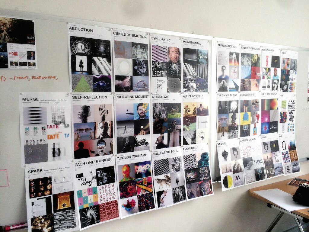
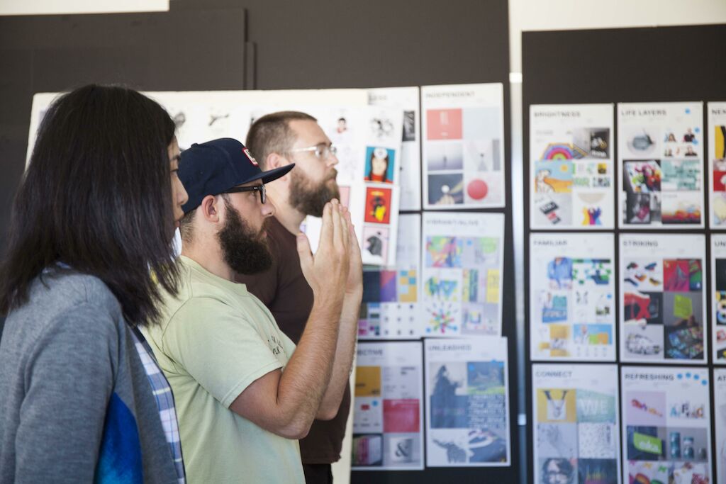
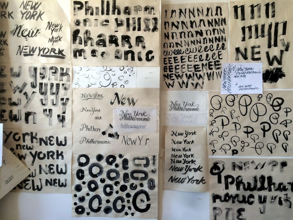
We decided to take over one of our conference rooms. We moved our desks in there and worked all day Saturday, Sunday, and Monday. We were flying to New York on Tuesday. We ended up with 18 directions that we liked and put them into six buckets that we felt interpreted the strategy in a number of different ways.

Nyp_style_boards

HR: Once we were selected as the agency, what was the brief?

LG: They had a line at the end of their brief — ”to be transported by a rush of sensation and emotion” — and that was our guide for everything. The logo, the brand, everything really needed to express and evoke it in some way. We all looked at that and crossed our eyes, because that’s a pretty tall order to summarize in a quarter-inch black-and-white logo.

Nyp_2

HR: How would you describe the way the client was evaluating the designs? What did it seem they were looking for?

LG: We had three main clients we were working with throughout the process. They all had different directions. They reacted to different things, from ”Is this practical?” to ”Does this go with the brief?” to ”I just like it.” There were some directions that were just a very personal choice. In the third round we had a brushstroke logotype, and even though they told us very specifically not to do anything like that, we all just loved it.

Part of how we work is we want to surprise clients and show them things they didn’t think could be there. It’s not just about satisfying with what they expect. We were really trying to explore all aspects. They talked a lot about the precision, that it’s sophisticated, high-end. They do a lot of outreach, a lot of kids programs. They do a lot of movies, a lot of general pop culture. But also they’re the New York Philharmonic — the history and knowledge and everything that goes with that. So there were different aspects that we were trying to explore and figure out. Which should we turn up or down? You can’t turn the volume up on everything. It just becomes chaos.

HR: Maybe you could talk a little about testing.

LG: We had gone through a number of rounds where we were staging things on brochure covers, and doing full systems, and some things made it to the second round from the first initial tissue session. The second round we presented eight full brand directions. We played around with the website, brochure covers, banners, collateral, newspaper ads. What are the illustrations? What is the photography style? We did a lot of exploration around imagery style.

We eventually narrowed it down to five brand directions and logos, all completely different than the next. They loved every single one of them. We got down to four. They set up the testing online. There was real-time feedback. We could see what everybody was liking, or loving, or hating.

The direction they eventually chose got unusually high approval. We had certain ones we thought would be number one and number two. We were really surprised at people’s responses.

HR: Why do you think the final direction was favored?

LG: I think it embodied a lot of the things that the philharmonic was looking for. The big thing that they wanted was a sense of openness and this sense of ”I’m going to have an exciting evening and be transported in this way.” They wanted something that would evoke that rather than “I’m going to get dressed up and sit in a chair and I should be quiet.” These are live performances. When you’re there, anything can happen.

Metadesign_new_york_philharmonic_banners

Hozy Rossi is a creative director at MetaDesign San Francisco.