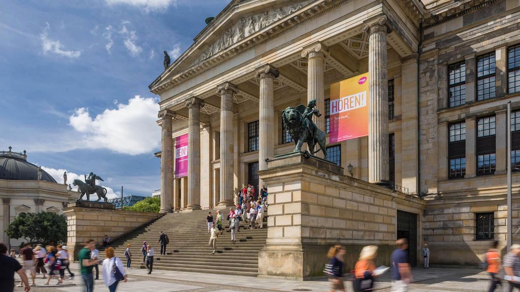
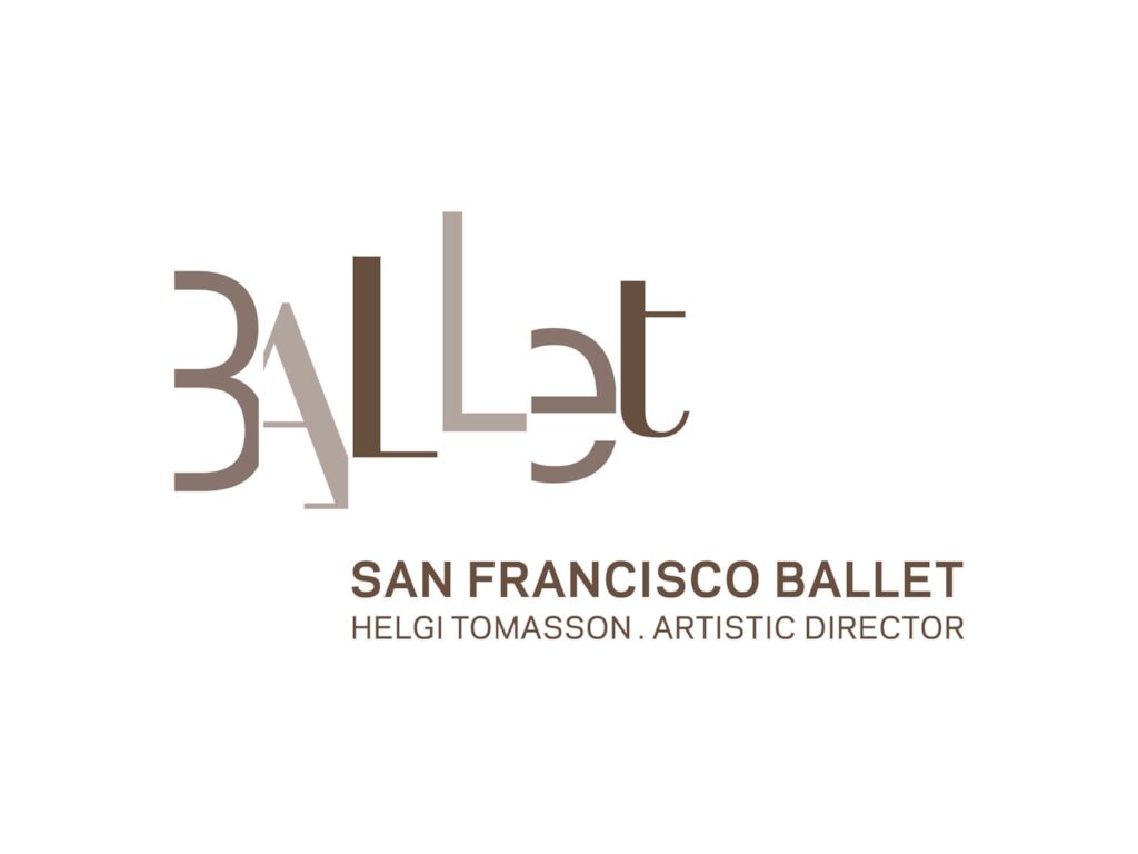
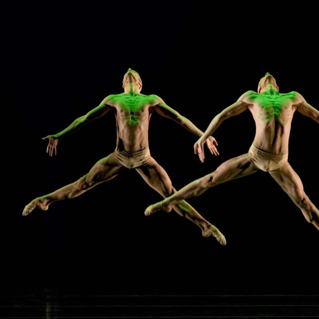
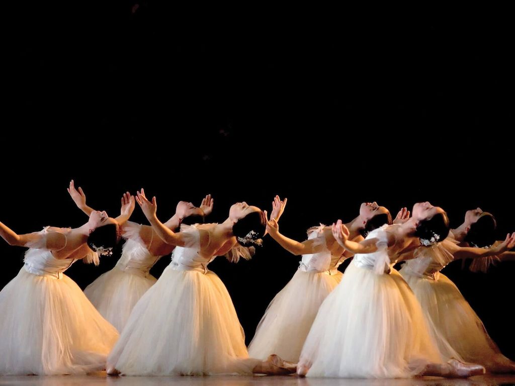
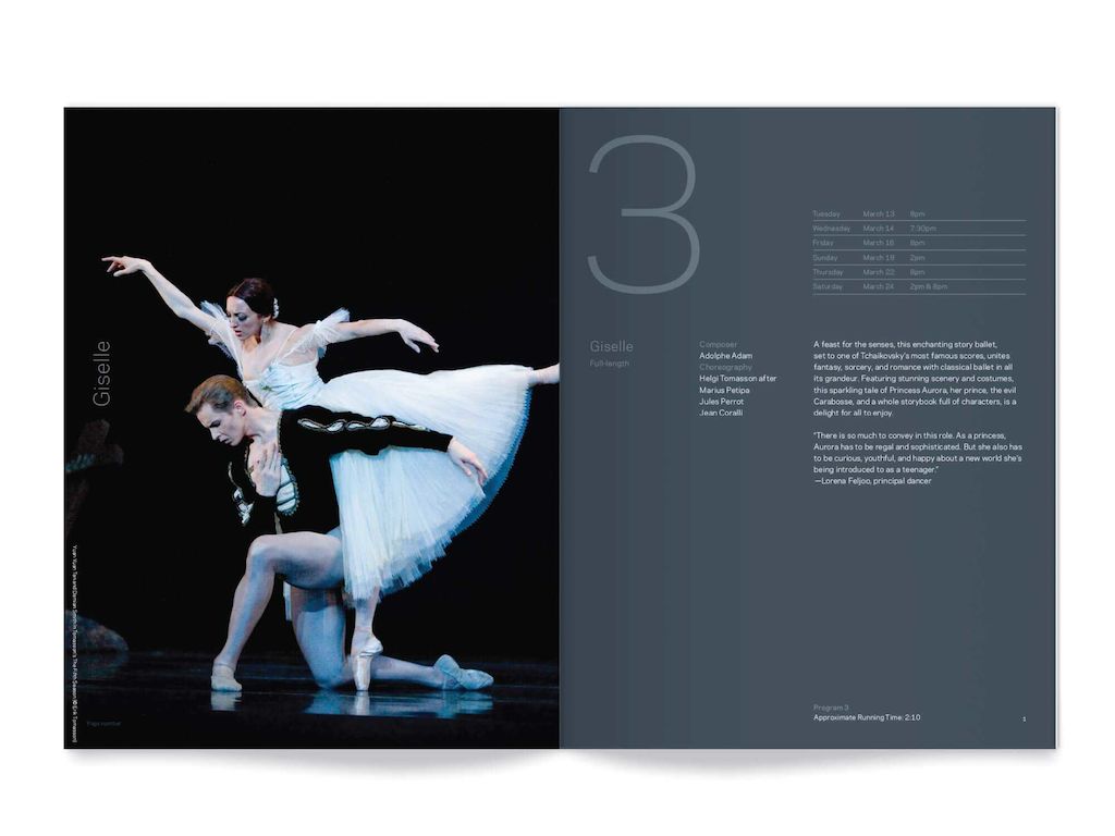
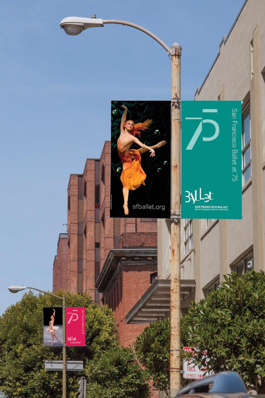
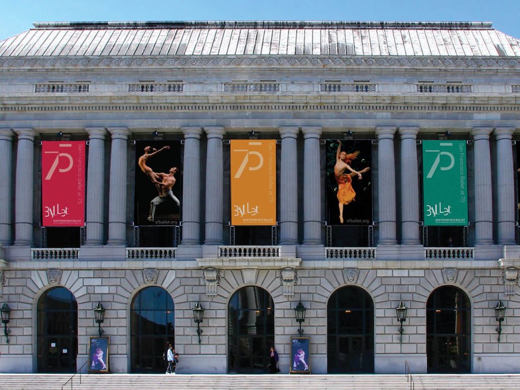
The rebranding aimed to reinforce the international reputation of the company and position it for the future. Our team of creatives worked in collaboration with artistic director Helgi Tomasson to create the identity system. The strategic idea behind the logo was to highlight the dance company’s repertoire and establish the ballet as an ‘exciting and cultural destination’. The logo combines elements from the traditional 19th century typeface Didot with the contemporary Galaxie Polaris. So, it was about honoring the past and infusing it with the future whilst acknowledging the present. There was a discussion around taking the traditional ballet art form and bringing to it a new, contemporary experience to represent the company moving forward. Elements of the logo are ‘choreographed’ as if on a stage, and the letters are ‘orchestrated’ to suggest the dynamic nature of the ballet art form. It highlights aspects of production lighting and shadows created on-stage through the use of a grey colour palette.

San Francisco Ballet
The audience for America’s oldest professional ballet company isn’t getting any younger.

需要更多信息?
联系 MetaDesign San Francisco mail.sfo@metadesign.com +1 415 293 23 40
