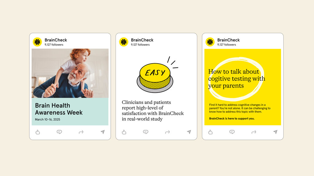
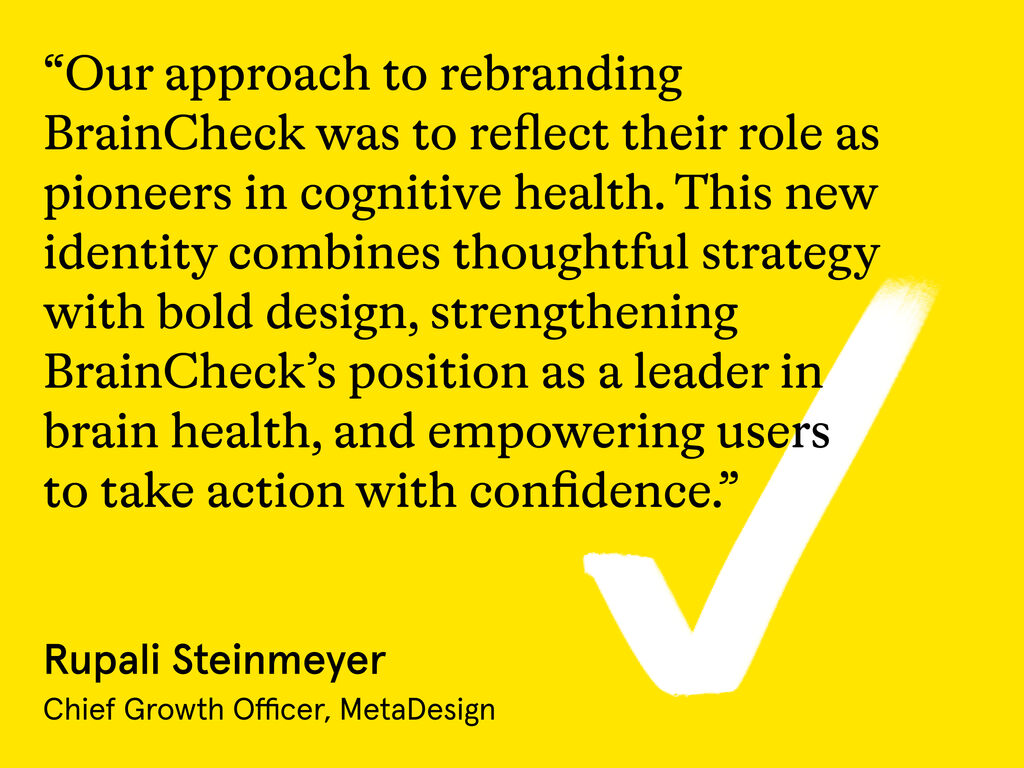
MetaDesign embarked on an extensive analysis of BrainCheck’s unique offering, market position, and the needs of its diverse user base. This strategic groundwork paved the way for a new brand strategy and identity centered on a bold purpose: “Check the brain, free the mind.” The strategy called for a design that would increase brand awareness and encourage doctors and healthcare professionals to engage with BrainCheck. The design needed to cut through the noise of a highly competitive cognitive health landscape and be noticed. Through the use of bold graphics, confident language, and a distinctive color palette, BrainCheck’s new brand achieves this cut-through while inspiring optimism and hope. MetaDesign brought this inspiring strategy to life by creating an all-new brand identity, including a redesigned logo, a vibrant color palette, and cohesive imagery, icons, and illustrations. A digital-first approach was paramount, ensuring a seamless and engaging experience across all platforms. The comprehensive rebranding, including an enhanced website, not only rejuvenates BrainCheck’s market presence but also underscores its commitment to advancing brain health for all generations, creating a movement toward proactive brain health management.
BrainCheck
Powering a new era for brain health
BrainCheck, an ambitious startup based in Austin, Texas, is at the forefront of digital cognitive health innovation. Their mission is to empower providers, patients, and people across generations to take action for earlier, better, and longer brain health. Despite BrainCheck’s innovative solutions, the brand identity no longer reflected its pioneering spirit and the urgent societal need for cognitive health awareness and action. This disconnect called for a comprehensive rebranding initiative to realign BrainCheck’s image with its groundbreaking mission and future ambitions. Recognizing this need, BrainCheck approached MetaDesign to develop a strategic vision grounded in extensive research, encompassing both external market insights and internal employee perspectives. This partnership presented a real opportunity to create something impactful, improving the detection and management of life-changing cognitive issues like Alzheimer’s disease.
A symbol of change
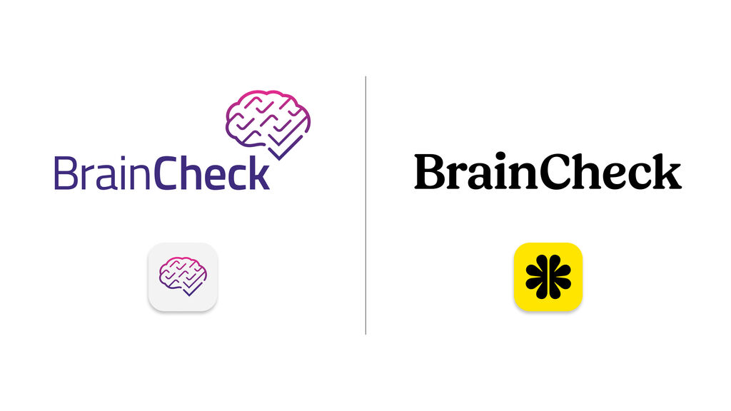
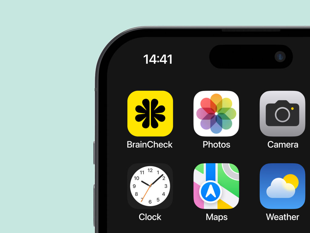
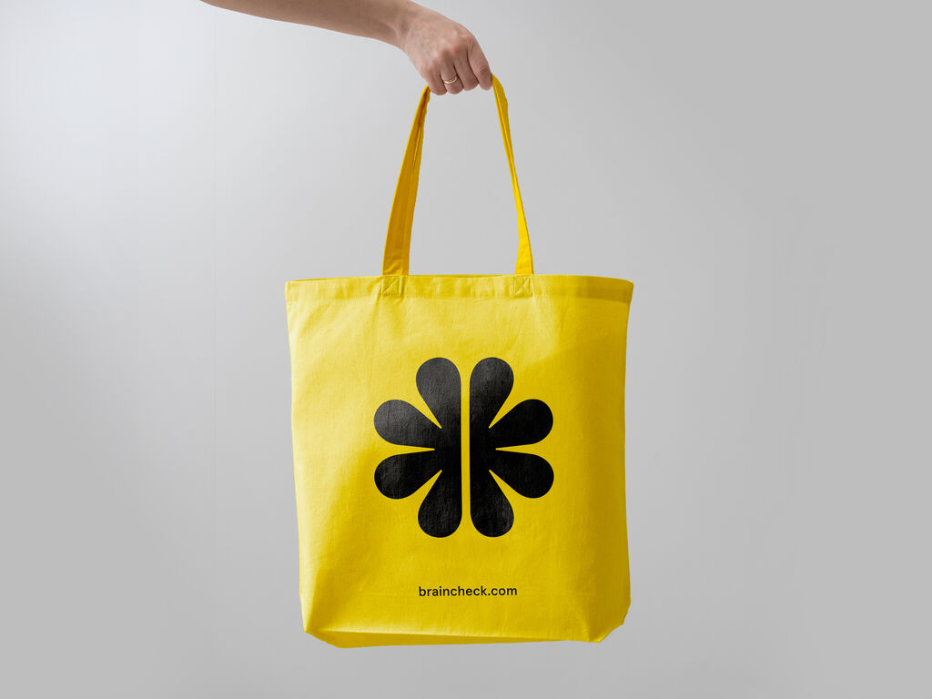
The most iconic new element of the updated BrainCheck brand is the BrainPower symbol. Alluding to the human brain in a gestural, simplified form, the BrainPower symbol also speaks to the wider hopes and possibilities around cognitive health—the blossoming of ideas and innovation, the convergence of partnerships and community, and the duality of the medical field and the public at large. It is a burst of energy that empowers people on their brain health journeys and a beacon of optimism for what’s yet to come.
The redesigned BrainCheck wordmark balances classic and contemporary aesthetics, conveying both credibility and approachability while enhancing the impact of BrainPower. Together, the wordmark and symbol form a cohesive brand identity that is refreshing and reassuring, amplifying BrainCheck’s commitment to using technology to make cognitive health testing easier and more accessible to people everywhere.
A fresh approach to accessible design
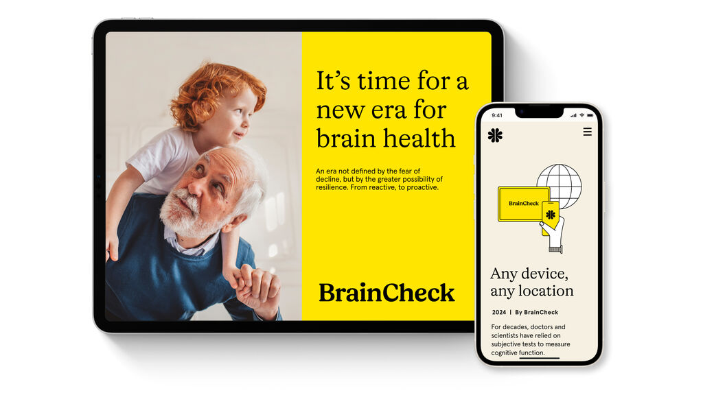
In today’s digitally-led world, functionality and accessibility are essential aspects of any successful brand design. The UI design for BrainCheck was built with numerous key users in mind: busy healthcare professionals, information-seeking carers, and the patients themselves. Since cognitive healthcare issues disproportionately affect older people, it was crucial to keep them front of mind. Accessibility played an essential role in everything we created from the very beginning. We developed an intuitive, responsive, and engaging online experience to meet the most rigorous standards of website design. Rebuilding BrainCheck’s website from the ground up, we ensured a cohesive visual identity across all platforms, promoting consistency and recognition.
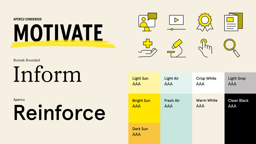
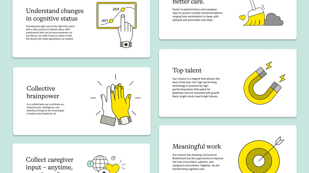
The modular design system is adaptable, supporting future growth and new features. Our carefully selected color palette and brand fonts meet AAA accessibility standards. Large icons, pictograms, and illustrations add to the design, making complex information easier to understand and more enjoyable to read, which helps people of all ages feel confident navigating the site. Additionally, the website incorporates numerous animations and intelligent interactions, enhancing the user experience and making it more dynamic and enjoyable to use. This thoughtful approach not only boosts brand credibility but also fosters greater user interaction and exploration, aligning perfectly with BrainCheck’s mission to make cognitive health testing easier and more accessible to everyone.

The result
This rebranding successfully rejuvenated BrainCheck’s brand identity, ensuring renewed relevance in the digital health landscape while striking a careful balance of clinical credibility and an emotional rally cry. The refreshed logo, vibrant color palette, and cohesive visual elements collectively reinforce BrainCheck’s mission to advance cognitive health and empower action. Rebuilding the website from the ground up, we created an intuitive and responsive online experience that meets rigorous accessibility standards, while at the same time delighting users. This strategy-led transformation not only solidified BrainCheck’s market presence but also amplified its commitment to advancing the brain health journey, marking a significant step forward in the brand’s evolution and potential to bring hope to millions.

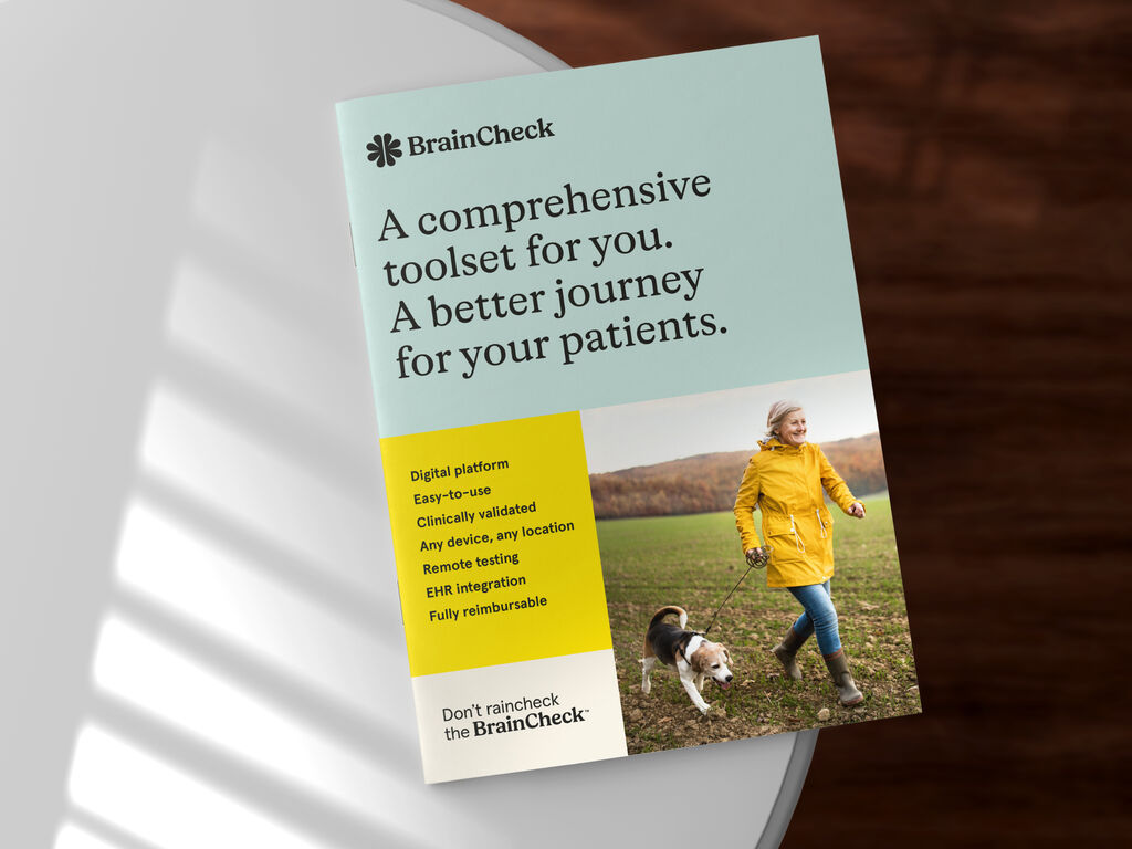
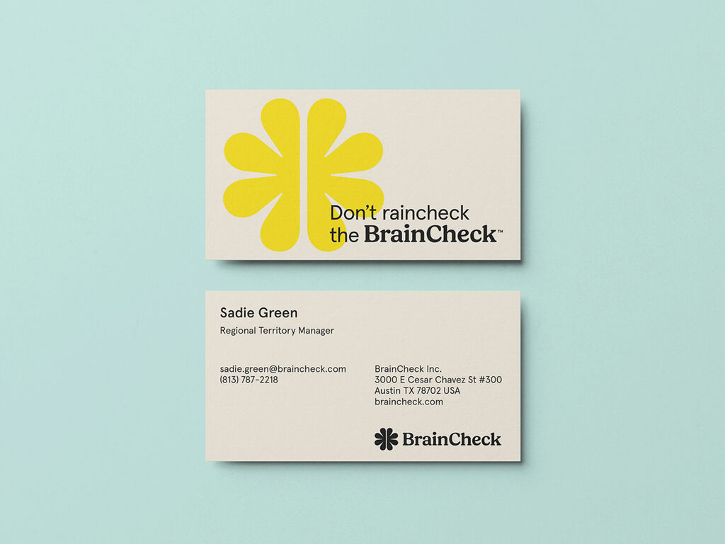
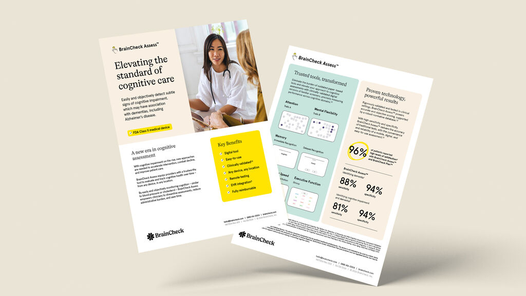
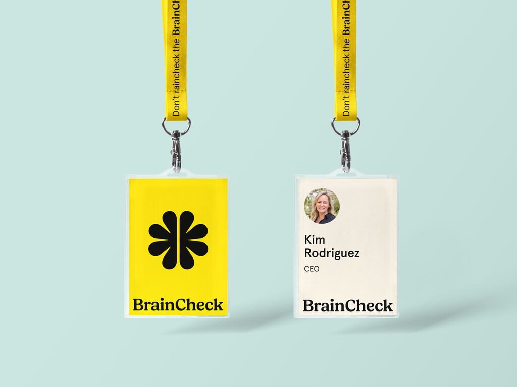
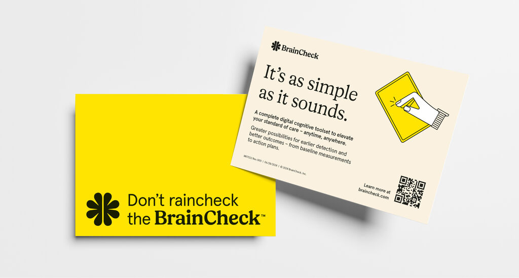
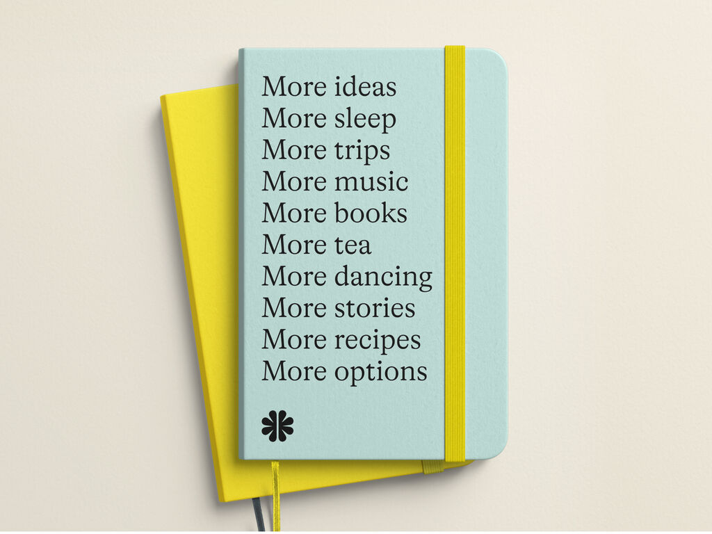

The refreshed BrainCheck brand made its public debut at the Alzheimer’s Association International Conference (AAIC) in Philadelphia on July 28, 2024, launching this new identity to a global audience of industry leaders. This event was the perfect opportunity for BrainCheck to demonstrate how its new brand symbolizes a leap forward in the neurocognitive field, highlighting the crucial role of innovative digital solutions in the future of cognitive health testing and reinforcing BrainCheck’s mission to make early detection and care-planning accessible to all.
Don’t raincheck the BrainCheck
Awards
Transform Awards North America 2025 (Best Brand Evolution (Business) & Best Visual Identity from the Healthcare and Pharmaceutical Sector)
Red Dot Design Award 2025 (Brand Design)
需要更多信息?
联系 MetaDesign Berlin
