Modern Advertising: There is a very interesting trend that increasingly more brands in China and abroad changed their logos in a simpler way or more streamlined form, what does MetaDesign think about this?
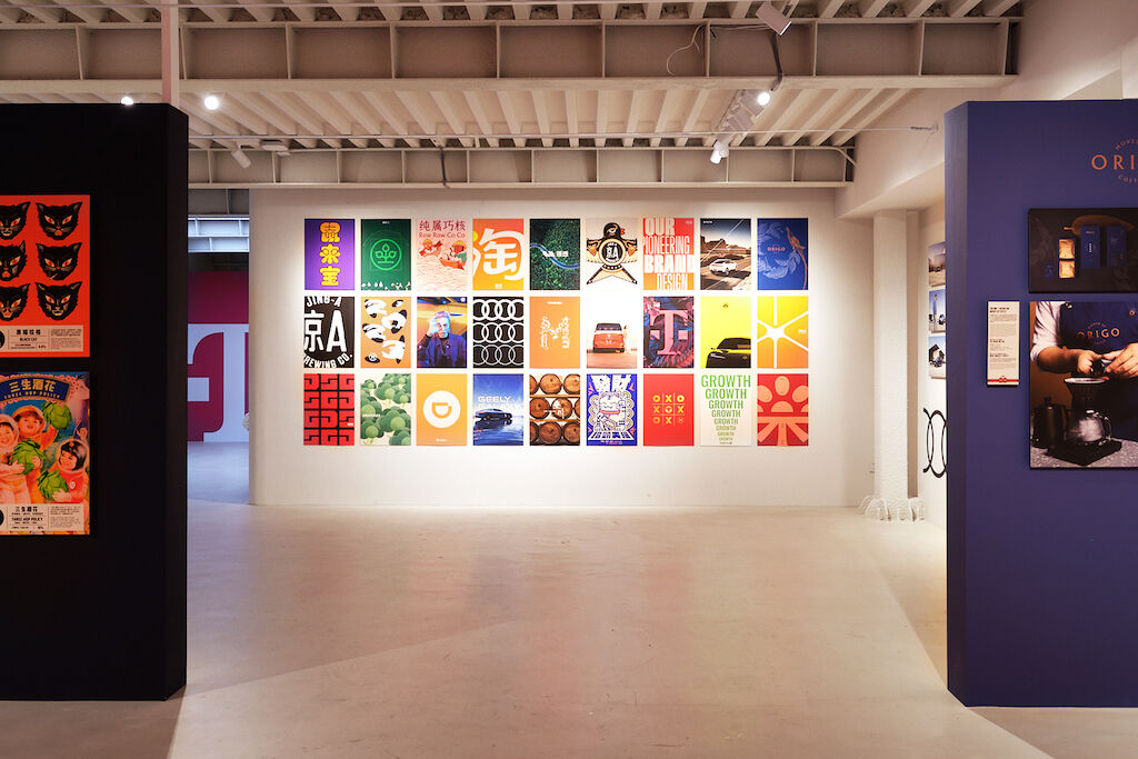
Daniel Leyser: The reasons for this trend are understandable, as from my point of view they are primarily of a pragmatic nature. Simple logos are easier to adapt to different media and are more scalable, especially in digital media. Moreover, this minimalism seems to have taken hold as a kind of global commons sense in terms of aesthetics, because minimalist design usually stands for clarity, modernity, etc., values that many companies try to occupy and thereby express in this way. The flip side: a logo often has history, origin, there are sometimes good reasons why it has a certain design complexity, which in sum also gives it character. One risk can be losing this character and joining the mass of generic logos by following this trend. This is where designers have to be very sensitive when it comes to adapting existing logos. Simplicity is by no means the only way to succeed, and above all it is not always the right way.
Sally Anderson: This development is primarily technology-driven. In the digital world, flat design is a fundamental design principle. There are very different reasons that can lead to such an implementation, combined with very different objectives. With the logo update we designed for Taobao, for example, we explicitly wanted to make the brand appear younger and more attractive to the younger generation. At Volkwagen, on the other hand, the reason for a flat design was, among other things, to correspond to the product design, which offers neither conceptual nor formal space for a three-dimensional logo.
