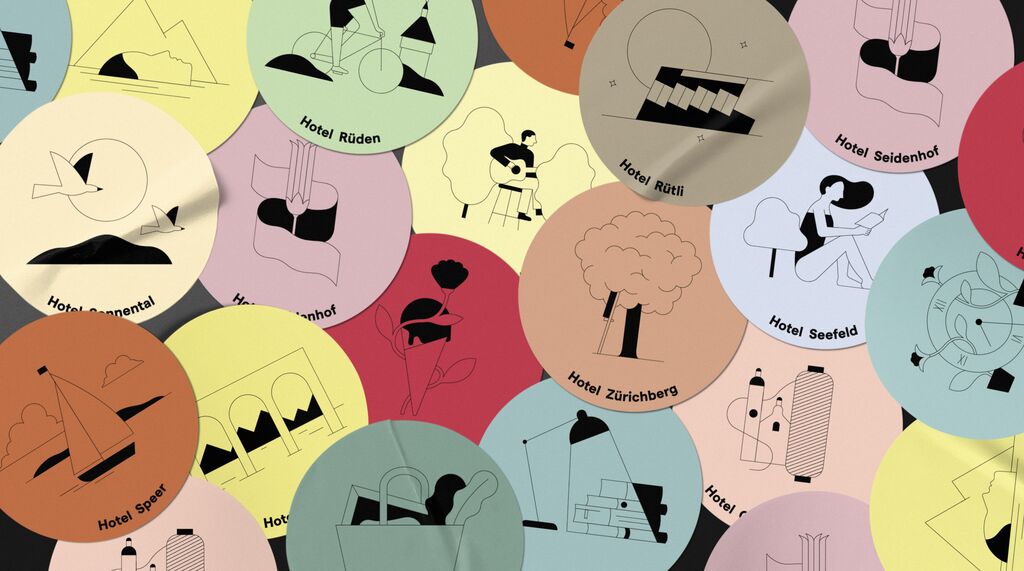
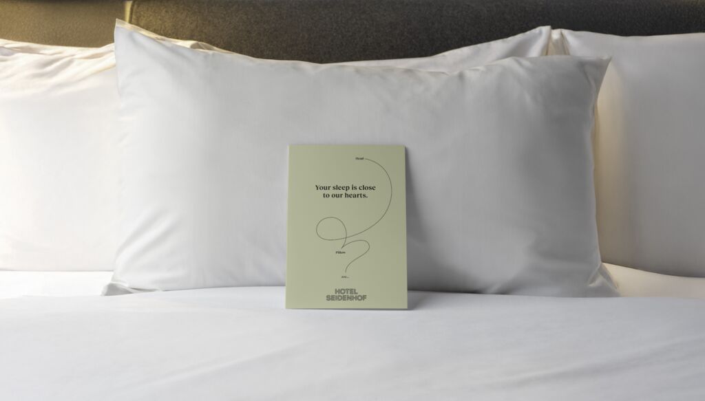
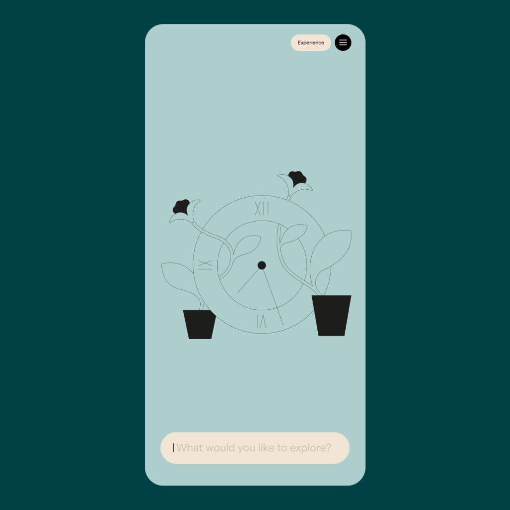
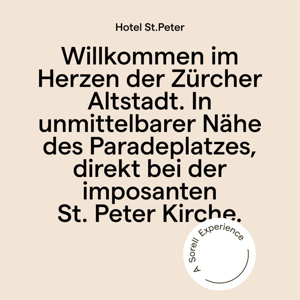
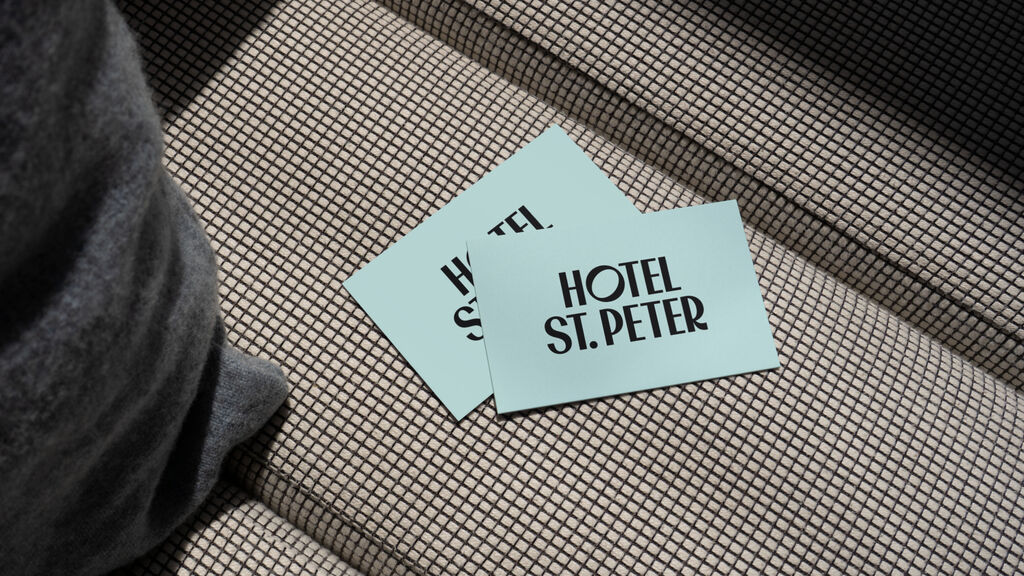
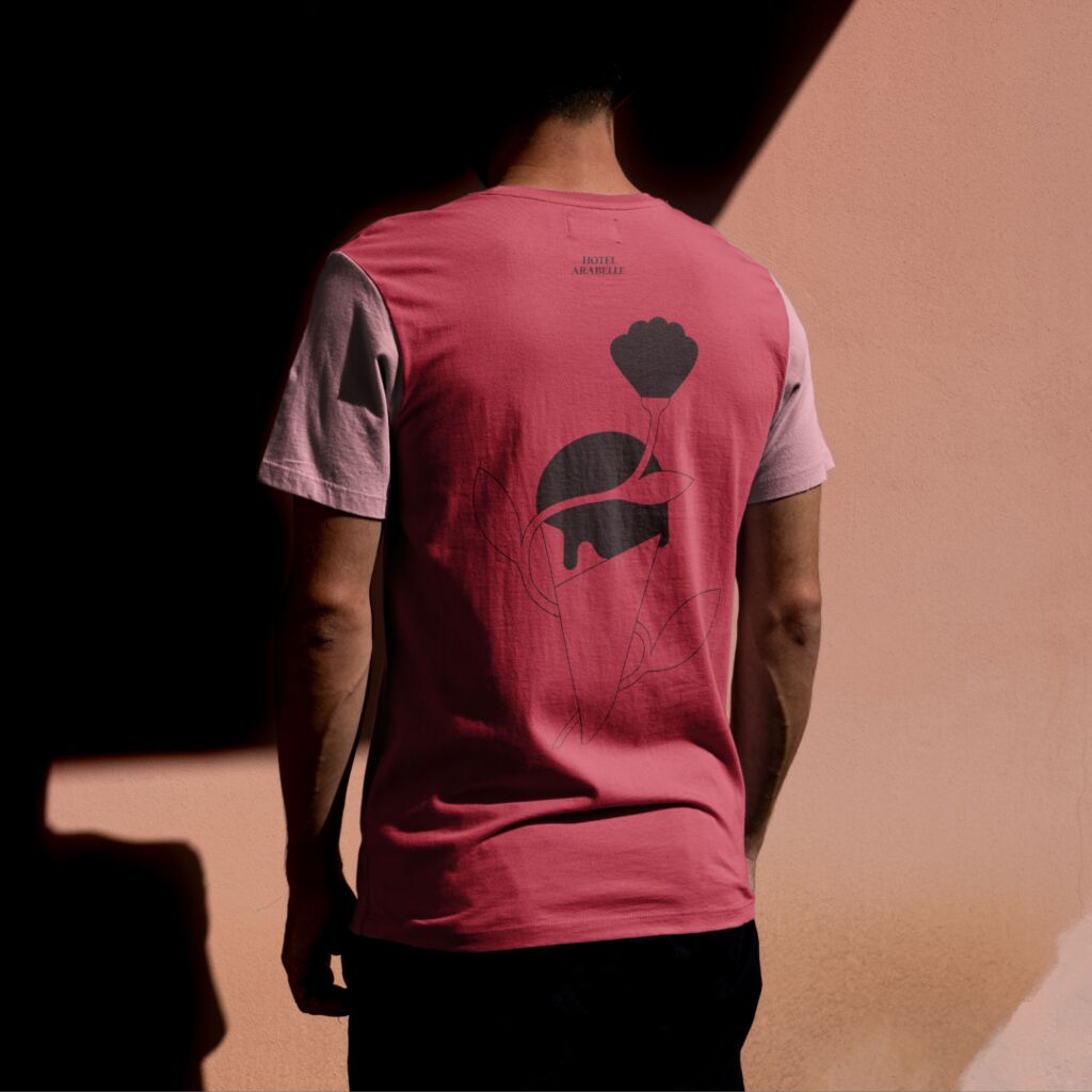
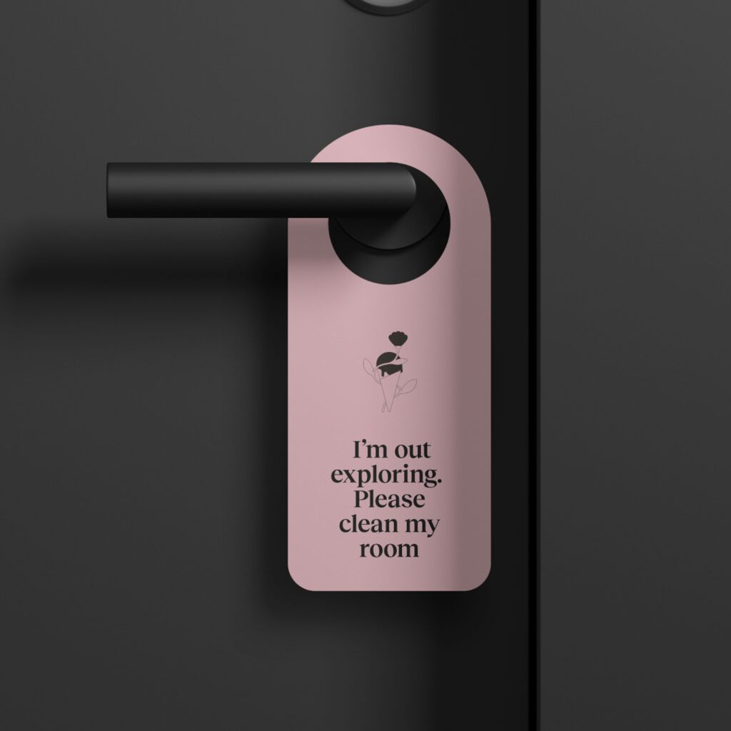
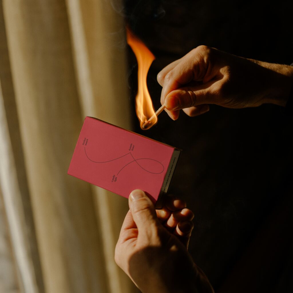
MetaDesign has translated this strategic direction into the Sorell experience with the creative guiding principle ‘at the pulse of life’. The central element is the new Sorell logo: the striking dot in the ‘r’ of the word mark positions Sorell as the center, platform and stage in the midst of the lively hustle and bustle of a city or neighborhood for guests and residents alike. In terms of color, Sorell deliberately stays in the background with shades of sage. At the same time, each of the 15 experience locations is given space to play with its own colors and set harmonious accents. Individual logos, a unique font and a specific illustration style with subjects inspired by personalities, the surroundings or special features of the respective location round off the Sorell experience.
Sorell
For experiences that last
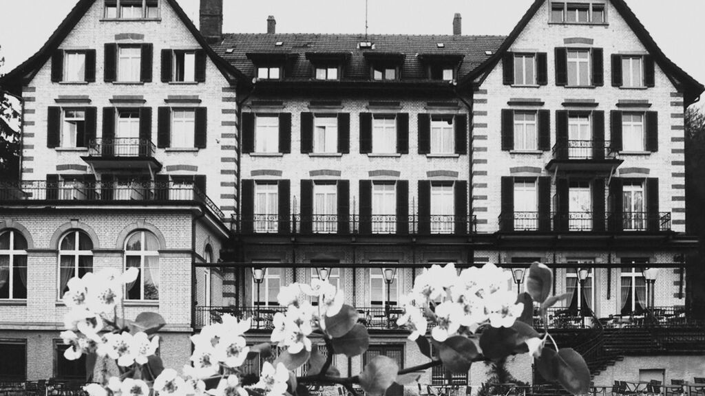
15 personally managed hotels in eight Swiss cities: This is Sorell, the largest owner-managed hotel group in Switzerland. As part of the ZFV-Unternehmungen (ZFV) co-operative, founded in 1894 by Zurich bourgeois women, Sorell has always stood for meeting places where the values of society, health, sustainability, inclusion and innovation are upheld. In future, Sorell will consistently pursue the goal of being an open place of experience for travelers and the local population alike - always with an individual boutique character.
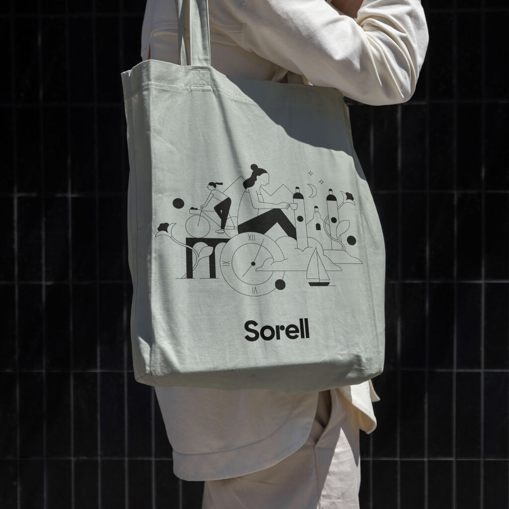
索瑞尔Sorell精品酒店均精心设计,并注重细节、历史和在地环境的融合。每家酒店都个性化地将自身的特征融入设计,将极具代表性的建筑融入进自身标志。
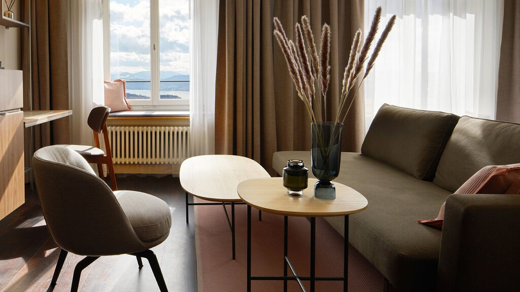
在品牌颜色方面,索瑞尔Sorell特意采用浅灰绿色作为品牌背景主色,其灵感源自于室内设计。与此同时,我们精心定义每个关键插画的主题,以反应出酒店内外独特的体验。
字体和插画风格作为统一的视觉元素,在索瑞尔Sorell的体系中和谐一致地呈现。其插画风格通过使各个主题相互交织,进一步强化了其带给受众的身在其“中”的感觉。
Need more information?
Contact MetaDesign Zürich