Henkel

Video is loading…
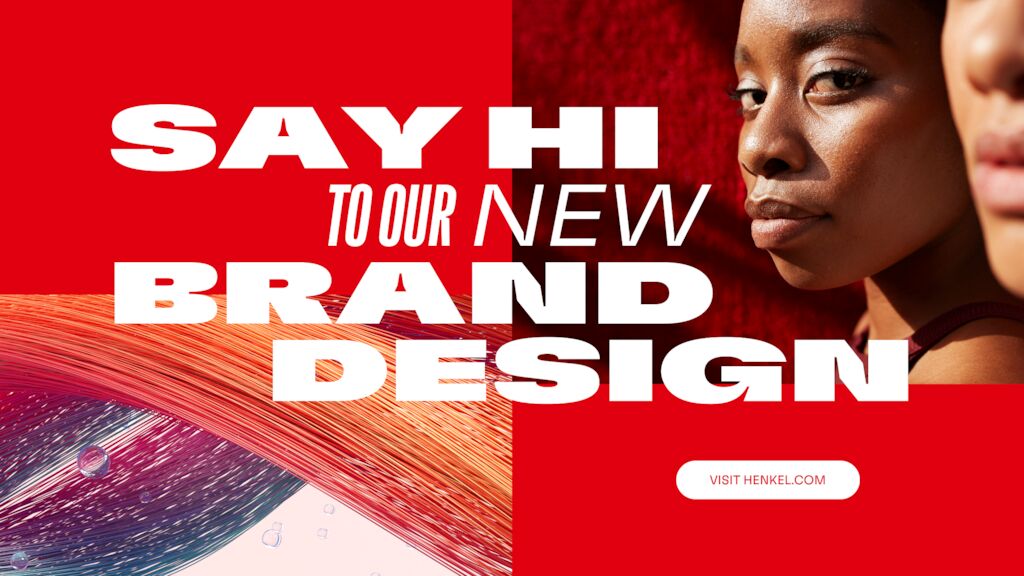
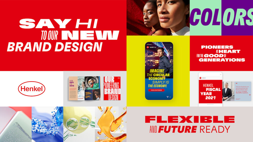
A truly pioneering brand design
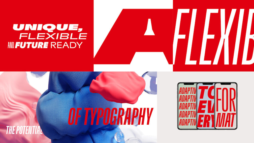
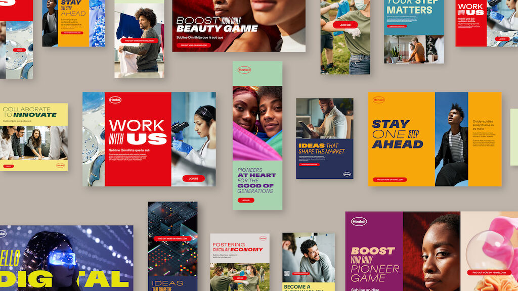
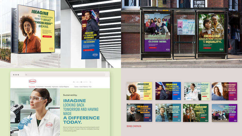
While always expressing Henkel’s pioneer positioning the new visual identity offers a high level of flexibility. It can be seamlessly tailored to any business or audience need – from focused to expressive communication.
The identity modernizes the brand without giving up what makes it recognizable: the iconic Henkel logo, which has stood for Henkel’s quality for more than 100 years, and the core colors red and white form the foundation of the design. Always showing that Henkel is transforming and determined to move forward without losing touch of its heritage.
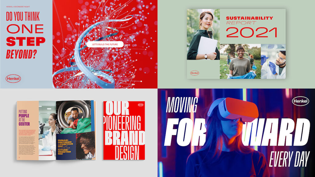
Freedom within a framework

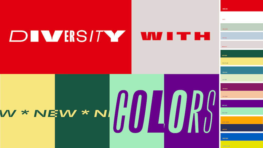
Freedom within the framework
The integrated brand architecture creates a clear framework while providing a high degree of flexibility for the interaction between the Henkel brand, the two future business units, Adhesive Technologies and Consumer Brands, and their product brands, as well as all Henkel functions and initiatives.

"The Henkel brand expresses who we are, what we stand for and what we do to different target groups worldwide. That’s why a strong corporate brand with global recognition is important, not only for us, but for all our stakeholders."
Awards
German Design Award 2023 (Excellent Communications Design - Corporate Identity)
iF DESIGN AWARD 2023 (Communication Design - Company Branding)
German Brand Award 2023 (Excellence in Brand Strategy and Creation / Brand Design - Corporate Brand)
German Brand Award 2023 (Excellence in Brand Strategy and Creation / Brand Revival of the Year)
Red Dot Design Award 2023 (Brands & Communication Design / Brands / Other)
Red Dot Design Award 2022 (Brands & Communication Design / Communication Design / Corporate Design & Identity / Corporate Design)
Need more information?
Diana Brix mail.dus@metadesign.com +49 30 59 00 54 0