Our process
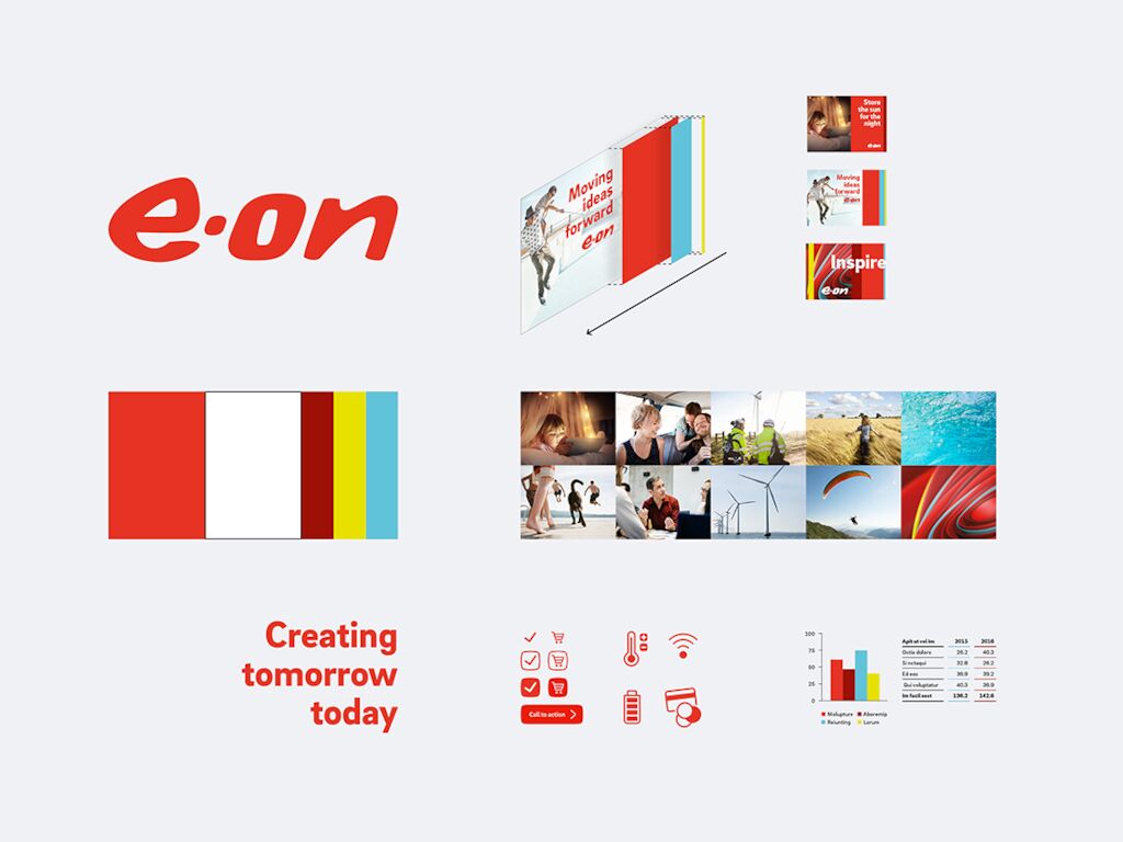
In close collaboration with the client and considering both strategy and design, the right balance between existing and new brand elements were defined. Due to the circumstances in 2020, the process took place in a solely virtual setting. We see this as proof that in the digital age, collaboration across national borders is easily possible and can produce outstanding results, even for complex projects.
In order to ensure efficient implementation of the brand identity, a proprietary brand management system developed by MetaDesign provides a convenient working basis. All necessary resources are available online anytime and are always up to date.
Our solution
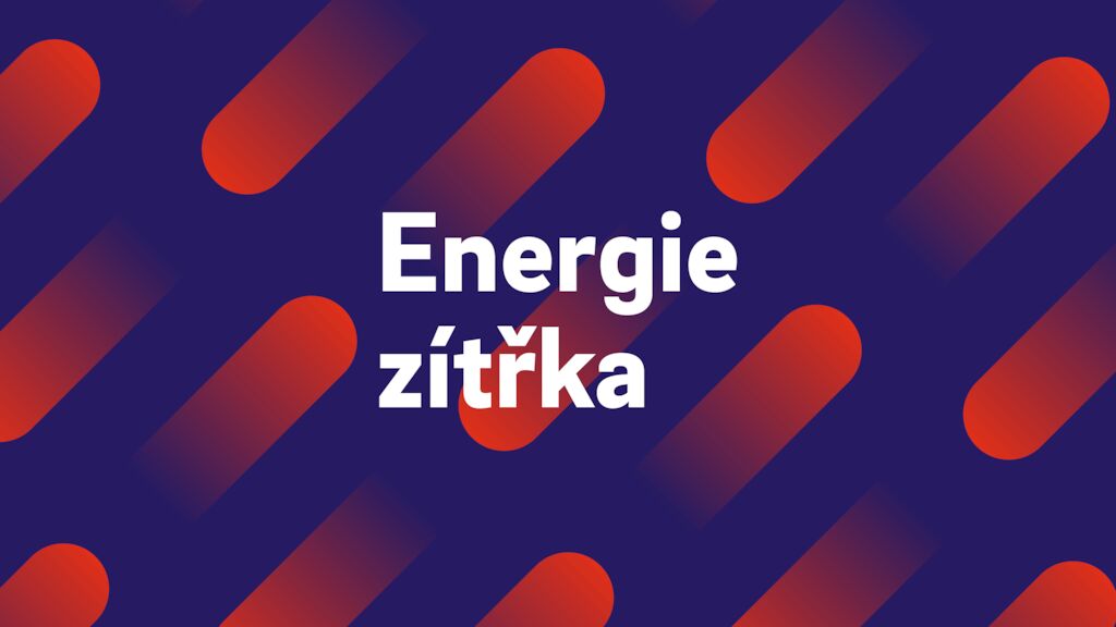
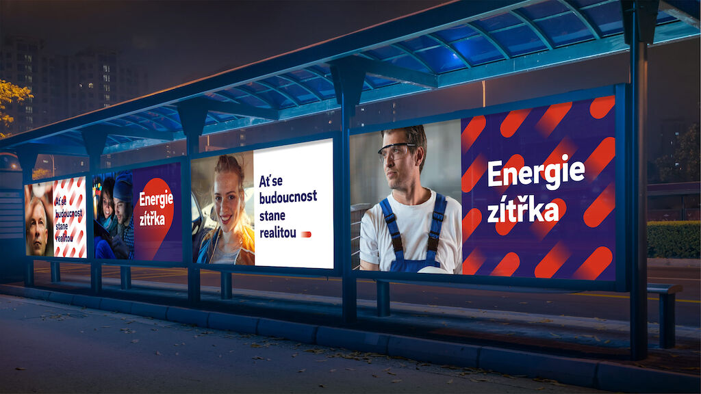
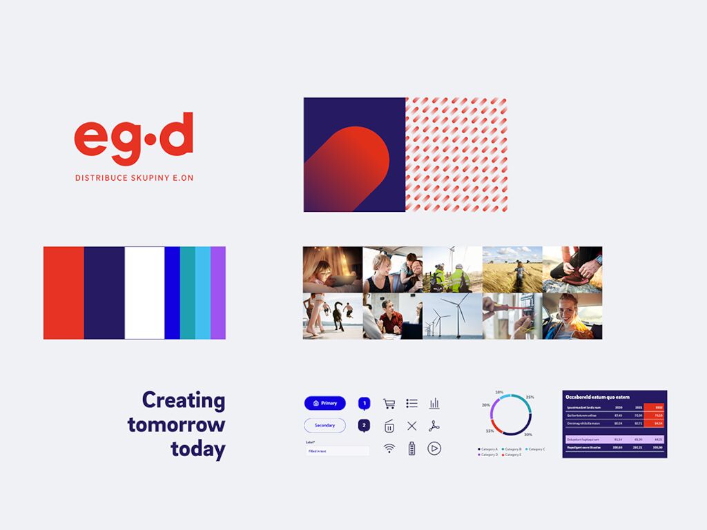
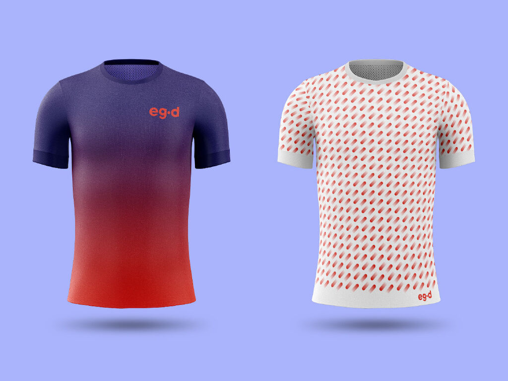
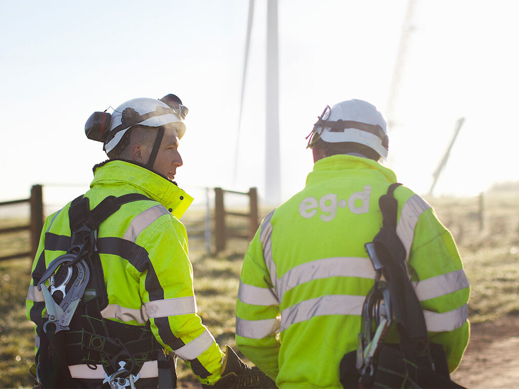
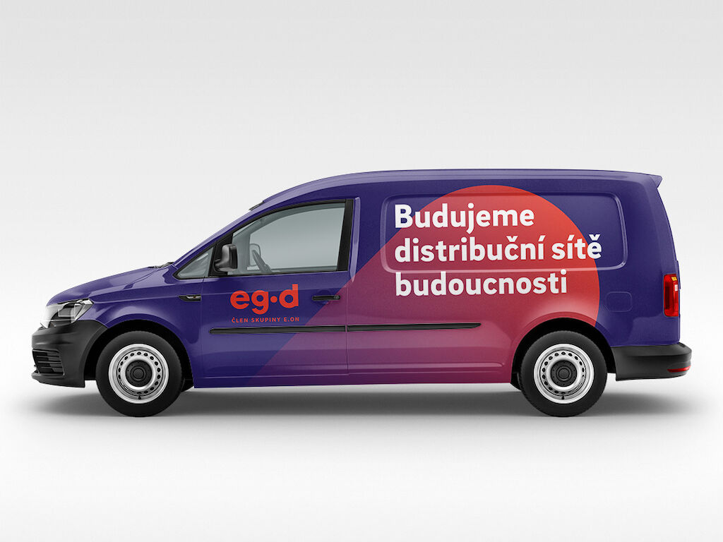
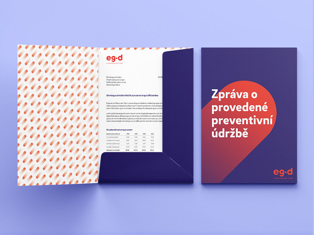
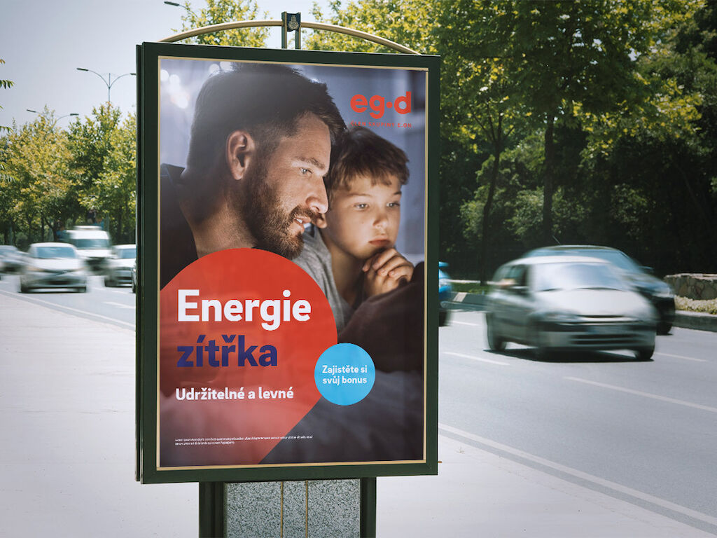
The result is a unique, contemporary identity that displays an implicit link to the umbrella brand. While the primary color, typography and imagery signal the affiliation to the E.ON Group, the “Accelerator” creates a an outstanding key visual. As a dynamic brand element, it visualizes the flow of energy and thus refers to EG.D’s core business - the operation of electricity and gas networks. Depending on the context, the Accelerator can subtly accompany communication or ensure maximum recognition value through eye-catching applications.
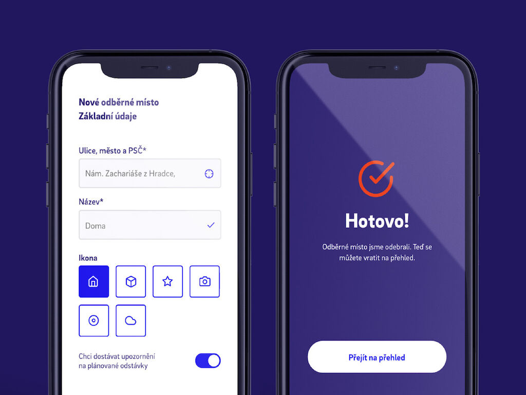
An extended color palette optimized for digital applications and a comprehensive UI kit ensure versatile use across all relevant touchpoints.
