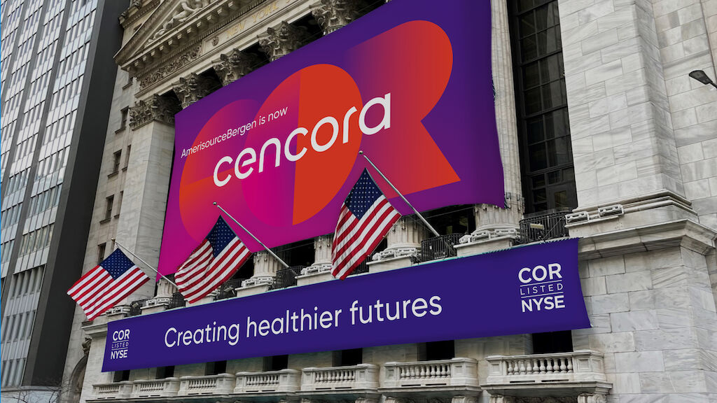
The new company brand reflects the differentiated and innovative value Cencora brings to its customers, associates and global healthcare marketplace.
After the past few years of pandemic, Cencora's goal of creating a healthier future has never been clearer. As a leading global healthcare company, with a foundation in pharmaceutical distribution and solutions for manufacturers, pharmacies and providers, they create unparalleled access, efficiency and reliability for human and animal health. The unwavering dedication of their 22,000 global associates impacts the health and well-being of people and communities everywhere.
The new brand reflects the role of the company within healthcare and boldly expresses who they are what they stand for.
As we look to the future, we acknowledge our strong legacy and celebrate our innovative spirit to move health forward.
The multi-year, branding evolution process included in-depth analysis among internal and external partners. Our systematic and sustainable approach to branding with a design-centric mindset is at the heart of the assets we created.
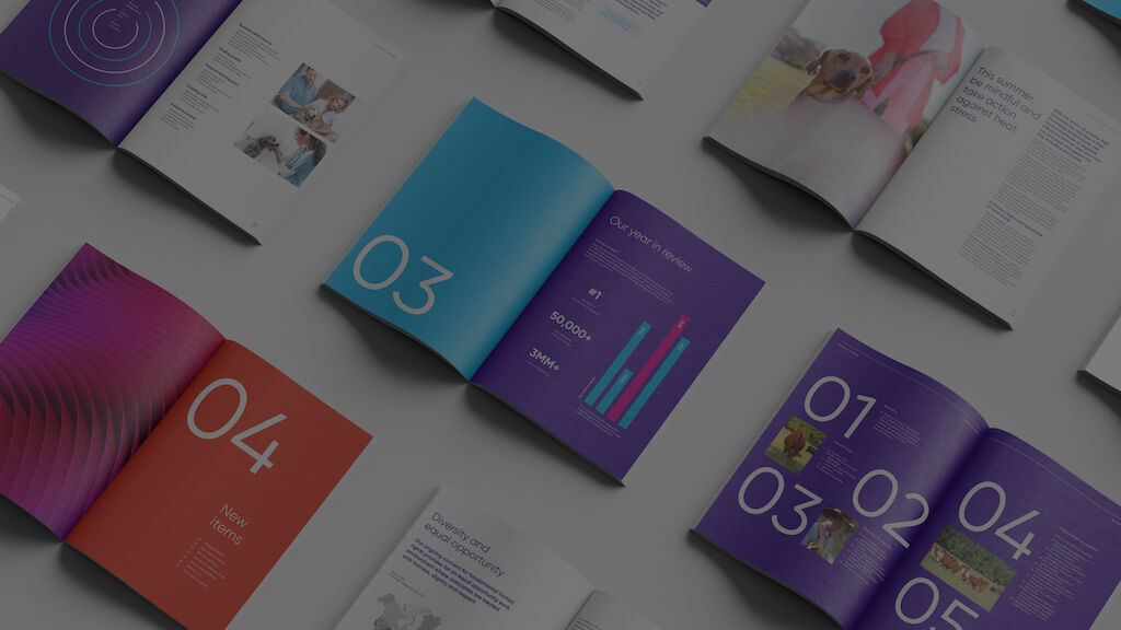
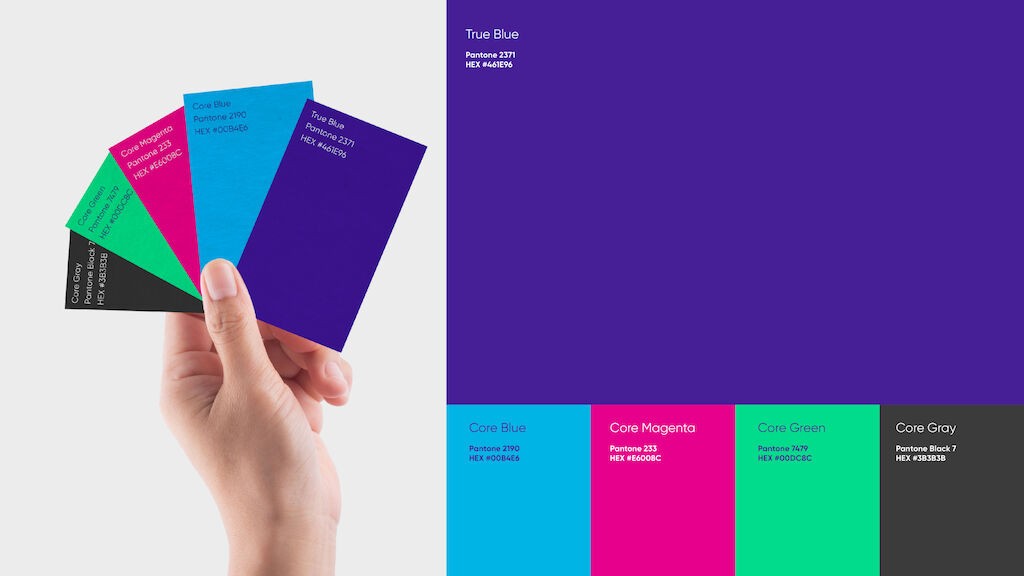
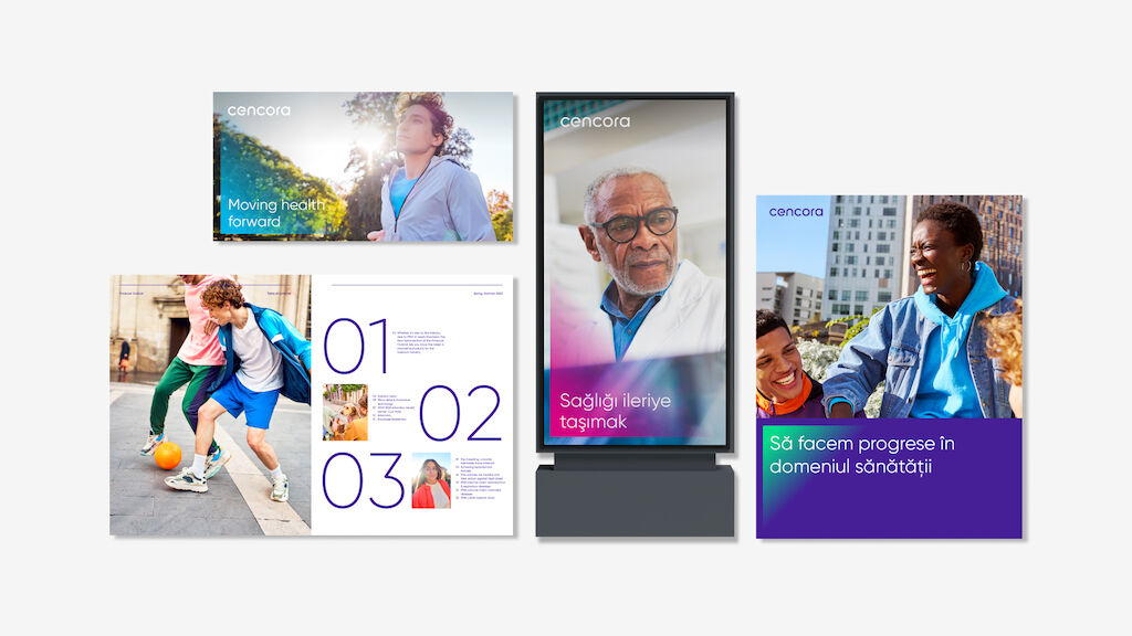
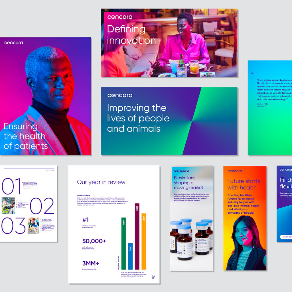
Building trust from the inside out and creating a differentiated offering in the healthcare market were among our goals to deliver a unique experience for this Fortune 10 healthcare company. Each brand element - including type, color, imagery, and graphics - was carefully designed with a specific intention and alignment to overall business objectives, and the outcome is a fitting and sustainable translation of strategy in design.
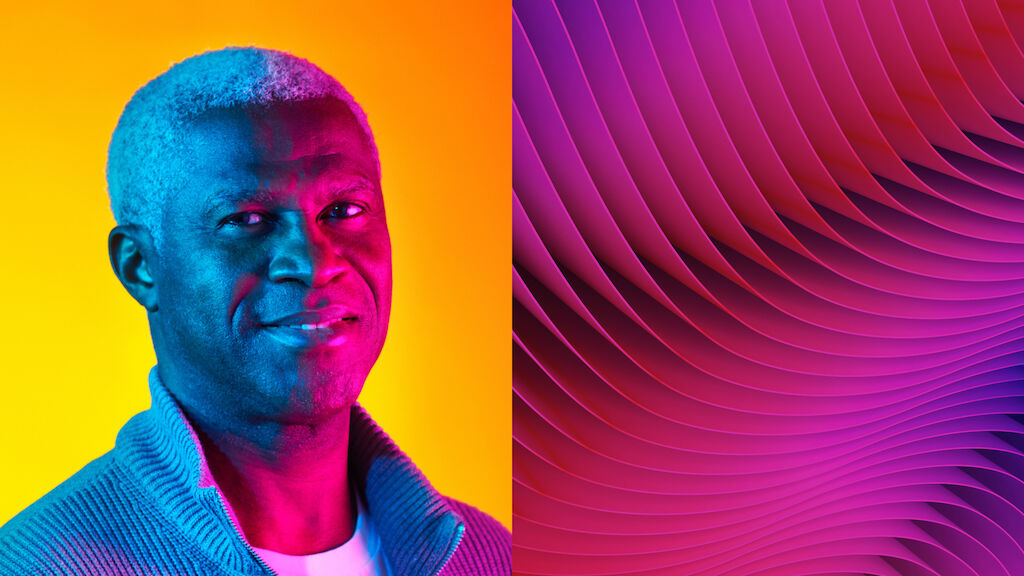
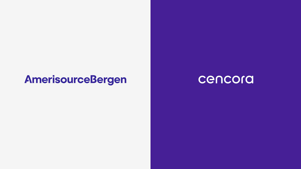
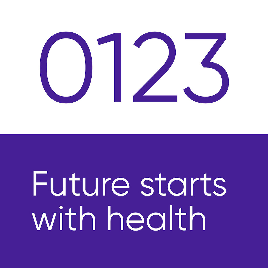
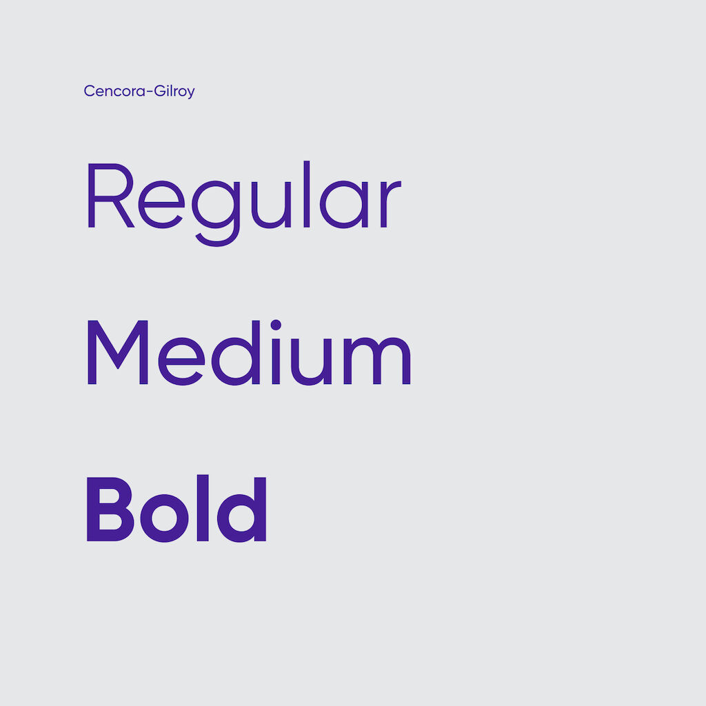
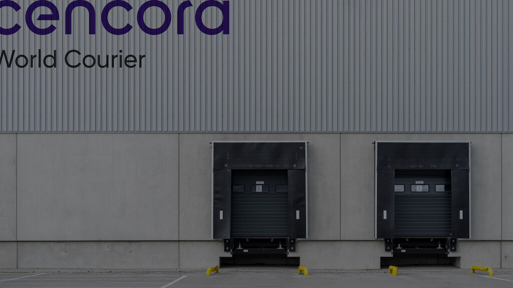
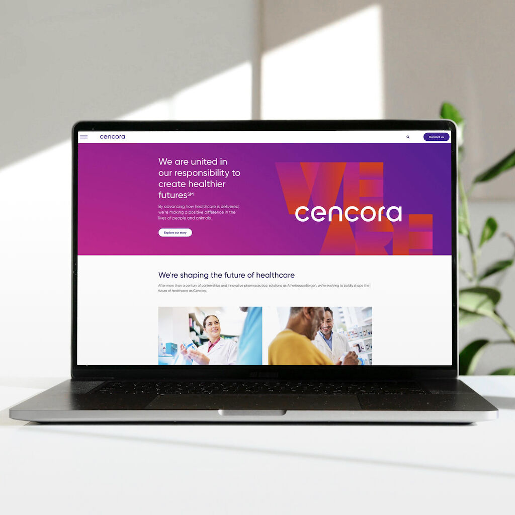
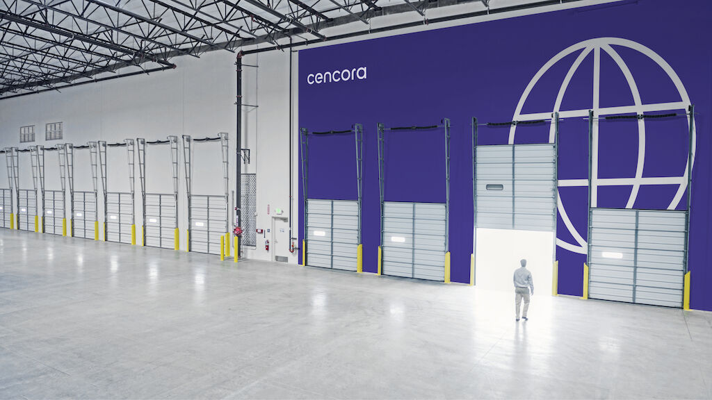
The new brand is driven by a spirit of innovation with a design that is energizing, confident and inspiring. The vibrant colors, dynamic gradients and powerful imagery evoke a radiant and bright experience. The new Cencora Gilroy font features a modern design-driven aesthetic with a powerful open type feature that is able to accommodate global languages and extensive digital applications. Cencora’s new wordmark logo is a move toward simplicity, increasing impact while reducing complexity, and projects a forward-thinking, bold organization.
The Logo: before and after
The refreshed brand embodies innovation and is different from anything else in the healthcare industry. Each brand element including type, color, imagery, and graphics was carefully designed with a specific intention and sustainability in mind.
As brand transformations go, this is perhaps one of the most strategic and expansive ones we have been advising.
In close partnership with our clients, our team supported a brand transformation that will be seen and felt in all internal and external interactions globally.
Awards
Transform Awards North America 2024 (Best Brand Development (Corporate))
Transform Awards North America 2024 (Best Implementation of a Brand Development Project)