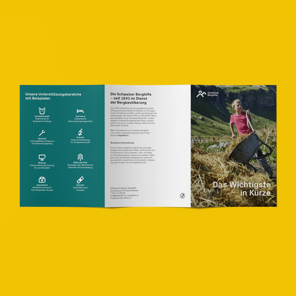
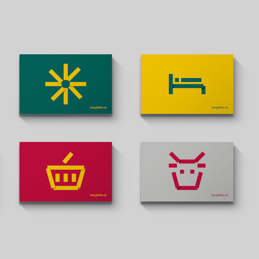
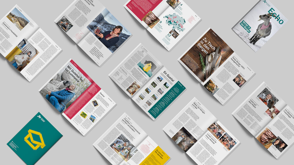
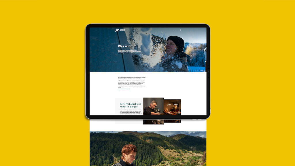
With sharpened brand positioning, clear messages, and a concise visual identity, MetaDesign has translated this promise into a bold and future-oriented brand image.
Through positive attitude we celebrate the courage, passion, creativity and willpower of the Swiss mountain people. A positivity which is also expressed through the content, clear statements and a reinvigorated tonality that addresses its audience at eye level, in partnership – always full of joie de vivre, and a twinkle in our eye.
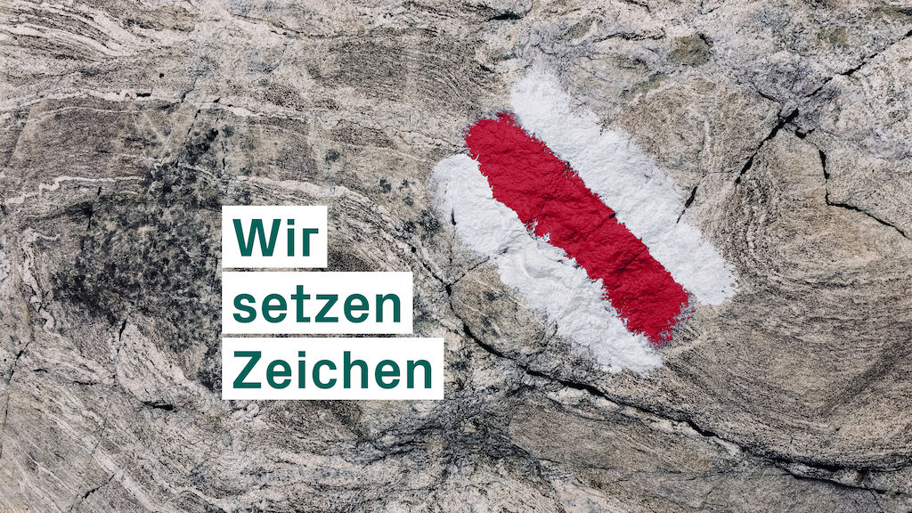
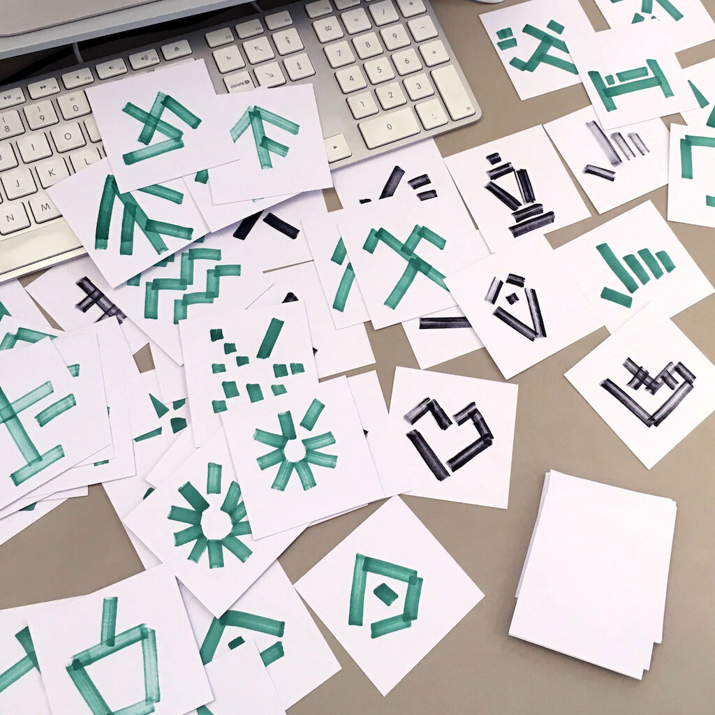
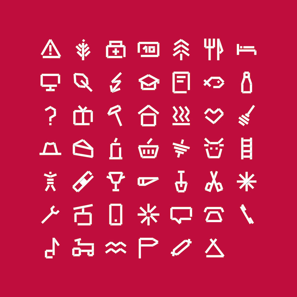
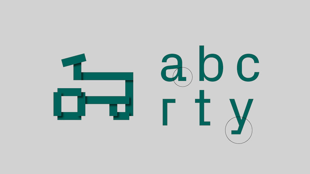
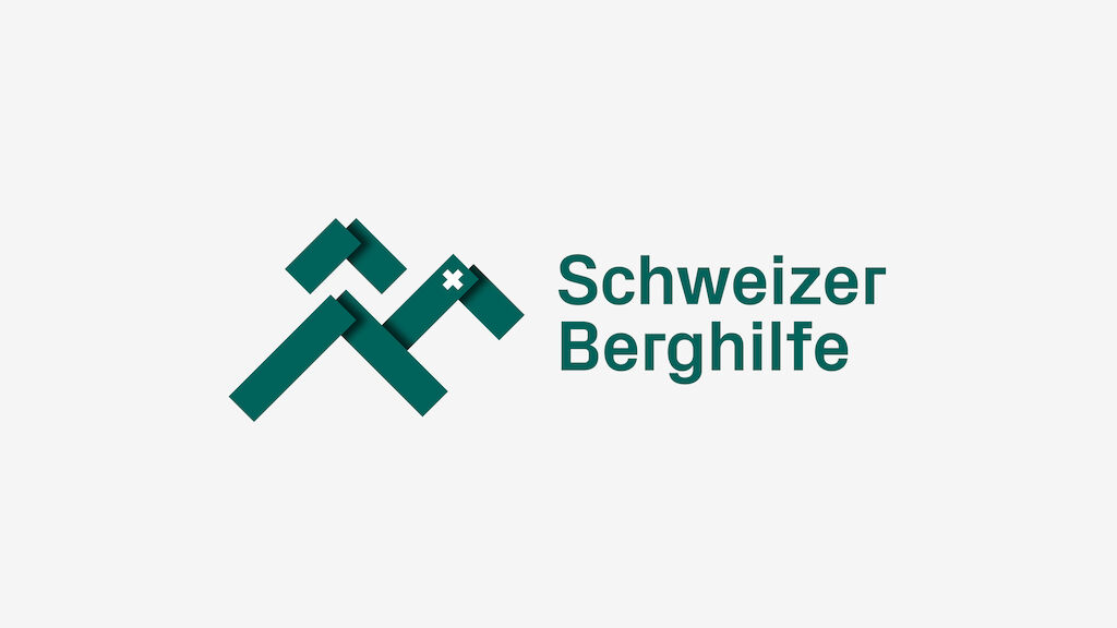
Colourful, modular and flexible: The design clearly expresses the rediscovered self-confidence of the Schweizer Berghilfe. The typography and the new logo refer to a sign language, used for path markings and shapes that have been familiar to the alpine regions for centuries – simultaneously they represent a mountain world that is both contemporary and future-oriented.
