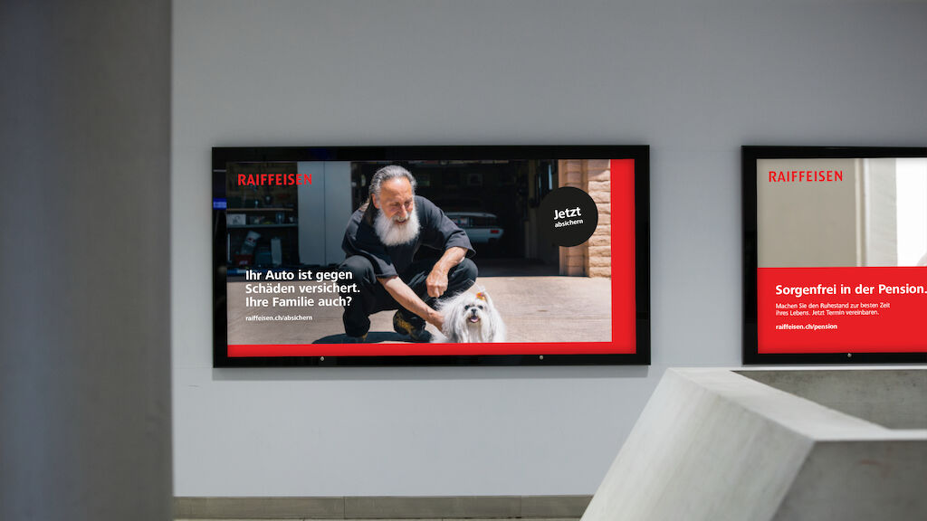
The new brand thrives on movement and dynamism. As in the well-established word mark, the color red marks an essential element. People in everyday life reflect the naturalness, closeness, and diversity of Raiffeisen as a cooperative. These few but clear design principles create the fundament for a vivid, differentiating, and contemporary brand.
Video is loading…
Raiffeisen
Paving the way for the future
Raiffeisen stands for an over 100 years bond with Switzerland. Its winning formula is to always be close to the people and keeping pace with the times. Thus, following the comprehensive rebranding of Raiffeisen in 2006, the next step has now been taken: under the credo 'simple, clear, close', Raiffeisen is continuing its successful path with a clear focus.

Video is loading…
Video is loading…
Video is loading…
Video is loading…


Video is loading…
Video is loading…
Video is loading…

需要更多信息?
联系 MetaDesign Zürich