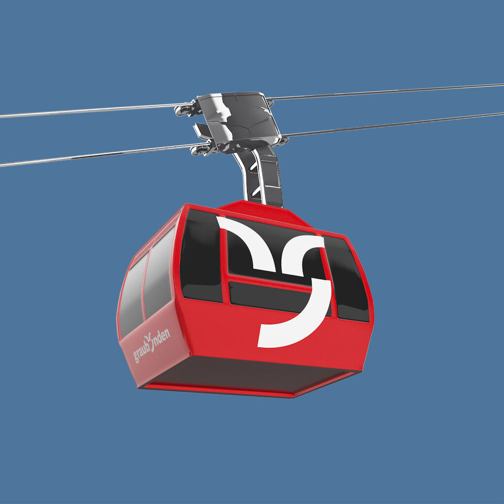
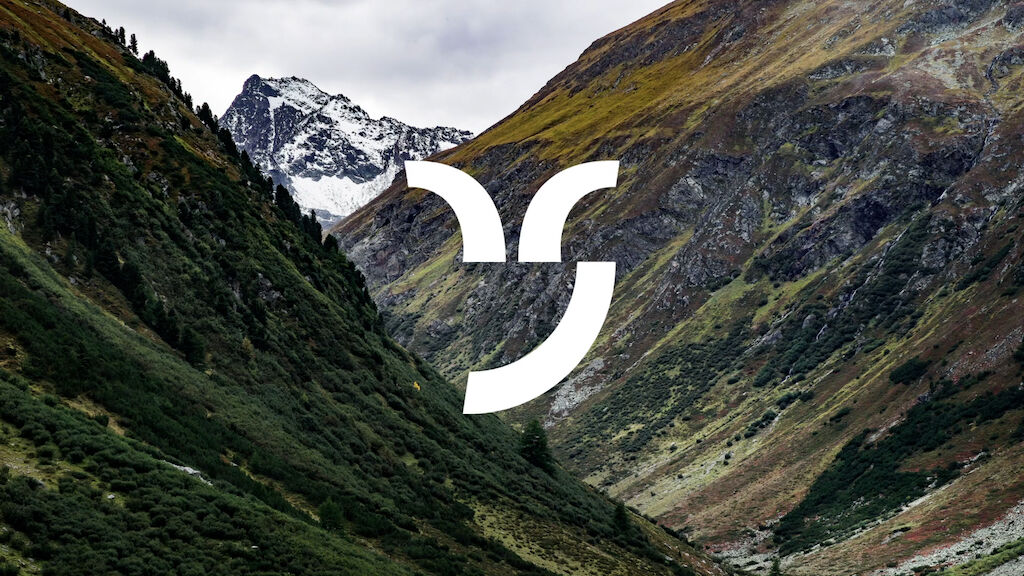
Instead of a hierarchical brand architecture, the graubünden brand and its partners are now part of a brand ecosystem – simpler, modular and versatile. The partners value offerings for customers define their role in the brand ecosystem. This brings more clarity for customers, more freedom for partners and more power to the graubünden brand. The popular brand symbol – a stylized capricorn head – unites all applications and guarantees recognition across the brand.
Video is loading…
graubünden
An iconic symbol for a diverse region
The Graubünden region offers more than tourism in a picture-perfect mountain world. The regional brand graubünden was created to promote the location in a sustainable way – making the region an attractive place to work, live and relax. More than 70 businesses, companies, associations and institutions as well as countless destinations are associated with the graubünden brand and promote the idea of the "NatureMetropolis of the Alps".
Video is loading…
Video is loading…
Video is loading…
Video is loading…

需要更多信息?
联系 MetaDesign Zürich