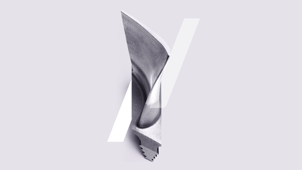
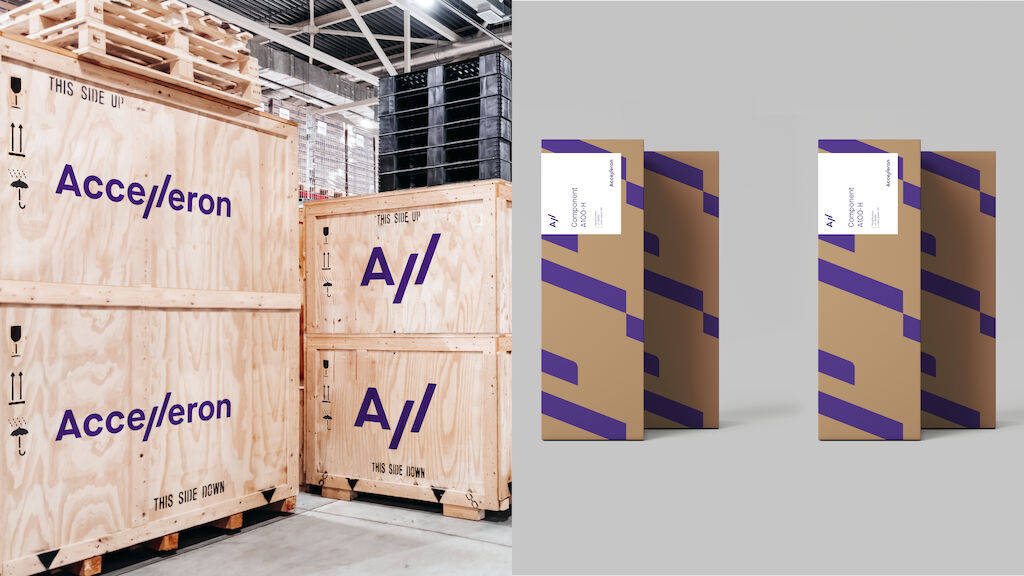
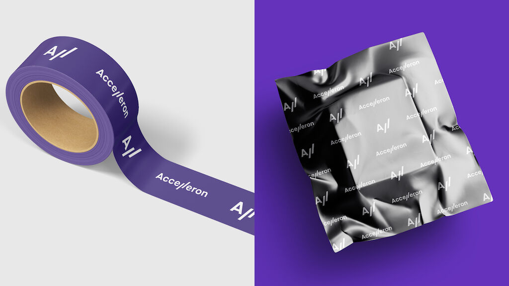
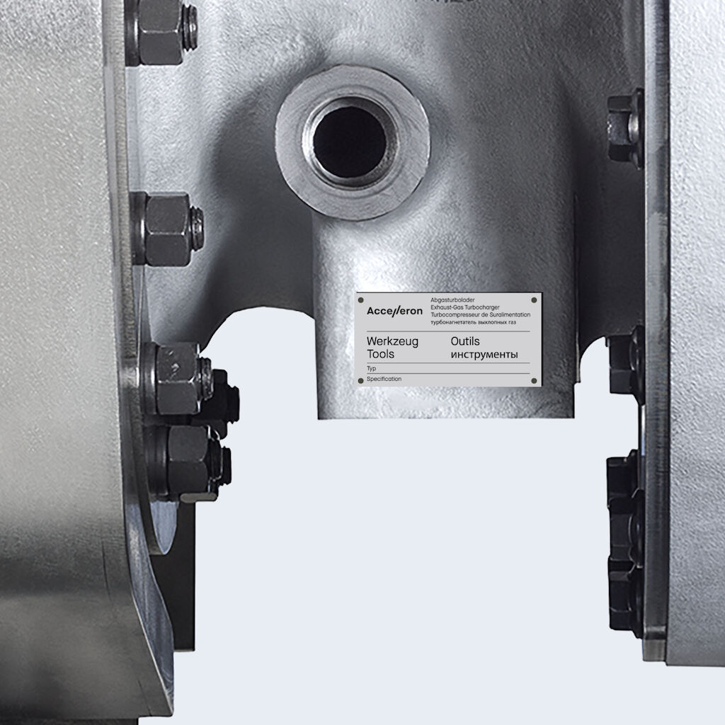
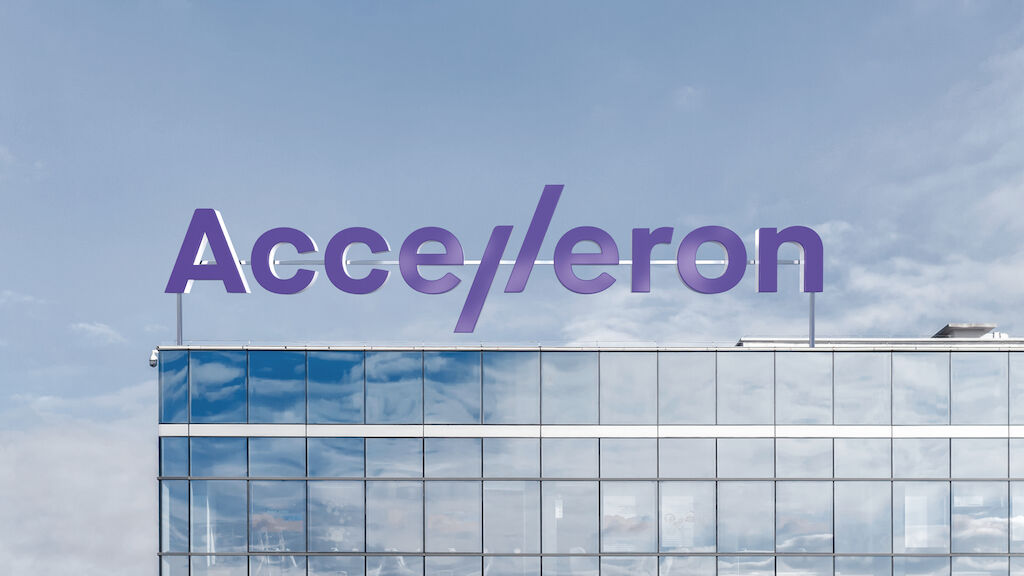
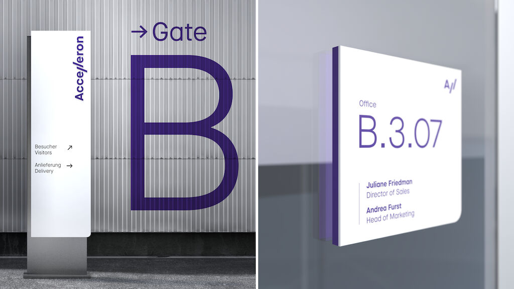
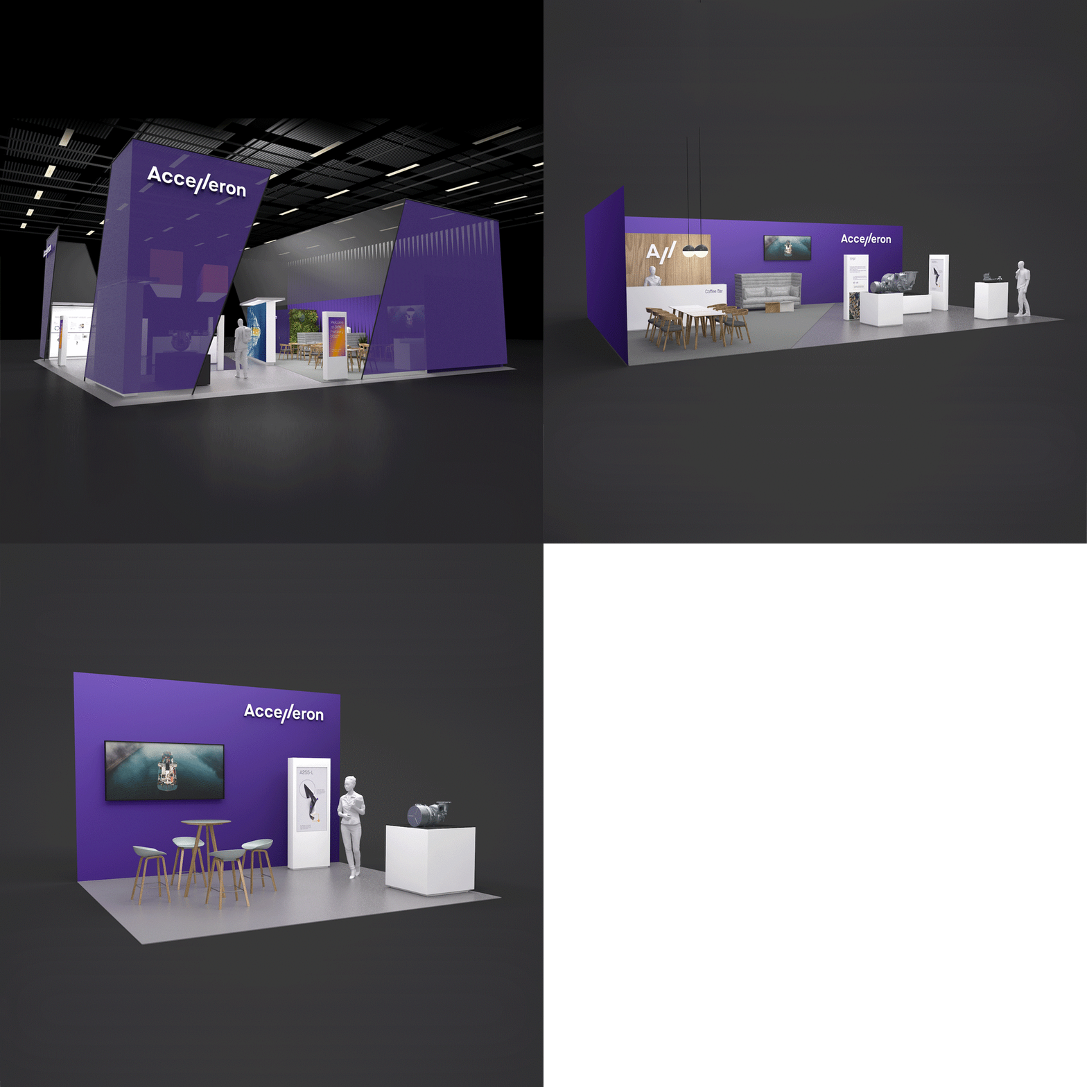
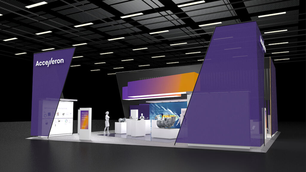
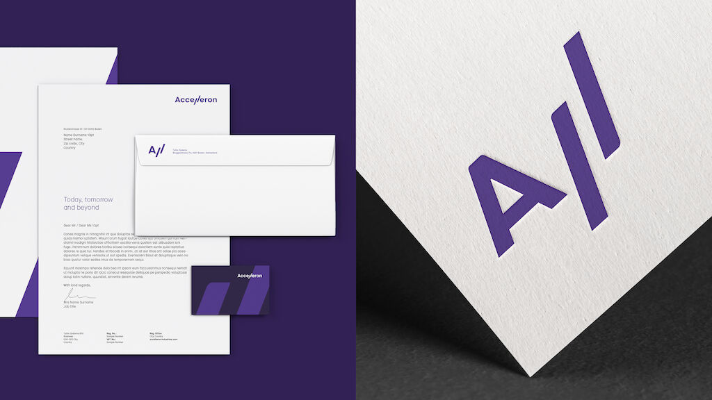
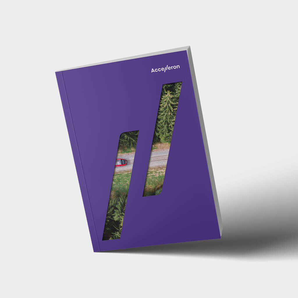
This unique position and power become tangible in a visionary brand and a completely new brand experience. At the heart of the brand is the capacity of innovation and imagination of its employees and the expertise they bring to their customers. A portmanteau of Acceleration, Access and Excel sums up this claim in the name Accelleron. The overall brand experience is empathetic and approachable, coupled with the attributes of speed, skill, and sportsmanship. The diagonal double-L in the wordmark represents the blades of a turbine wheel, Accelleron's heritage and core business, not to mention that it’s emblematic of the industry's transformation. The purple color scheme combines the air currents associated with blue and red from the turbocharging process while conveying a royal, high-end flair. In doing so, Accelleron deliberately takes a human position, differentiating itself in the market.
Accelleron
A new brand to move further
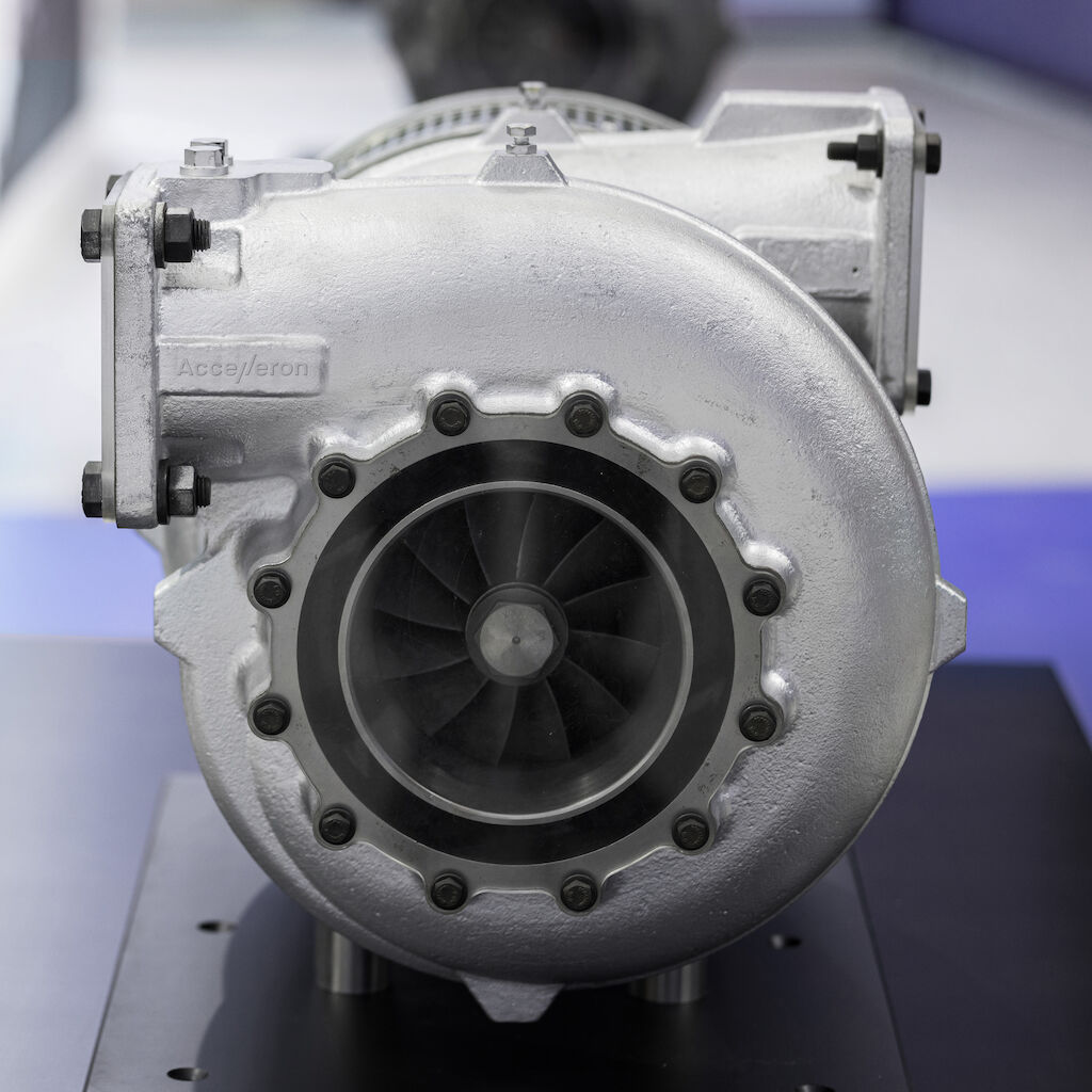
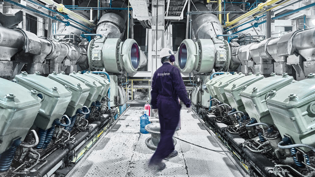
Accelleron is the epitome of high-performance turbochargers for diesel and gas engines around the world. With breakthrough innovations and cutting-edge technologies, Accelleron turbochargers help industries at sea, on land, and on rails to move ever more efficiently, reliably, and sustainably. As a former ABB division, Accelleron not only positioned itself independently on the stock market, but acts as such with the ambition to continue Turbocharging's successful path as a global market leader and to help drive global progress in a sustainable way.
需要更多信息?
联系 MetaDesign Zürich
