It's no secret: the world needs to reduce carbon and plastic. And as the world's population grows, it can't hurt to provide people with more and safer food. That's why SIG, a leading systems and solutions provider for aseptic packaging, has a vision: to become the sustainability leader in the industry with the goal of being net positive by 2050. SIG aims to give back more to people and the planet than it takes out.
Blog
For better: how MetaDesign helps B2B company SIG on its way to net positive
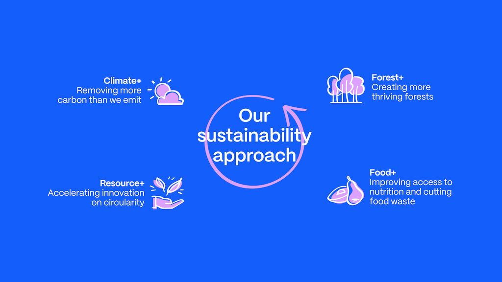
That's quite an ambition - too good to be true? Not really, because SIG not only declares itself a force for good but also puts its money where its mouth is by making net positive part of its corporate strategy with four areas of action:
- Removing more carbon than the company emits
- Create more thriving forests
- Accelerate innovation in circularity
- Improve access to nutrition and reduce food waste
Great! I mean, SIG is committed to creating a net positive future. So how can we at MetaDesign as a creative strategy and branding partner do our part? Spoiler alert: there's a lot.
One strategic ambition, one guiding principle: for better
First and foremost, we have translated SIG's net positive ambition into the simple, memorable guiding principle "for better" - tangible, easy to grasp, and fun to follow. No matter what SIG does or takes on, SIG is committed to delivering "better" for customers, consumers, and the world. Striving for better is not a slogan to satisfy today's public expectations of sustainability, it is simply at the heart of everything SIG does.
The power of a concise brand narrative for net positive
"For better" guides SIG to create the most sustainable packaging solutions across categories and channels. If you're a dairy or fruit juice producer, all you have to do is knock on SIG's door and you'll find the number one sustainable solution. "For better" drives SIG to deliver innovative and flexible solutions, to pioneer technology, and ultimately to help customers transform their businesses for the better. It inspires SIG to work in partnership with its customers to bring food to consumers in a safe, sustainable, and affordable way.
"Our goal is to deliver the most sustainable, innovative, fast, and flexible packaging solutions in carton, pouch & bag-in-box across categories and channels."
Bundling the power of sustainability in a one-brand architecture
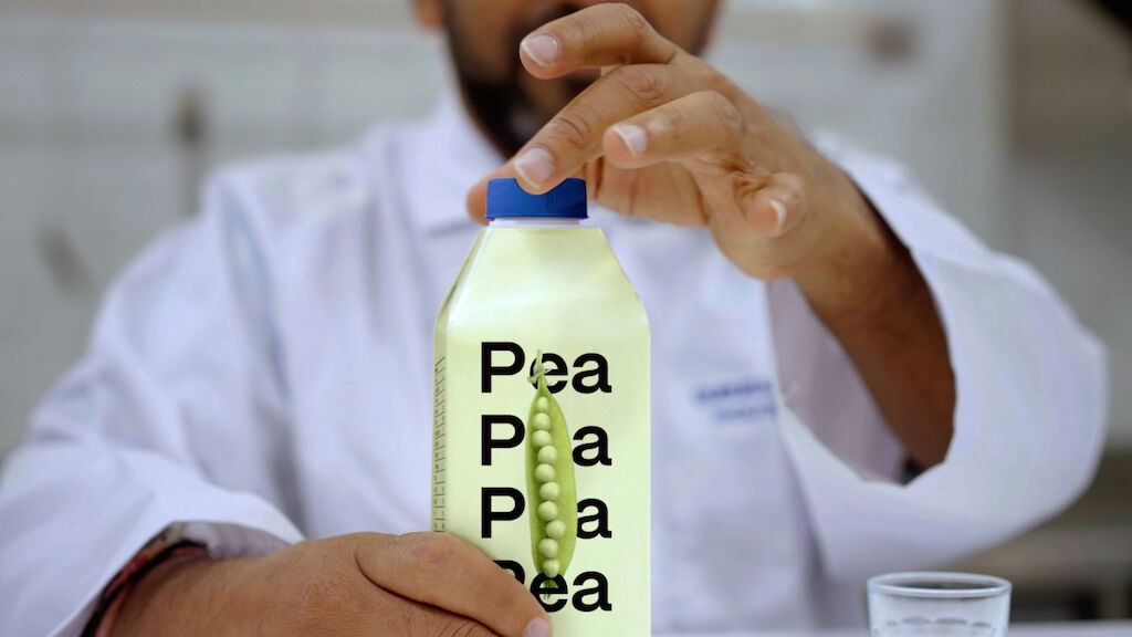
Along with the strategy, we also considered how SIG could effectively communicate its ambition, especially in light of significant acquisitions such as Scholle IPN, a leading global supplier of flexible packaging solutions such as bag-in-box cartons and stand-up pouches. Should SIG keep Scholle and other brands as sub-brands in the future? Or should the strength and ambition of "for better" be bundled under one roof? By establishing SIG as an umbrella brand, we have laid the long-term foundation for the latter.
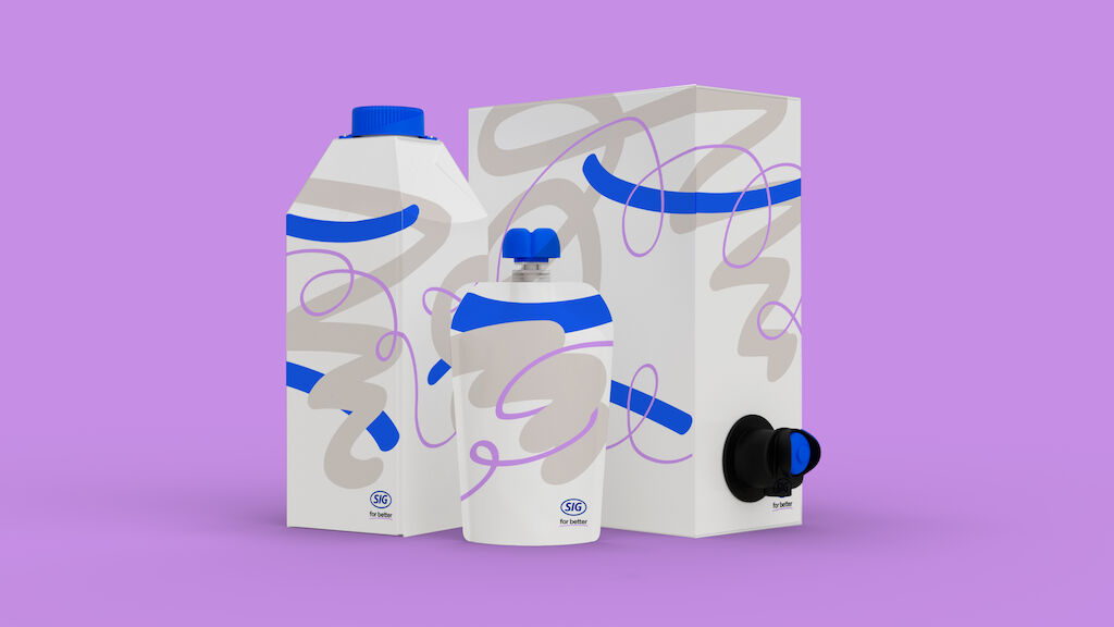
Combining forces for better in one product packaging family
Speaking of joining forces for better, does this also apply to packaging communication? Guess what, it does. Let's take a look back: SIG has been designing packaging with sustainable features since 2010, when it launched the first aluminium-free aseptic carton. Previously, each package with a new sustainability feature had a different name. This made communication increasingly complex, especially in times of constant progress, as SIG regularly improves the sustainability performance of its packs, adds new sustainable features, and even combines them. Sounds complex? It is.
Our solution? Respond to complexity with simplicity: We created a product family that can encompass any current or future sustainable packaging solution, regardless of its characteristics. This allows SIG to give its sustainable innovations a home, and to communicate them with impact and transparency. Also, it allows the sustainable product family to grow sustainably with each product – until the product family becomes obsolete because all SIG packaging solutions will be sustainable by nature.
Making for better tangible through a compelling brand experience
And then what? Now that the stage is set, it's time to let the world know: with a holistic brand experience that is driven by the attributes "human, dynamic, bold".
- Human, because although SIG is a B2B company, its innovations and products are highly consumer-driven, consumer-tested, and consumer-proof, and thus truly made for people and their real needs.
- Dynamic, because SIG customers want to manufacture products efficiently, quickly, and flexibly - just as consumer behavior and market trends demand.
- Bold, because no one else in the market can do this as quickly and comprehensively as SIG can, and with a net positive effect.
And now: let's get visual! First of all: no, the SIG design won't just be green (but we guess you were prepared for that). So, sorry, no clichés.
Designing net positive starts with a scribble
But what's the big idea? Typically, B2B brands insist on showing their precision and perfection. SIG, however, has chosen a path of imperfection and authenticity, while giving back more to people and the planet than it takes. Because this ambition is a journey that is quite urgent, the new SIG design tells a story of speed, dynamism, and new ideas that are needed every day.
Speaking of people, there are people behind SIG - with emotions, with challenges, ready to write the future for the better. Since every idea for a sustainable packaging solution starts with a scribble, why not put the scribble on paper in the design? The scribble conveys the message of imperfection and never standing still.
Because of SIG's strong connection to nature, we also gave each color a name: SIG Sand (gray), SIG Forest (dark green), SIG Moss (light green), or then SIG Sky (blue), which reflects precision and technical expertise, as well as SIG Spark (lilac), which emphasizes SIG's spark for innovation. Like nature itself, the design comes with packaging that is flexible, efficient, protective, safe, sustainable, affordable, and beautiful – for better.
UX and accessibility for better
But wait a minute: in a world of packaging, where's room for UX? We can tell you there's plenty! Bye waterfall, hello modular building blocks: we took a very agile and collaborative approach to create the digital user experience. Designers and developers worked simultaneously in live tools and documents, allowing the SIG user experience to grow as you watch. Needless to say, this contributed to a very efficient and relatively sustainable process in a short period of time.
As for the result, we first created a light version of the website based on the building block principles introduced earlier. This allowed the topic of sustainability to be promoted immediately and saved time before the light version of the website was replaced by the technically economical, integrated online experience. Today, SIG can count on an online experience that is simple, energy-efficient, and easily adaptable to evolving packaging and ever-changing user behavior.
As with the packaging, since we design everything for people, we have kept accessibility in mind throughout the user experience. This includes color contrasts, visually generous typography, large touchable interface elements, and other elements of accessibility across barriers.
A real-time sustainability score that contributes to net positive
Last but not least, we have come up with a real invention: a digital 3D packaging configurator with a real-time sustainability score. The idea is to enable SIG, together with its customers, to define the contents, the package size, and the type of closure, knowing at the same time the footprint and the price of the packaging - a simple but effective tool to actively integrate sustainability into the packaging design process (and in case you haven't noticed: it's fun and meaningful!).
Sustainable materials for spatial branding on a global scale
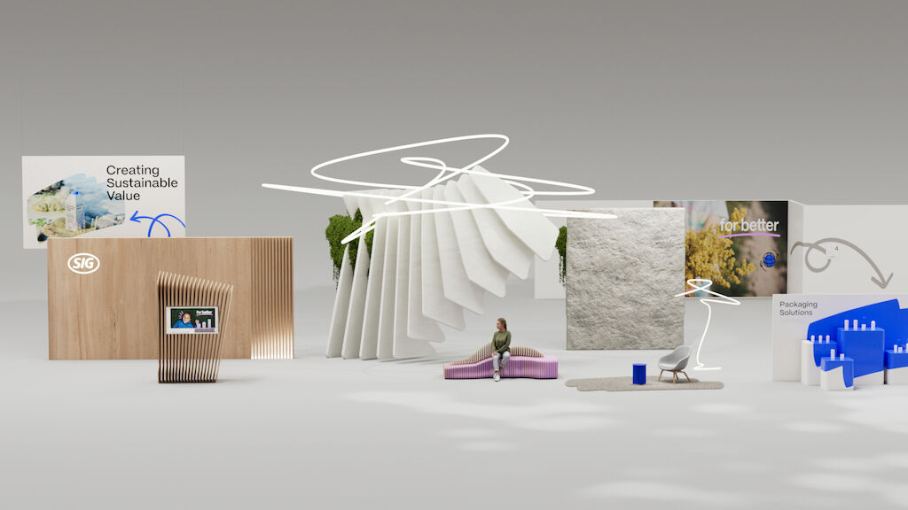
Time for even more tangibility - let's go spatial! It's all about materiality, design language, and spatial situations that convey the brand's ambition. A concept ensures consistency and scalability - from customer zones to cost-effective office spaces.
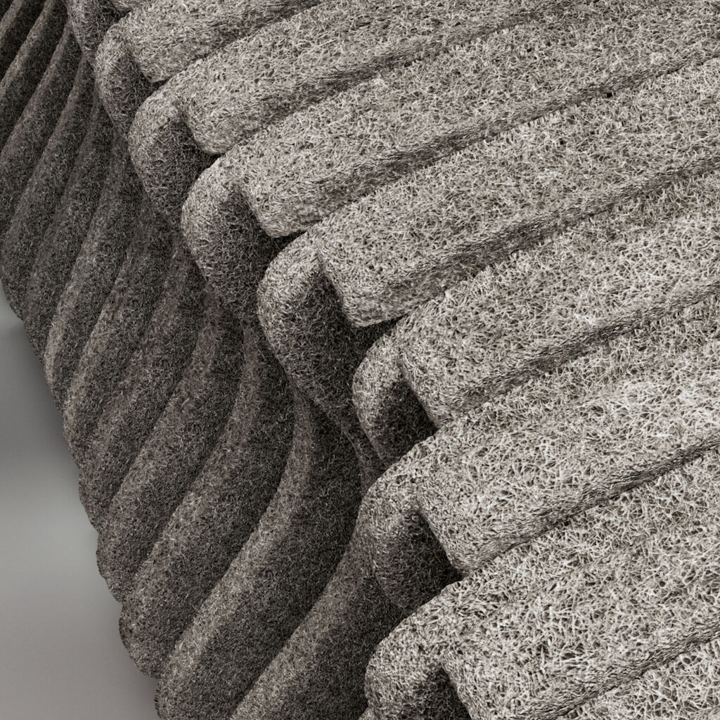
A sculptural transformation object called "solution wings" takes center stage. It represents SIG's irrepressible will to develop and is made of recycled material. In addition, natural materials such as softwood in the meeting areas (raw material for paper packaging), broken sandstone in the monolithic counters or the wall application as a reference to the headquarters at the Rhine Falls, the largest waterfall in Europe and landmark of SIG's headquarters in Neuhausen, characterize the appearance. In addition, exhibition areas with brand-typical white components merge with product and communication carriers consisting of vertical green walls, enabling SIG to make "for better" tangible at its headquarters, branches, and showrooms as well as at trade fairs and events.

Taking every employee on the „for better“ brand journey
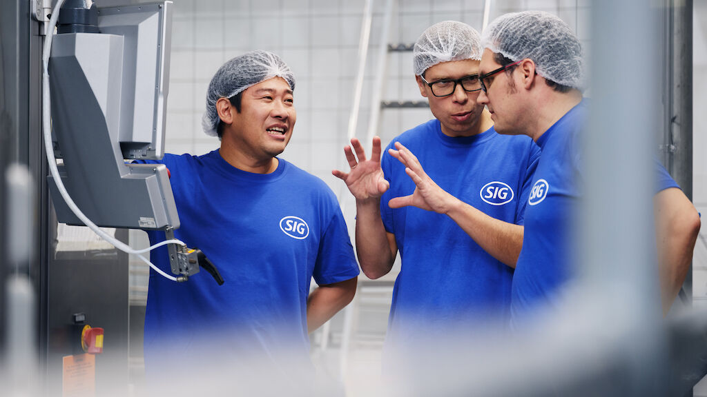
Now - uh oh - imagine that SIG defines the claim "for better" and when it's time to launch, only a handful of people know about it? That's why we involved colleagues and representatives from across the organization - from SIG, Scholle IPN, and Evergreen Asia - early in the creation of the new brand. In order for SIG to fully deliver on the brand promise of "for better", its ideas, passion, collaboration, and entrepreneurial thinking, it was crucial to take every employee on the evolving "for better" brand journey and continuously empower them to live the shared SIG spirit to the tips of their hair.
An employee app to enable engagement with the new brand
To mark the beginning of this new chapter in SIG's success story, a new SIG employee app brings everyone closer together, fosters the new community, and strengthens collaboration. The app serves as a platform to playfully learn about and engage with the new brand through stories, articles, and quizzes around "for better", ultimately empowering everyone to bring the new brand, culture, and spirit to life.
Reaching more talent to engage with the for better spirit
As you know, it's precious and valuable to retain the employees who have just started to live, breathe, embody, and shape the new SIG spirit. But what about the talent out there that we know exists and fits the "for better" as our employees do, but we just haven't met yet?
Based on "for better", we defined a story and four guiding employee messages that we communicate: potential for better, together for better, innovate for better, and work for better. What may sound trivial is crucial: by continuously communicating these four employee messages, SIG will attract more and more employees and talents who are driven to deliver for better in the sense of SIG's claim. This will enable SIG to sustainably ingrain the spirit of "for better" in its culture and in all aspects of SIG.