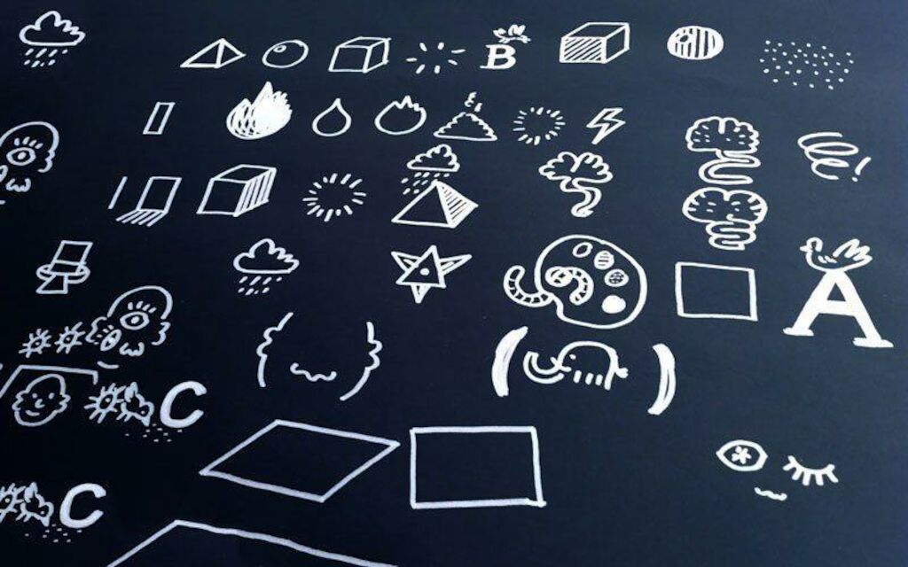
Illustration is in the air! Not only is the stylistic device perfect for dipping into fairytales or attracting crowds to indie festivals, it has also significantly stimulated advertising, packaging, and web design. And yet illustration hasn’t drawn many lines in branding. What a huge loss, say we.

Blog
Defining the Fifth Element
The power of illustration is grossly underestimated, certainly in branding. When talking about creating brand images, we automatically think of photographs and immediately start to comb through this big pool of pictures — making use of already existing concepts, reproducing exorbitantly smiling, hand-shaking people in blue suits for the hundredth time. But let’s be honest: cloning stereotypes doesn’t really scream “brand credibility,” does it? So, if authenticity and differentiation are the aim, we need to go beyond and create a new dimension of visual worlds. This is where illustration enters the scene, bringing its big bag of potential in tow.
First and foremost, illustrations can be full of life, thrillingly playful, and therefore able to tell stories that stick, something that campaigns and ads make use of forever. Just think of Red Bull or Switzerland’s favorite: the “damage drawings” of the insurance company Mobiliar. They all have our all attention. So why not make the brand’s core memorable, too?
Being as flexible and versatile as illustrations are, they can potentially meet every specific need on every specific channel. And with their explanatory character, illustrations bring abstract subjects to the point and make complex messages tangibly comprehensible. Brand values like sustainability, progressiveness, or trust? My mind is spinning, my hands tingling!
And the candy clip: illustration brings in wit and charm without drifting off into ridiculousness. Just think of what the Red Bull campaigns would be like if they would have used real people.
Illustrations are able to tell vibrant stories, tickle your imagination, and allow admission into a world that photography can never ever take you. Or is legally not allowed to take you.
And this is why I plead for integrating illustration into the key elements of design, defining a brand’s identity just as much as the logo, font, colors, and the formal principles do. So it is our job to prove that illustration is not only a cute accessory or scribble but absolutely has the power to create identity. Starting now.
_Simon Fuhrimann is designer at MetaDesign Zürich.