The project initially came into being following an inquiry from Kunsthalle Bremen, which wanted to develop a key visual for the planned exhibition "Icons". The curatorial idea of the exhibition was ambitious and bold from the start: The entire art gallery was to be cleared out in order to allow each exhibit its own room. Focusing optimally on an individual work should make it possible for the visitors to approach each work of art in a contemplative way and free from the "background noise" of other works in the same room.
It was planned to have a cross-section through the most important works and artists of the past 600 years, on the basis of which one should follow the change in meaning of an icon, from the original devotional picture of religious worship to a work by an artist personality duplicated millions of times worldwide, the adoration of which no longer has any religious significance whatsoever. From the image of saints from the Middle Ages to, as it were, the pop cultural self-portrait of a Vincent van Gogh and further on, to our present time with artists like Jeff Koons, Gerhard Richter or Andreas Gursky.
Icons are omnipresent
From our first considerations, we took this plan one step further. The transformation of the term “icon” is now also no longer constrained by the disengagement of a specific art object. We find icons in all areas of life, no longer just in art. We all relate with the concept of the most duplicated objects, people and depictions from e.g. music, architecture, design, sport, science, politics, the list goes on. It is precisely this open and personal reflection which seemed to us to be an important element in order for the exhibition to open up to a broad public as a special experience, as well as to address those who do not often go to museums. The art gallery’s team accepted this discourse with us with curiosity and with growing enthusiasm.
By posing the question about what truly constitutes an icon, we came to three core aspects:
1. Worship: An icon shows "adoration" (which can be religious, but also completely secular).
2. Duration: The adoration takes place over a long period.
3. Consensus: It achieves the greatest possible circulation.
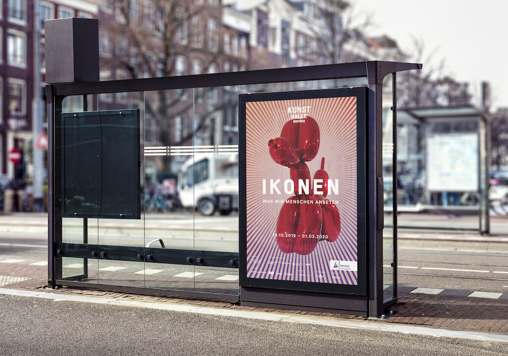
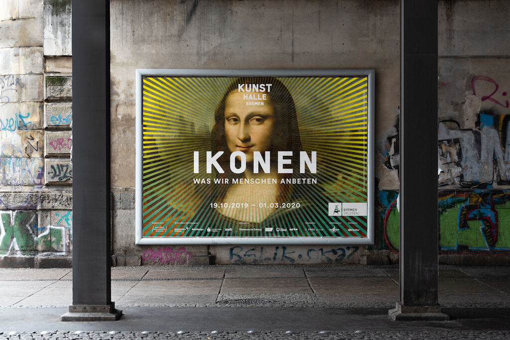
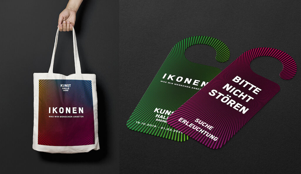
We then condensed the core subject of adoration in terms of communication to "What we worship as people" in the additional sub-title of the exhibition. An important step to suggest to the visitors from the title that it is much more than just religious devotional pictures. And it led us to a very simple and intuitively comprehensible visual motif, a halo, the "aureole".
What is special about the "aureole" lies in its multifaceted adaptability for media and formats and not least that it can be used in isolation but also as multi-colored overlay for exemplary works from the exhibition in communications (e.g. the poster motif). Therefore, one day it generates an excitement and magical, mysterious effect, other times it super-elevates the effect of the specific artworks and wraps them in auratic light; in a manner of speaking, it manifests the worthiness of adoration in a visual way.