Embark_thumbnail

A Journey of Discovery

Your dog is your best friend, but how much do you really know about him? MetaDesign recently created the branding for Embark, a startup that uses genetic testing to provide dog owners with insights into their pets. Brady Boyle, lead designer on the project, discusses the evolution of the visual identity with Hozy Rossi.

HR: You had dogs growing up. You bring your dog to the studio. Were you psyched to be working on a dog project finally?

BB: Not only was it a dog project but it was a new brand. Those are the best things that come in the door. They didn’t have an existing logo, and the client seemed super excited and receptive. The strategy was good. It was exciting.

HR: So what was the brief? What was your understanding when it came time to design?

BB: The brief was “promising discovery.” That was the positioning, and it was about going on a journey with your dog and understanding where your dog came from so you could create a better path for them in the future. That blends well with the name, because you’re embarking on a journey. So that was a good jumping-off point. It was playful. They didn’t want to be super scientific. They’re not trying to shove a bunch of data down your throat. They wanted to make a fun brand that would appeal to pet owners.
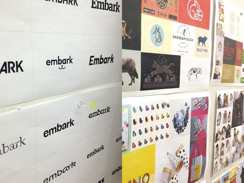
Embark_boards

HR: That reminds me. Something interesting happened in the handoff from strategy to design.

BB: Yeah. This was the first time where during the handoff meeting the client was there, and we got to ask him questions directly, which was huge. Spencer [Wells] was here by chance, and he likes the process of design. He was a part of the design kickoff and the introduction to the designers and the initial brainstorm. That was a unique experience because anything that we came up with, he was able to elaborate on and be a part of the discussion. We hadn’t planned for him to be in the room. In hindsight, I like that it was impromptu.

HR: Coming out of that meeting, things moved pretty quickly.

BB: We had three or four days to get three directions together. We worked late a couple of nights and got it done.

HR: Tell me about the three directions.

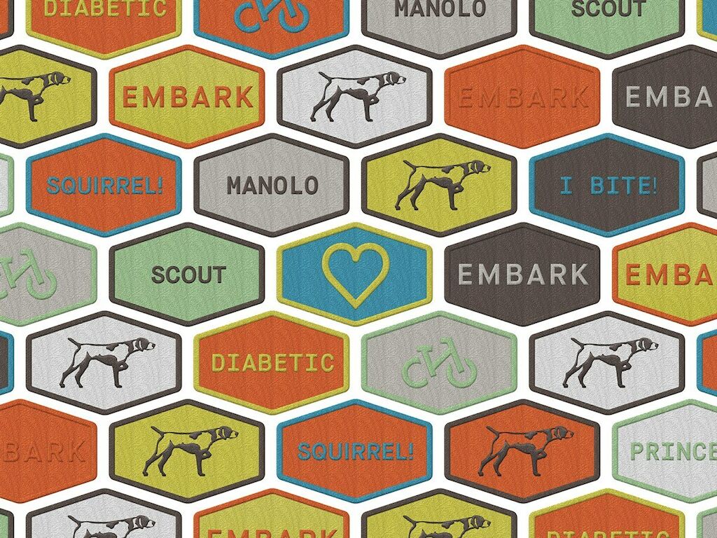
BB: Conceptually the first one was very much tied to the strategy. It was about embarking on a journey, and this is your tool kit for your adventure. So all the brand elements fit that — almost like an REI. It was a literal interpretation of travel, and meant to be a rugged brand that’s built to last.

Embark_patches

The second direction was all about learning about your dog, as if your dog could finally talk. We did simple, large typography — basic translations of what a dog would say. It’s like getting to know someone for the first time — making a real connection with your dog, and the whole journey of truly becoming your best friend.

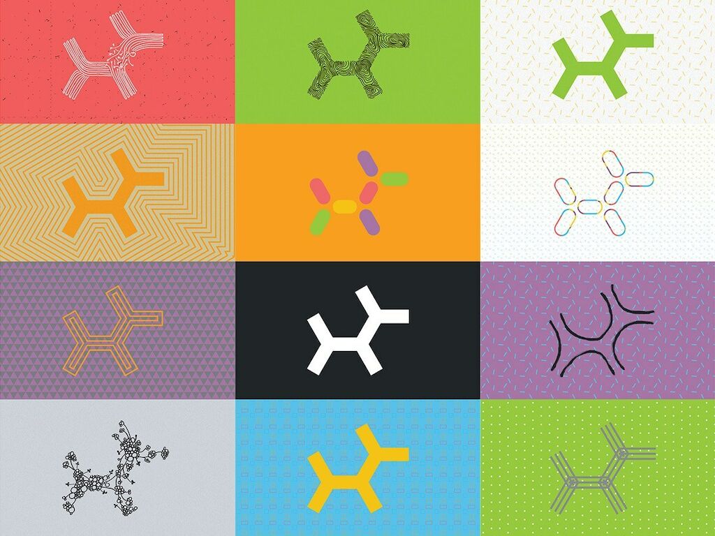
The third direction looks at the common denominator of dogs, so it’s understanding dogs at their most basic level and what they have been throughout time. They’ve always been depicted similarly: two legs, a tail, a back, ears, and a snout. Little kids draw dogs the same way. Dogs all have a common ancestry. You take that and expand it to every type of dog.

The Embark logo is the most standard version of that dog. It’s built out of four hexagons that are placed next to each other. How can we make a dog out of the most simple shape? It’s seven lines, all the same length, connected at the same angle.

HR: And this is the one the client chose.

BB: Yeah. It was Sofia [Llaguno] who came up with the logo. She was keeping it very standard, always rendered the same way. We were looking at how we could push it. What if we take this logo, the common denominator, and render it in different ways? It became a lot more scientific and clinical using vectored shapes.

HR: What came next once this direction was chosen?

BB: We did the packaging, the identity system, stationery, video, the website, some ads.

The website presented some challenges. They needed ways to visualize the data they deliver. It’s a lot to learn about your dog, and it was a lot for us to learn. As a designer, you find yourself thrown into a situation where you’re having to keep up with this super-technical stuff. These people are scientists. Things can get deep really quickly. Being thrown into data-heavy situation like this, you’re required to learn it so you can execute appropriately. It’s crazy how much I learned about the way they track genetics in dogs.

HR: One day you’re working on dog genetics, and the next day, well …

BB: They launched the brand. It’s largely out of our hands now. This is something you were deep into for a month to six weeks, and then suddenly it’s over. It’s exciting to know that it’s out there, but it’s a little like going on vacation and leaving your puppy behind. That’s the nature of what we do.

Hozy Rossi is a creative director at MetaDesign San Francisco. Our Embark case study can be viewed here. Information about Embark and their DNA testing for dogs can be found on the Embark website.